Maker Quarterly

Mohawk Maker Quarterly #10: Beauty

Words
Mohawk
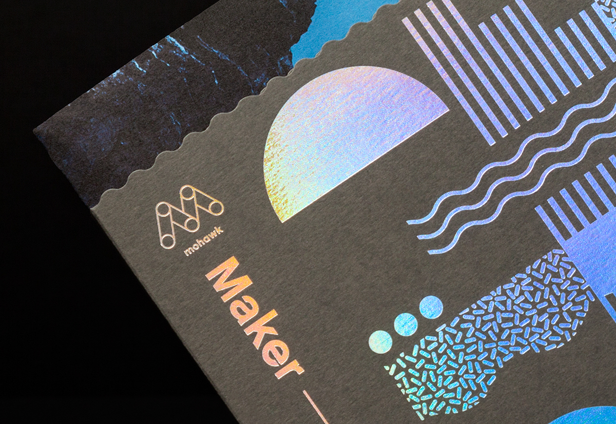
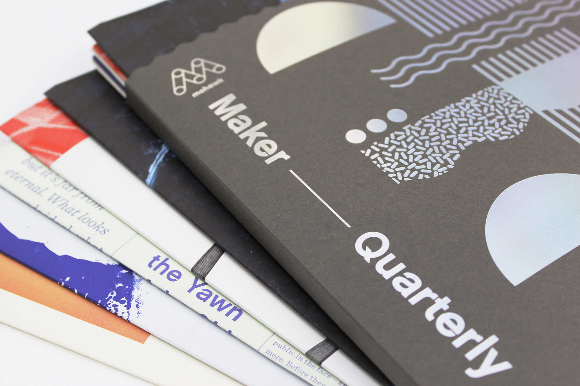
Cover of Maker Quarterly 10 with iridescent foil stamping

Beauty isn’t a superficial aesthetic trait; it inspires, moves and engages us. It triggers emotion. It attracts. It gives pleasure. 
What’s more, beauty is universal: Everyone, regardless of culture, age or experience can recognize and appreciate a beautiful person, scene, object or sound, even though we have differing opinions of what qualifies as beautiful.

Since the Mohawk Maker Quarterly’s inception in 2013, and with each issue since, Mohawk and partner, Hybrid Design have pushed the boundaries of creative expression in print. Issue nine featured a substantial change to the masthead and a new form factor, while issue ten goes one step further by completely upending traditional publication guidelines by organizing the content in a series of five large-format posters.


“This issue seeks to prove that beauty is far more than a superficial aesthetic trait. We hope that the Beauty Issue of the Mohawk Maker Quarterly helps designers harness the connection between meaning and beauty to create transformative work.”
Chris Harrold
Vice President + Ceative Director, Mohawk

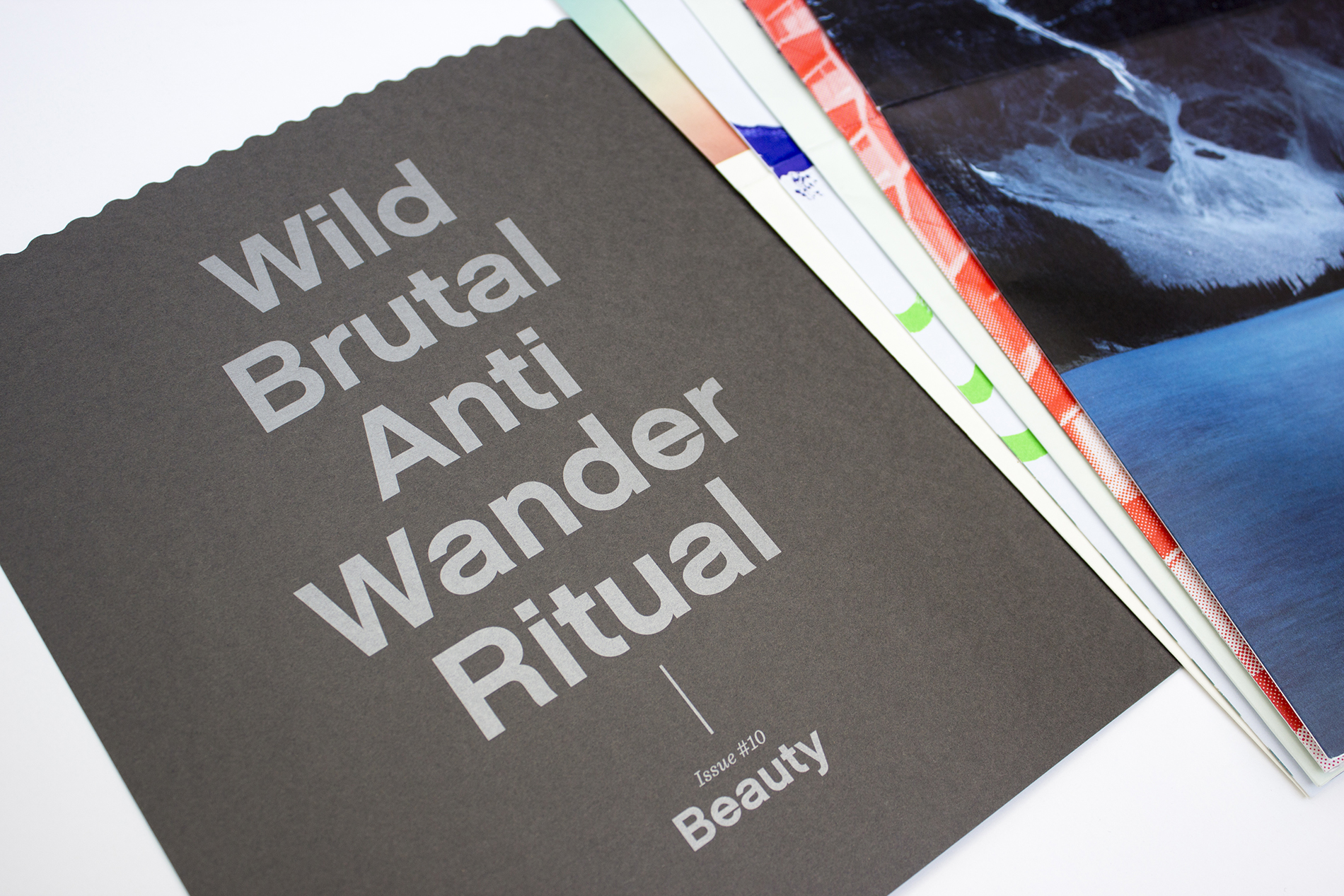
Maker Quarterly 10 and its contents laid out in a fan arrangement

Dora Drimalas, Principal of Hybrid Design adds, “Beauty motivates, opens our eyes and captures our attention. It has the remarkable power to move us independent of, and often in opposition to, our rational mind. Even for those of us who can admit beauty moves us, we struggle to justify it. To make truly great work we need to accept the value of that which is hard to measure, and unapologetically advocate for the emotional response it can provoke.”

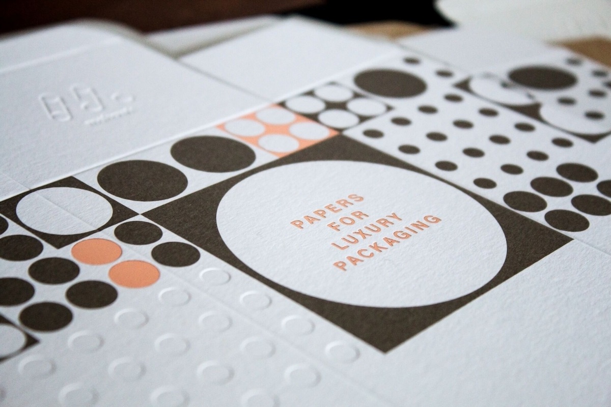
Close-up of foil stamping on the cover
Detail of Issue 10's Cover
Mohawk Maker Quarterly 10

The cover of issue ten is a tri-fold pocket folder which serves as a container for the five sections of this quarterly, each printed on different textured and colored Mohawk papers. Inspired by airport carpets, the cover pattern aims to create beauty from a source we rarely notice and otherwise find aesthetically unappealing. The combination of Strathmore Wove Charcoal Gray and holographic foil allows the beauty of the materials to shine, creating a visual and tactile experience with a single printing process.

Close-up of inner table of contents
Inside Front Cover of Issue 10
Mohawk Maker Quarterly 10

The inside front cover features a table of contents introducing the five “chapters” of the publication, each designed to explore beauty from a unique perspective and a distinct voice while demonstrating five different papers. Each chapter is an eight-panel “mega-brochure” that reveals a full 24 x 36” poster featuring photography, typography, illustration, narrative and architecture when it is unfolded.

The Beauty Issue brings in several new writers who bring new depth and perspective. Feature articles include:

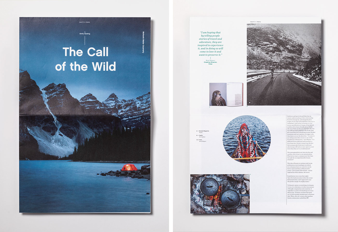
Two-page spread viewed from above
The Call of the Wild
As storytelling supplants advertising, brands are emerging as unique mediators of a conversation between us and nature. Printed on Mohawk Options Vellum, Crystal White, 70 text.
Words
Emily Gosling
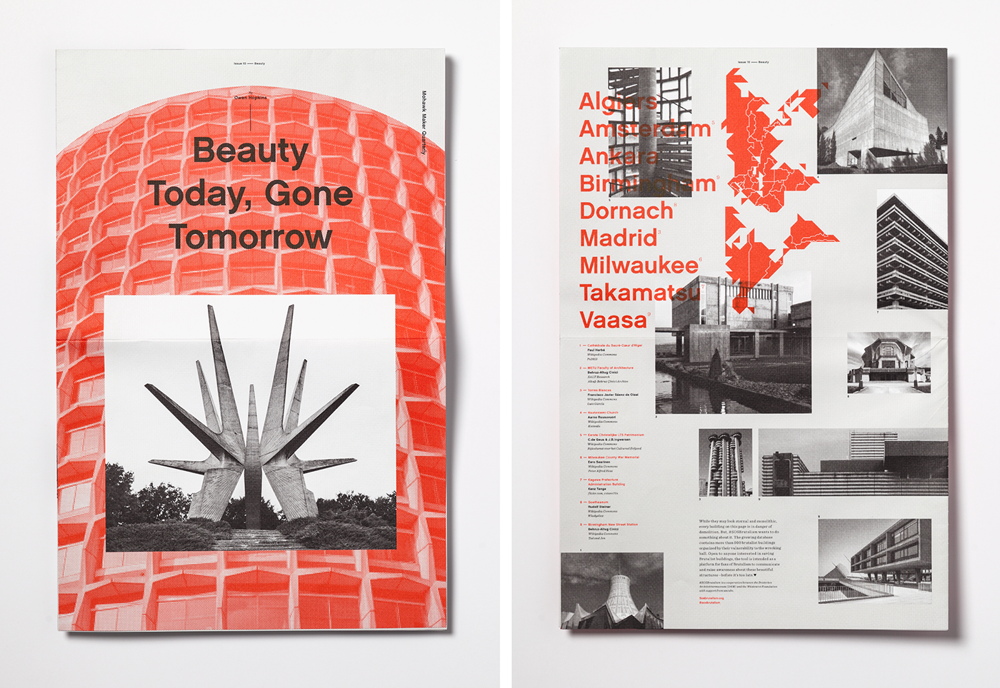
Inner spread with two-tone design, black and white photos, and red illustrations
Beauty Today, Gone Tomorrow 
After years of being reviled, Brutalism, architecture’s most polarizing style, is again fashionable. Printed on Strathmore Grandee, Ultimate White, 80 text. The rough texture of Strathmore’s Grandee finish mirrors the tactile quality of concrete, Brutalis
Words
Owen Hopkins
Two views of an inner poster photographed from above
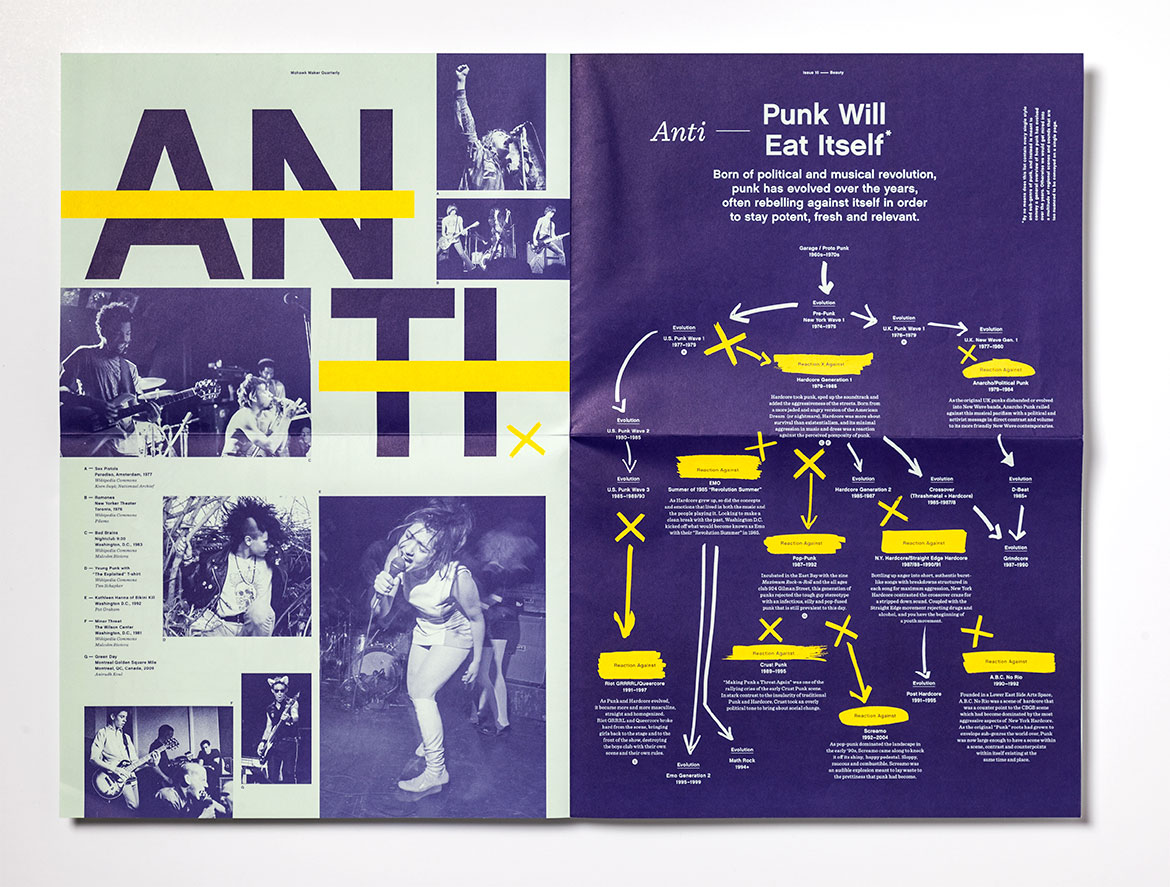
Two-paged spread, "Anti," photographed from above
Anti
Essay Collection
Words
John Dugan, Bryn Mooth, Dora Drimalas

Anti | Essay Collection
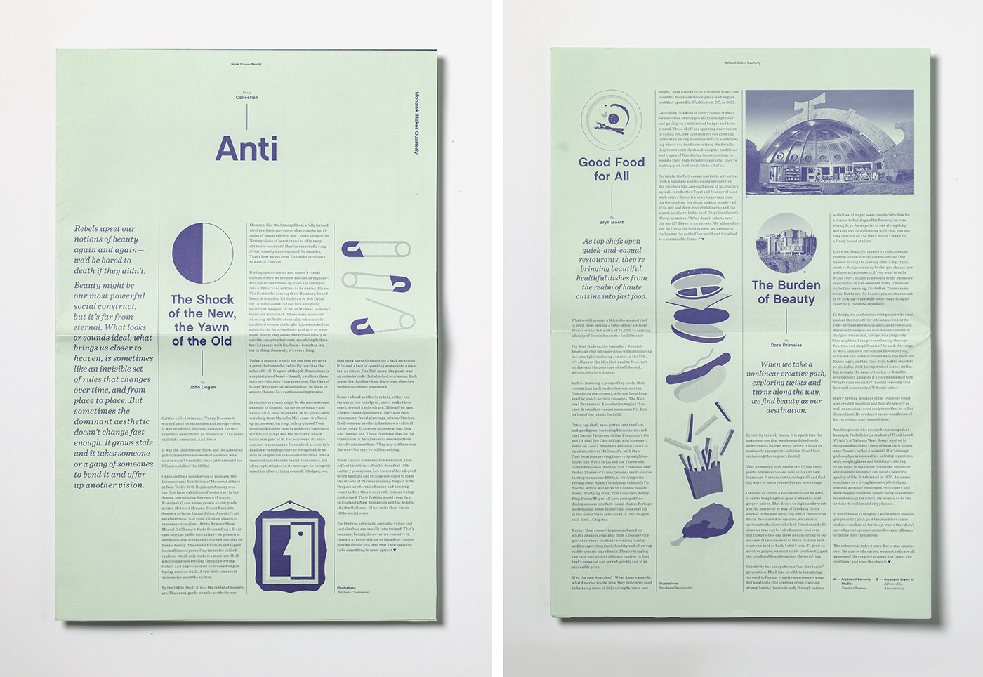
Printed on Mohawk Via Smooth, Light Green, 70 text. The simple combination of colored paper and one ink make the paper as important an element as the printing.

  • The Shock of the New, the Yawn of the Oldwritten by John Dugan – Rebels upset our notions of beauty again and again – we’d be bored to death if they didn’t. Beauty might be our most powerful social construct, but it’s far from eternal. What looks or sounds ideal is sometimes an invisible set of rules that changes over time and from place to place.
  • Good Food for All, written by Bryn Mooth – As top chefs open quick-and-casual restaurants, they’re bringing beautiful, healthful dishes from the realm of haute cuisine into fast food.
  • The Burden of Beauty, written by Dora Drimalas – When we take a nonlinear creative path, exploring twists and turns along the way, we find beauty as our destination.
Two views of inner pages
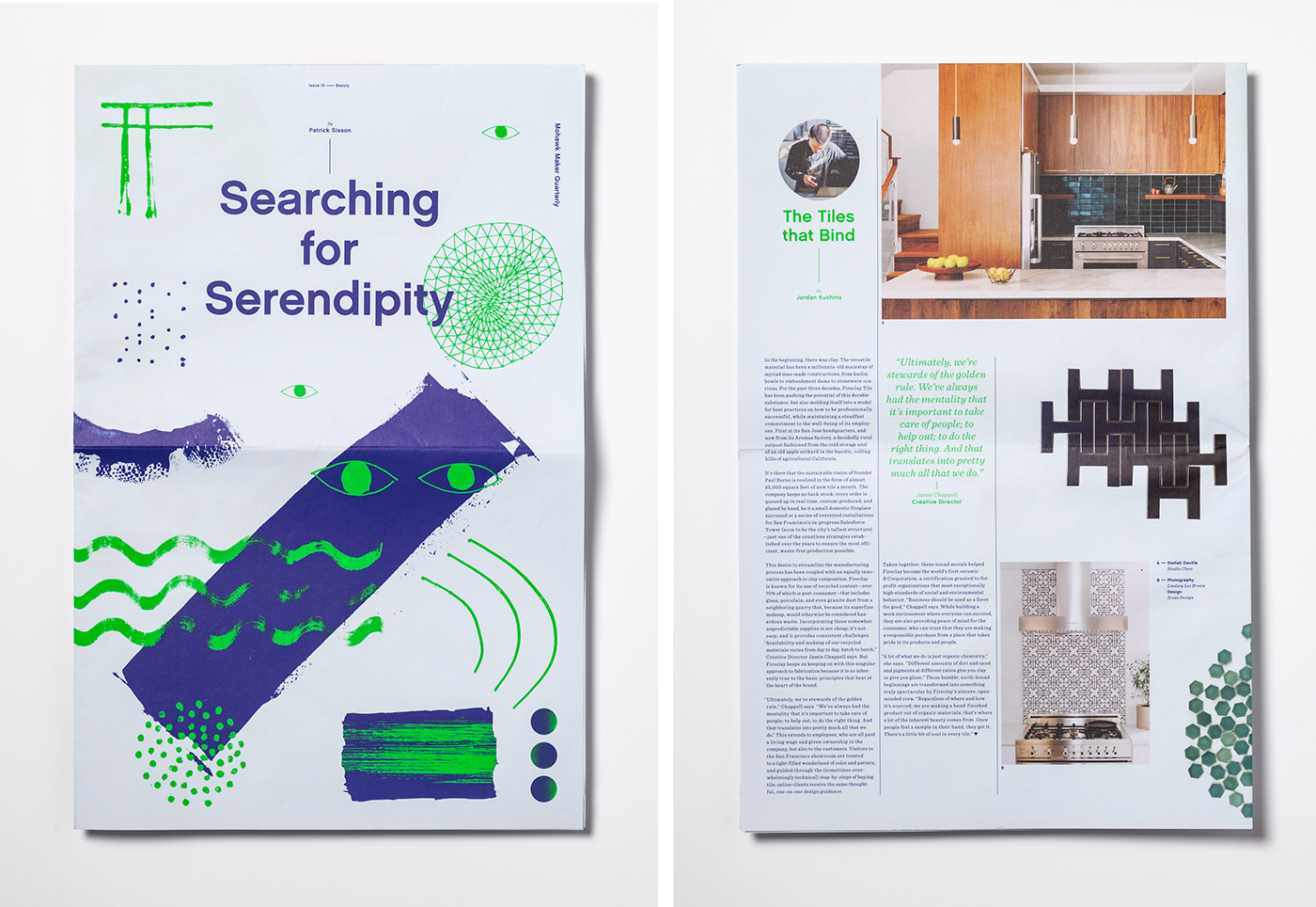
Searching for Serendipity
As design thinking turns creativity into just another word for corporate innovation, it’s important to remember the true value of chasing beauty for beauty’s sake. Printed on Mohawk Loop Smooth, Restful Blue, 70 text.
Words
Patrick Sisson
Two more pages viewed from above with photographs, illustrations, and text
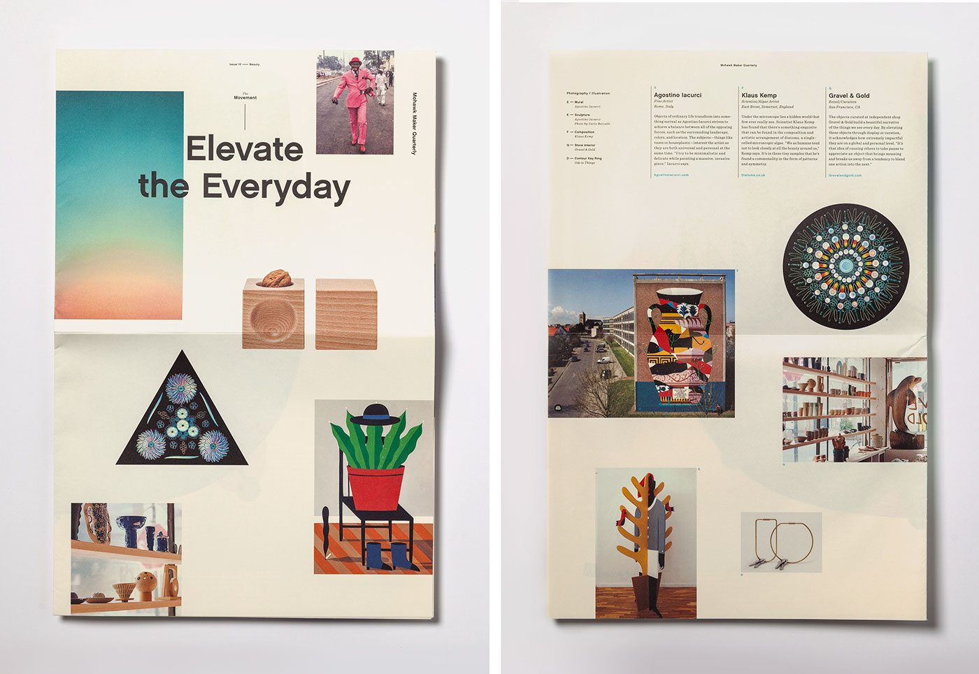
The Movement: Suit Yourself 
A profile of gentlemen of the Congo who elevate the everyday when they step out onto the streets in their sartorial best. Printed on Mohawk Superfine Eggshell, Soft White 70 text.
Words
Jessie Kuhn
Several pictures of inner pages from the Quarterly, stitched together
The Five Chapters and Posters
Mohawk Maker Quarterly 10

Mohawk Maker Quarterly issue ten also features the following makers:

  • Eric Cahan, Photographer, Brooklyn, New York, USA
  • Sightglass Coffee, Coffee Roasters/Shop, San Francisco, California, USA
  • Ode to Things, Product Designers/Shop, New Hampshire, USA
  • Agostino iacurci, Fine artist, Rome, Italy
  • Klaus Kemp, Scientist/Algae Compositions, Somerset, England
  • Gravel and Gold, Retail/Curation, San Francisco, CA, USA

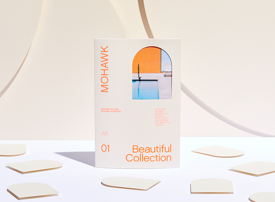
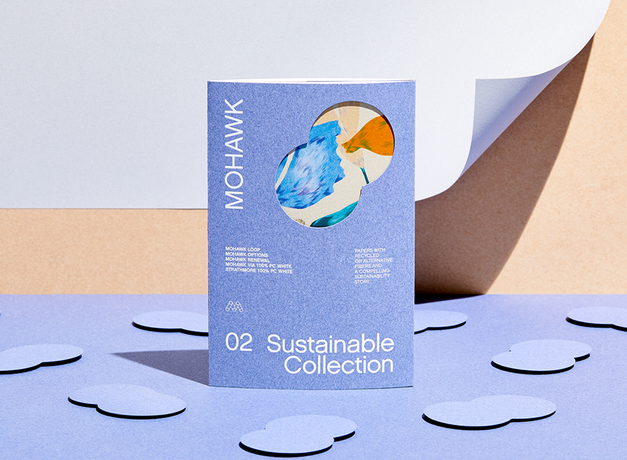
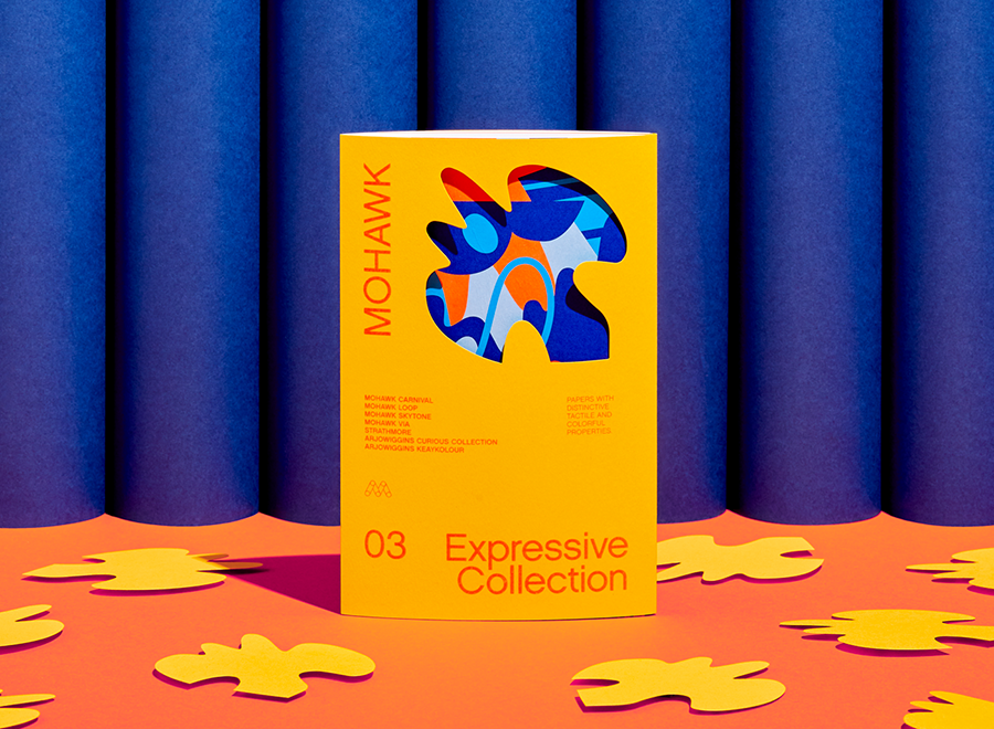
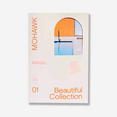
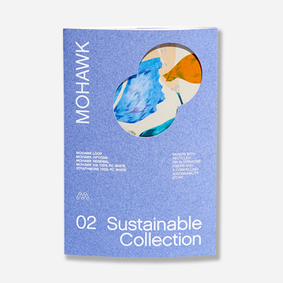
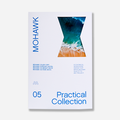
The issue features a selection of six distinctive colored and textured papers drawn from the following Mohawk paper grades: Strathmore (Elevated Collection), Options (Beautiful Collection), Via (Expressive Collection), Loop (Sustainable Collection), and legendary Mohawk Superfine (Beautiful Collection). It was skillfully printed by Sandy Alexander, Inc., Clifton, NJ, using four color printing, match grey, holographic foil, match green, match red-orange, light grey, match deep purple, yellow, match deep blue, fluorescent green, and match aqua blue.


Production Notes

PN-print-process
Print Process
Foil Stamping
capability_infoi
Offset Printing
capability_infoi
materials_techniques
Materials + Techniques
Fluorescent Inks
capability_infoi
Match Colors
capability_infoi
PN-designer
Designer
Hybrid Design

Suggested Articles

Maker Quarterly

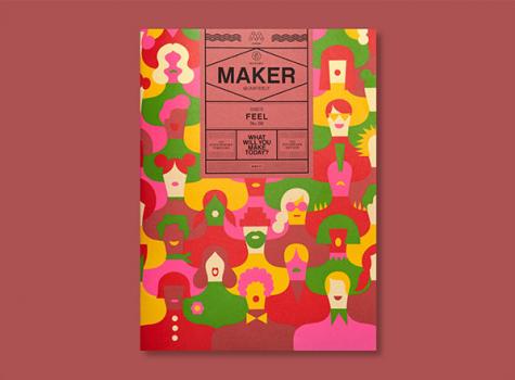
Mohawk Maker Quarterly #8: Feel

Issue eight of the Mohawk Maker Quarterly tackles the topic of “feel,” exploring how experiences, environments, and objects invoke this nuanced word.

Maker Quarterly

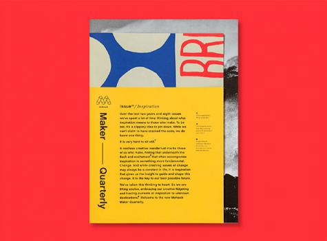
Mohawk Maker Quarterly #9: Inspiration

After two years of publication, the ninth issue of the Mohawk Maker Quarterly has been refreshed and redesigned, serendipitously themed around the concept of inspiration.

Maker Quarterly

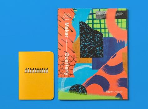
Mohawk Maker Quarterly #11: Process

The process of making something — method, materials, ingredients, artistry, experience — is the squiggly line between idea and object. In issue 11 of the Mohawk Maker Quarterly, we celebrate makers who take conscious paths to get from Point A to Point B.