Mohawk Blog

The Perfect Match

Photography
Hybrid Design
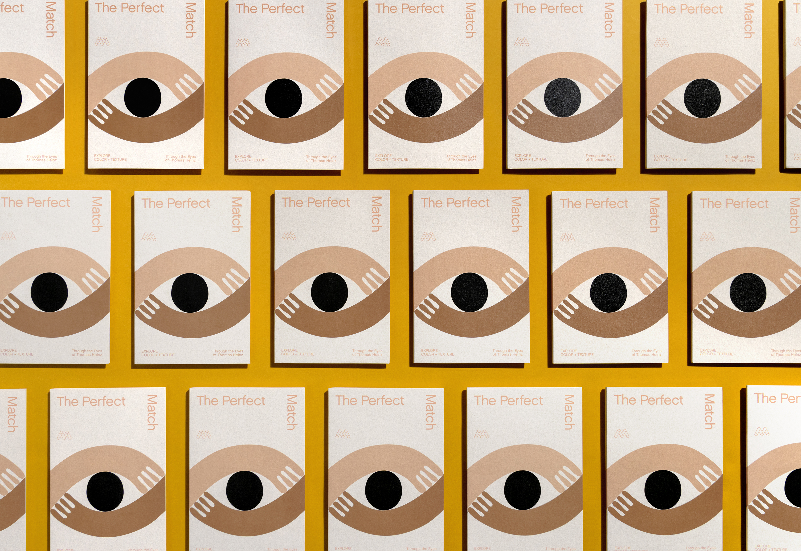
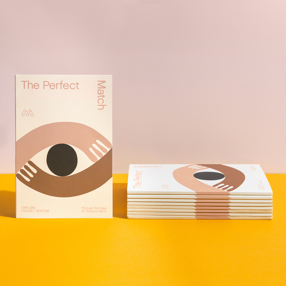
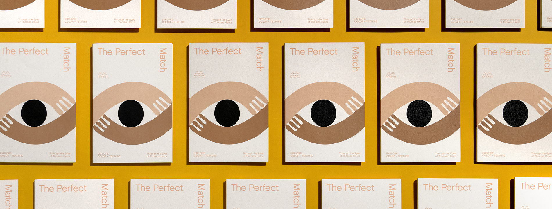
The Perfect Match image of cover

Explore color and texture through the eyes of Thomas Heinz. Mohawk introduces, The Perfect Match.
Colored and textured papers are a simple, but impactful way to embrace the unexpected, letting materials play a key role in support of your design intent. From the deepest, dramatic shades to memorable finishes, colored and textured papers help push any project from good to great.

To make a physical object that slows people down, activates their senses, and commands their attention, consider the impactful qualities of texture and color.

Color and texture open up new possibilities for design and communication, heightening the impact of your project.

For Cologne-based illustrator Thomas Heinz, it's "play, play, play, draw, draw, draw" until he gets the balance right. That's when the color experimentation begins.

One promotion upright next to a stack of promotions laying down
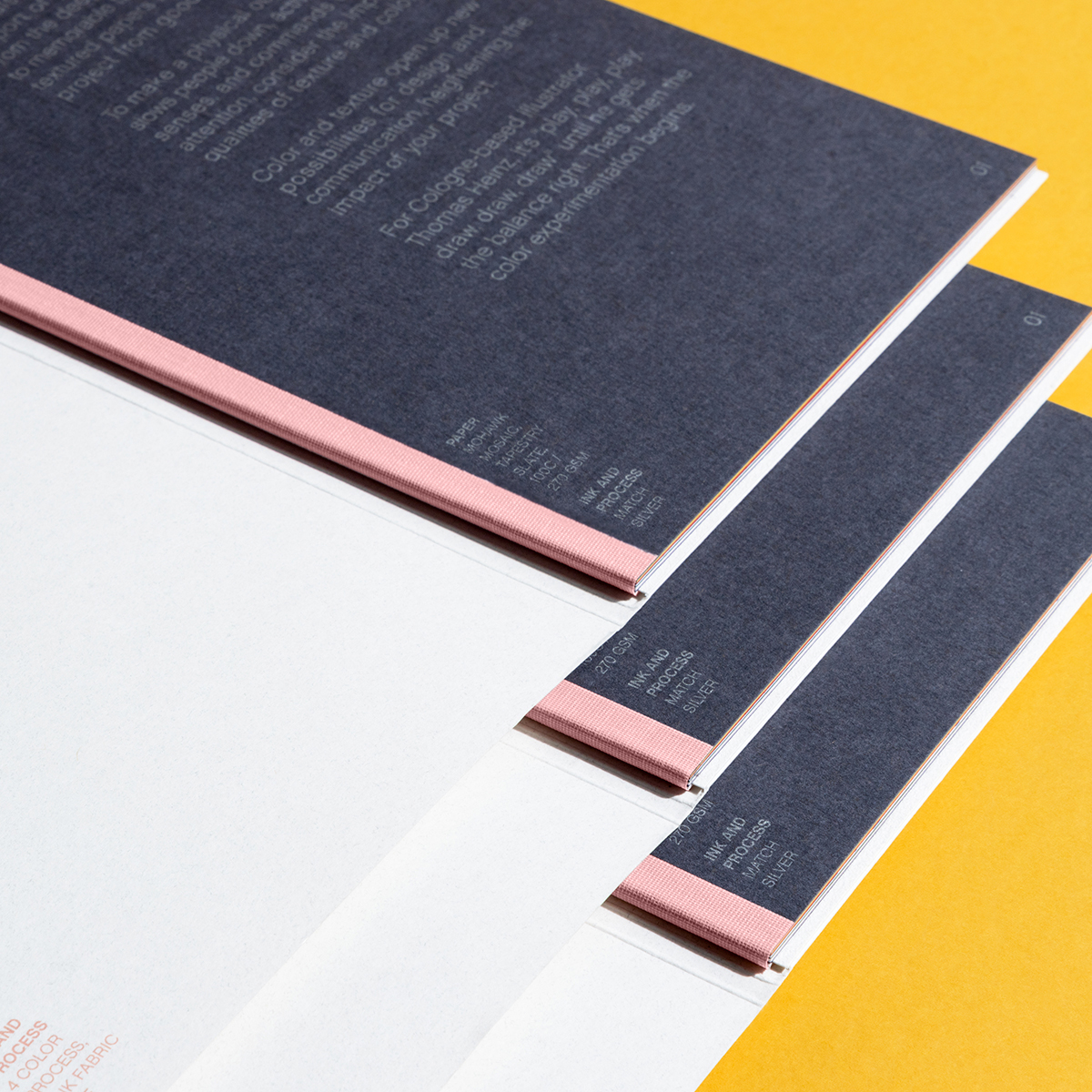
Front cover of promotion open to reveal binding and page one

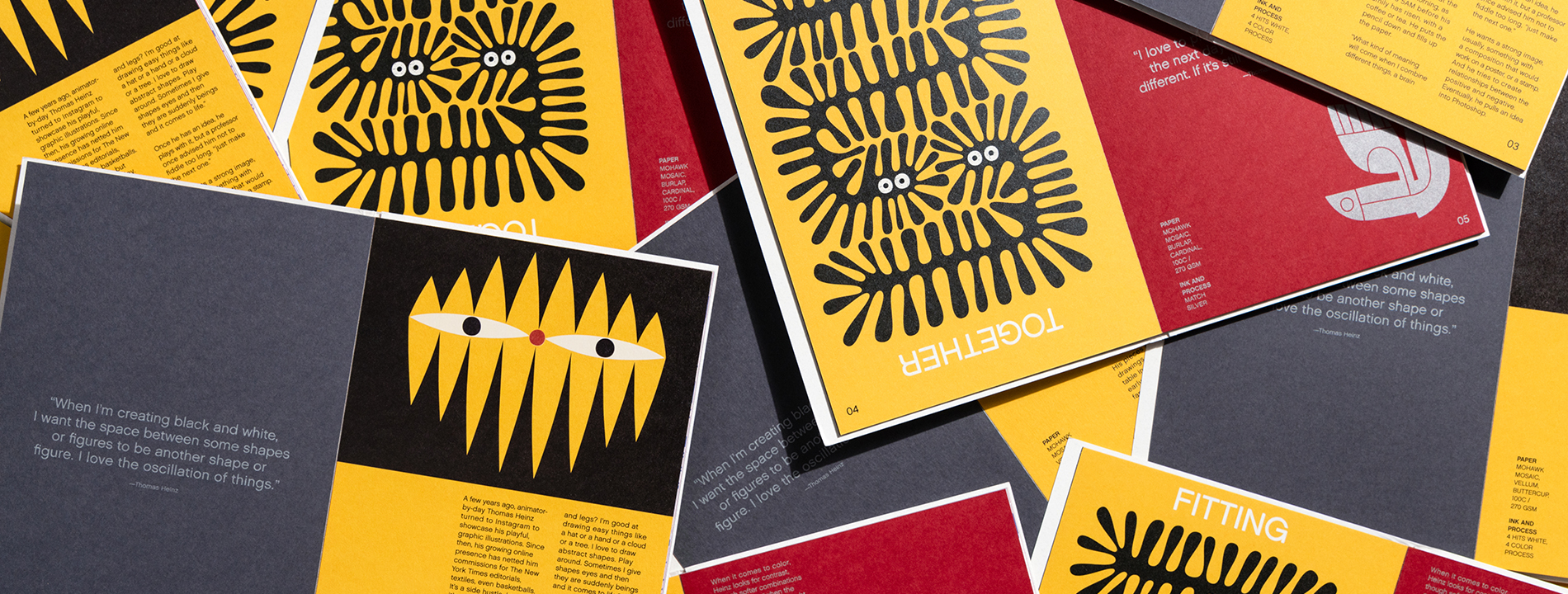
“When I'm creating black and white, I want the space between some shapes or figures to be another shape or figure. I love the oscillation of things.”
Thomas Heinz

Interior spread of slate and buttercup paper

A few years ago, animator-by-day Thomas Heinz turned to Instagram to showcase his playful, graphic illustrations. Since then, his growing online presence has netted him commissions for The New York Times editorials, textiles, even basketballs. It's a side hustle, but it's all about play.

His pieces begin as drawings-he sits at the table in the morning, as early as 5AM before his family has risen, with a coffee or tea. He puts the pencil down and fills up the paper.

"What kind of meaning will come when I combine different things, a brain and legs? I'm good at drawing easy things like a hat or a hand or a cloud or a tree. I love to draw abstract shapes. Play around. Sometimes I give shapes eyes and then they are suddenly beings and it comes to life."
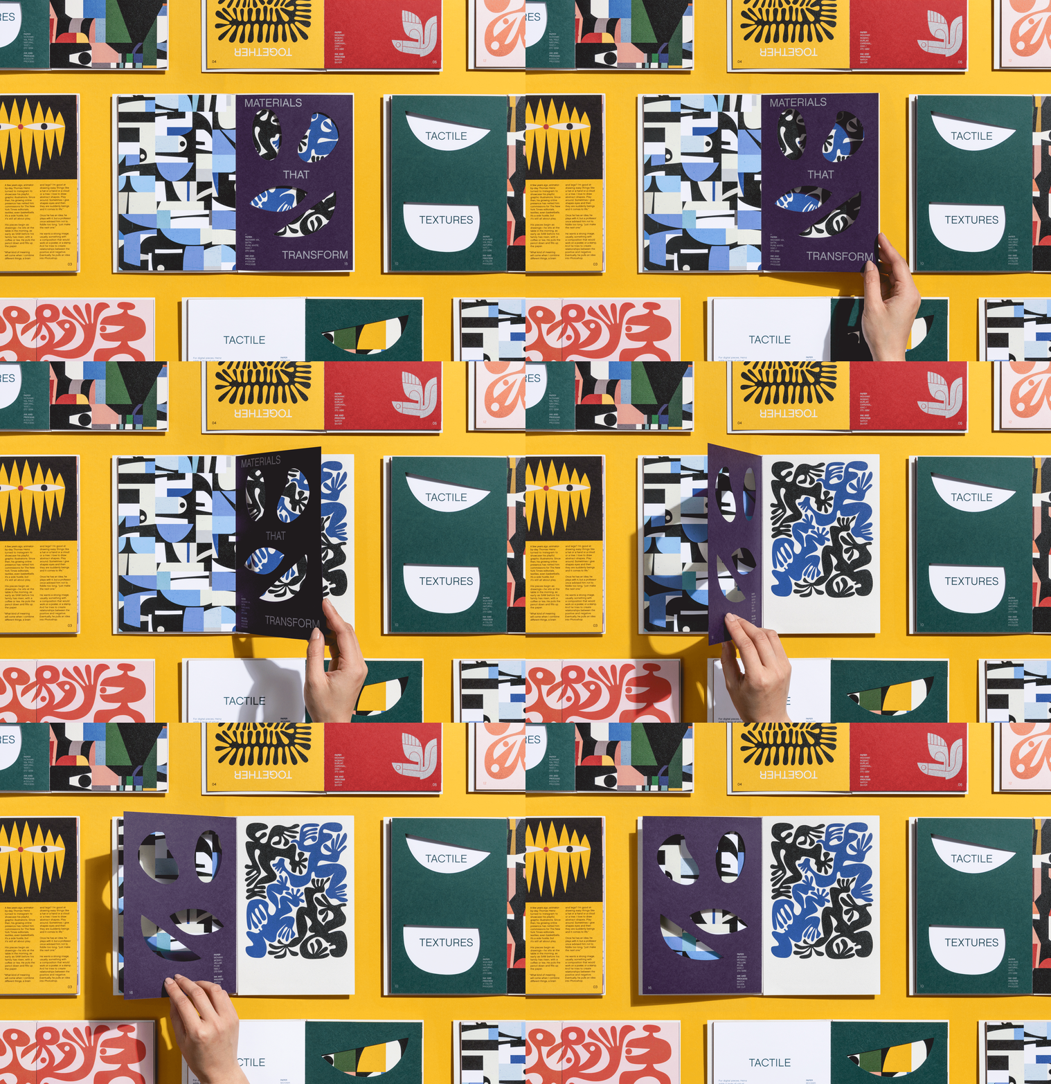

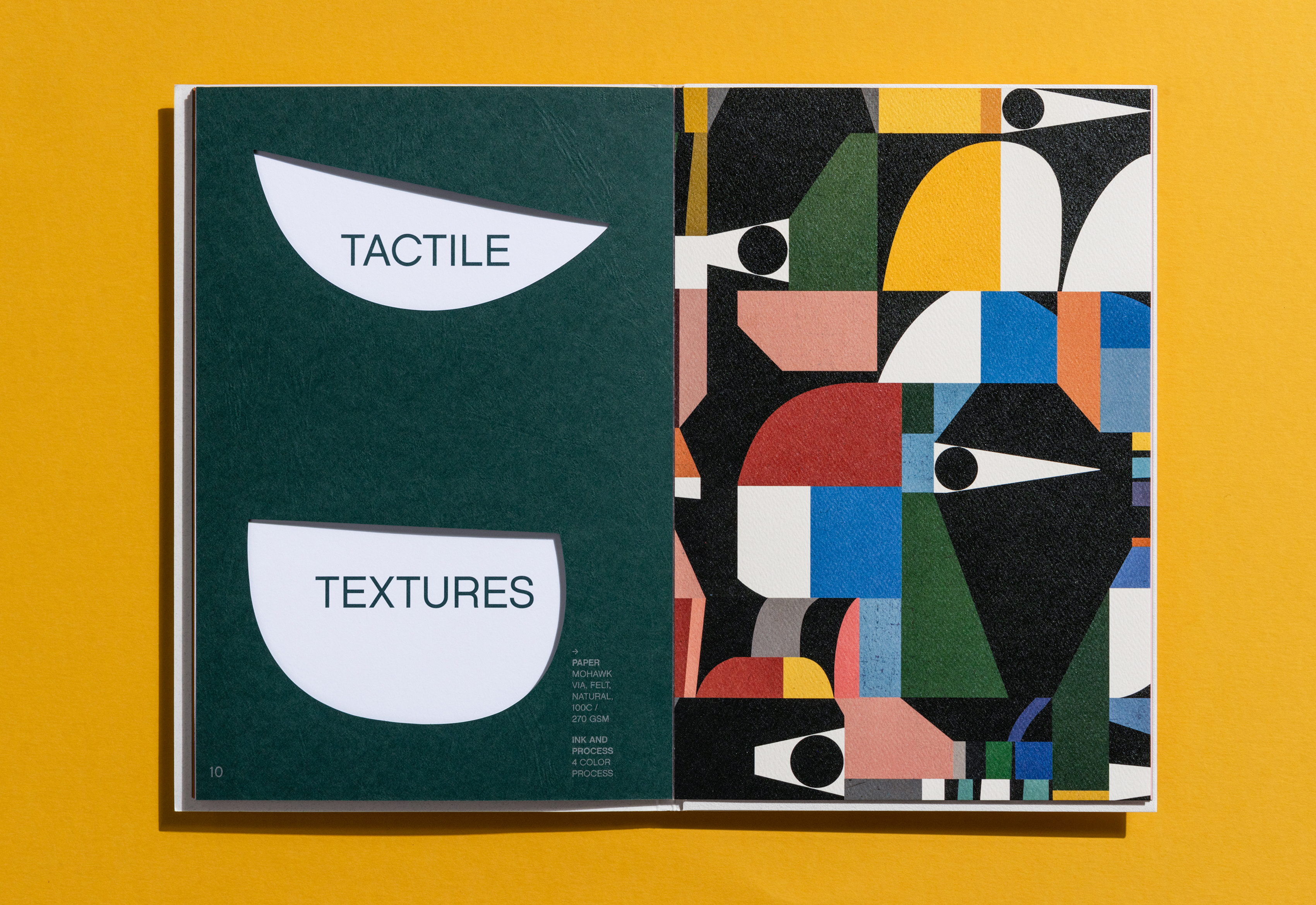
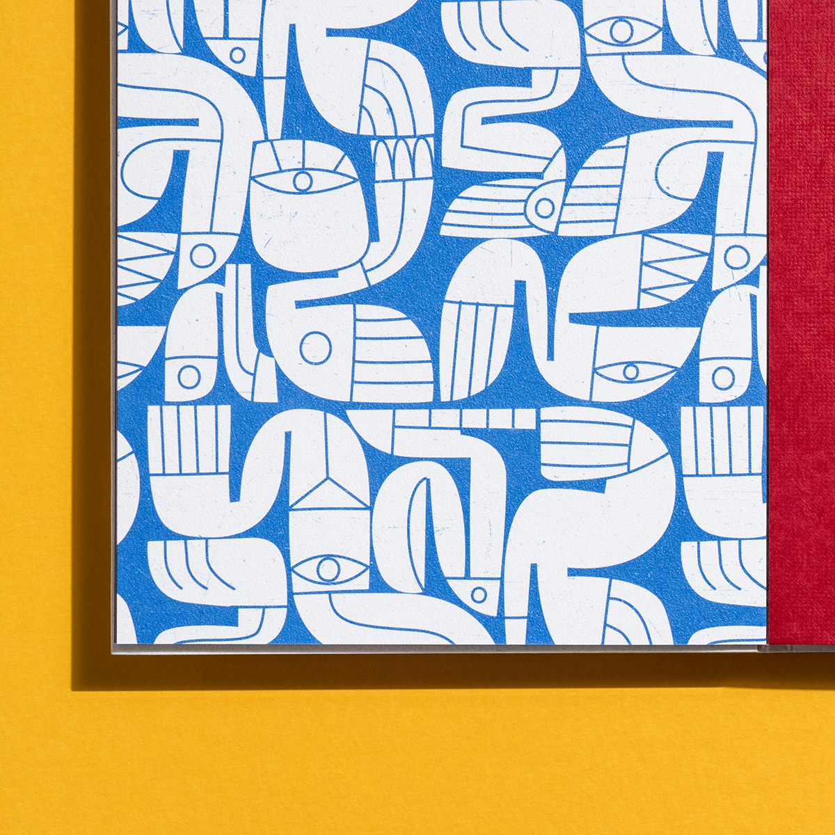
Interior spread of pages 10 and 11, Carnival Forest Green and Via Natural
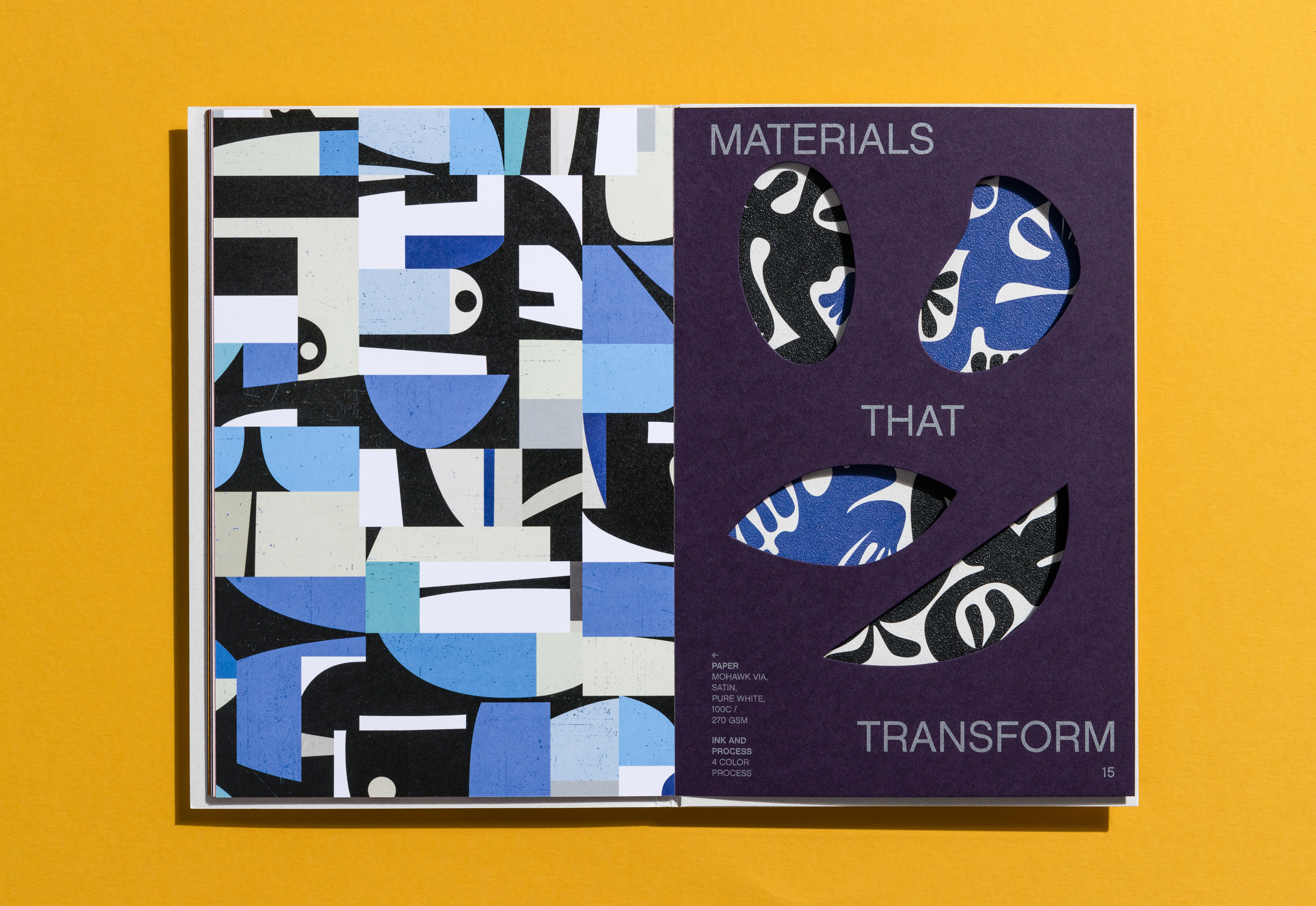
Interior spread of pages 14 and 15, Via Pure White and Mosaic Plum
gif of page 15 turning to page 16

“"I love to play with colors and look at it the next day. Mostly, it's completely different. If it's still okay, it might be good."”
Thomas Heinz

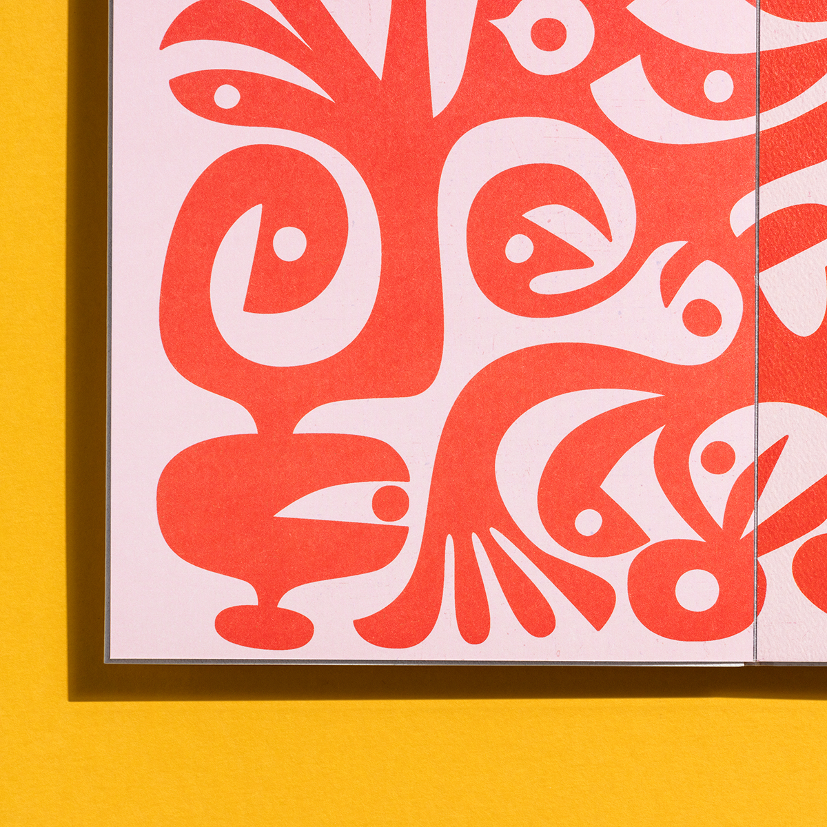
page 7, Mosaic Coral texture
page 12, Via Felt texture

Once he has an idea, he plays with it, but a professor once advised him not to fiddle too long, "just make the next one."

He wants a strong image, usually something with a composition that would work on a poster, or a stamp. And he tries to create relationships between the positive and negative. Eventually, he pulls an idea into Photoshop.

When it comes to color, Heinz looks for contrast, though softer combinations can be useful "when the theme is silence." He might overlay a 10% screen on green, or place a red sketch on pink.


Featured Materials Include:

COVER

  • Paper: Mohawk Mosaic, Coral, Cashmere, 100c
  • Ink & Process: 4 color process, pink fabric tape

PAGE 1-2

  • Paper: Mohawk Mosaic, Tapestry, Slate, 100c
  • Ink & Process: Match silver

PAGE 3-4

  • Paper: Mohawk Mosaic, Vellum, Buttercup, 100c
  • Ink & Process: 4 hits white, 4 color process

PAGE 5-6

  • Paper: Mohawk Mosaic, Burlap, Cardinal, 100c
  • Ink & Process: Match silver

PAGE 7-8

  • Paper: Mohawk Mosaic, Coral, Aspen, 100c
  • Ink & Process: Match green, 4 color process

PAGE 9-10

  • Paper: Mohawk Carnival, Cordwain, Forest Green, 90c
  • Ink & Process: Match silver, die cut

PAGE 11-12

  • Paper: Mohawk Via, Felt, Natural, 100c
  • Ink & Process: 4 color process

PAGE 13-14

  • Paper: Mohawk Via, Satin, Pure White, 100c
  • Ink & Process: 4 color process

PAGE 15-16

  • Paper: Mohawk Mosaic, Vellum, Plum, 100c
  • Ink & Process: Match silver, die cut 

WE KNOW YOU WANT TO FEEL IT


Production Notes

PN-printer
Printer
PN-designer
Designer
Hybrid Design

Materials Used

Suggested Articles

Field Guides

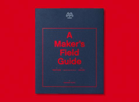
A Maker's Field Guide to Texture and Color

Introducing A Maker’s Field Guide to Texture and Color, an ambitious and comprehensive new printed tool from Mohawk, designed to serve as a hands-on resource for the creative community.

Mohawk Blog

Will Bryant: Use Paper as a Bonus Color

Colored paper opens up new possibilities for design and communication. Used with 4-color printing, it can become part of the image itself, giving you an additional color to work with. Have you ever thought about using colored paper as a bonus in your project?

Mohawk Blog

Communicating Luxury Through Texture

David Sutherland excels at collaborating with leading designers to produce the finest luxury furniture, fabrics and accessories. The company is known for bringing a fresh point of view to furniture design while creating refined collections for casual contemporary living.