Choosing the Right Paper for the Right Job

Name a defining characteristic that separates a good printed piece from one that is truly unforgettable? Congratulations if you guessed the paper it was printed on!
Application and Usage
When first deciding what substrate to choose for your job, always start by running through a basic checklist of questions. This will help as you begin to narrow your search for the perfect substrate. Some important considerations include:
How will the printed piece be used? What applications does it serve?
What is the intended lifespan of the piece?
What type of impression should your print create? What emotions are you trying to express?
As you can imagine, the paper you choose will be greatly shaped by the responses above. A simple sales pamphlet given to those entering a retail location has a vastly different set of needs than a high-end coffee table book meant to last for years. Similarly, a piece intended to promote environmental causes will differ from one intended to convey luxury.
Finish
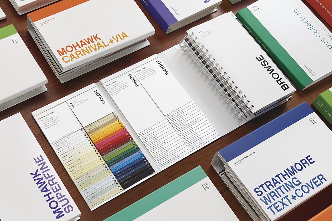
Used to describe the surface characteristics of a sheet, choosing a finish is one of the most critical decisions made in the paper selection process. A basic distinction between paper types is coated and uncoated, but other varieties exist as well.
Coated: Often available as gloss or silk (and coated on two sides or just one), this finish limits the amount of ink/toner that is deeply absorbed into the fibers of the paper. The result is a glossier, brighter and more vibrant look, which is often used for posters and magazines. The coated surface – which protects the papers from dirt and basic wear – is also somewhat resistant to pen ink and pencil, making it challenging to write on and not an ideal choice for business cards or stationery.
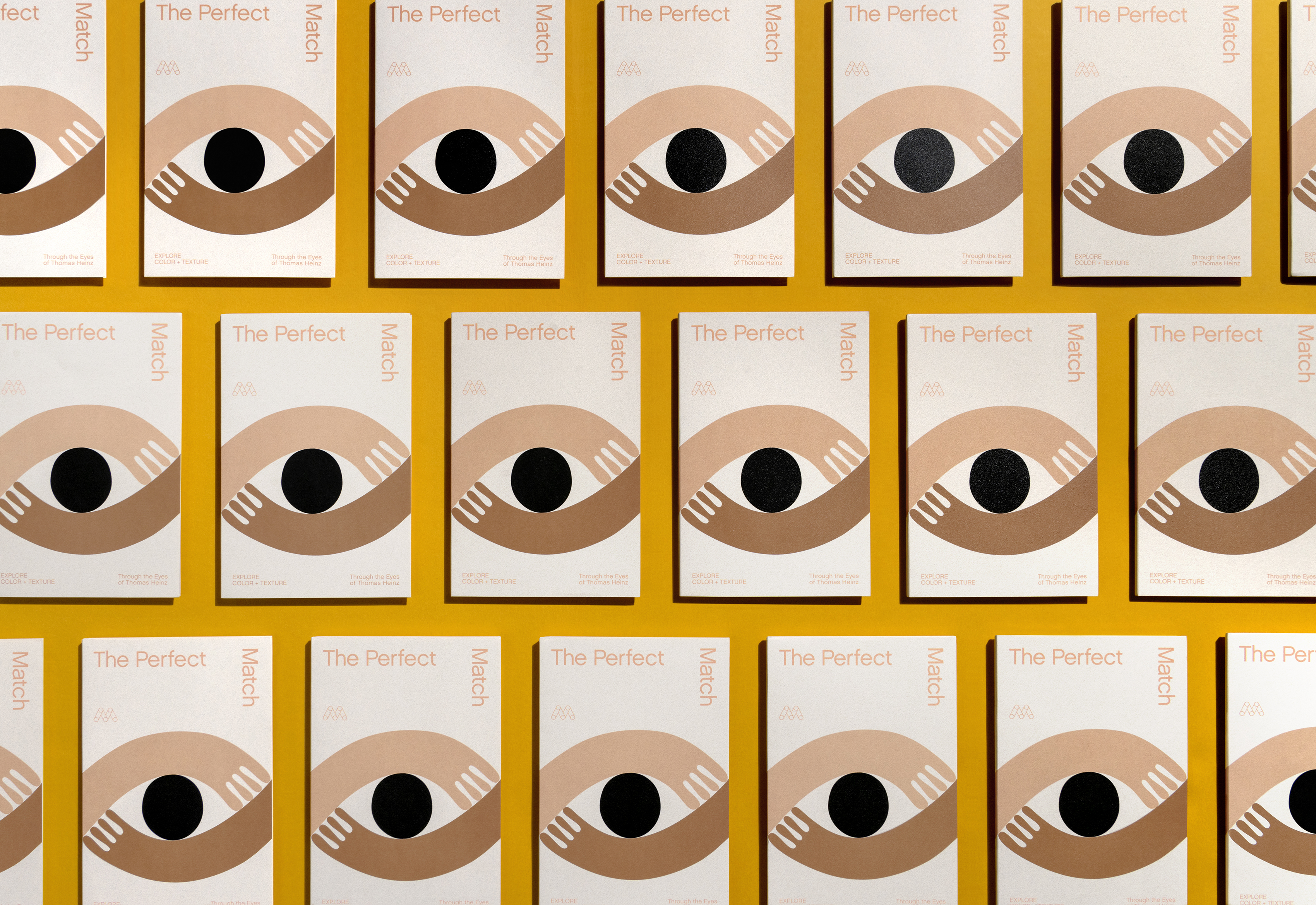
Uncoated: As the name implies, an uncoated sheet lacks any special compound or polymer coating on the surface. This greatly reduces light reflection while enhancing readability, making it an ideal choice for applications dense with text. Because this substrate is porous, ink is more deeply absorbed into the paper’s fibers which can result in more muted colors. However, uncoated papers are becoming a popular choice for those looking to stand apart due to their natural feel and elegant look. For example, Mohawk Superfine Eggshell Digital with i-Tone is one of the most popular sheets used in the photo products market today.
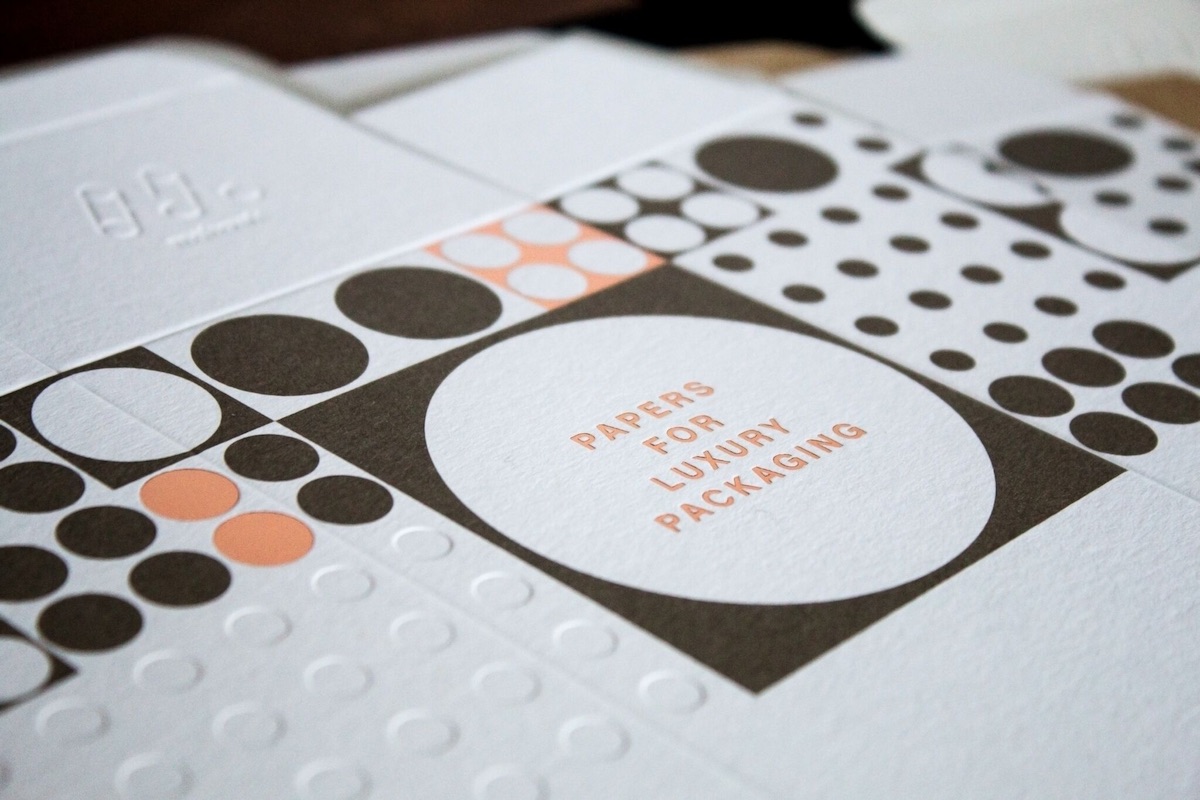
Textured: A growing number of textured and specialty papers exist, which can give your project a stunning first impression. Consider experimenting with linen, laid, eggshell, felt, vellum, or wove to enhance the feel of your printed piece.
Weight
Three popular methods exist to identify the weight of paper: the U.S. system (which measures weight in pounds, denoted as ‘#’), the Metric system (which measures weight in grams per square meter, denoted as ‘gsm’ or ‘g/m2’), and Points which is the actual caliper of the paper thickness.
U.S. system: Weights are determined based on one ream (500 sheets) of a paper’s basis size. For instance, one ream of a text stock that has a mass of 80 pounds is described as ‘80# Text’. Because each type of paper (bond, text, cover, etc.) has unique starting sizes, the basis weights do not correlate directly. Therefore, an 80# Text is much lighter than an 80# Cover.
Metric system: Expressed as the mass of a square meter for one sheet of media. In this system, a typical range is 60 gsm (light text-weight) to 400 gsm (extremely heavy cardstock). The Metric system is largely seen as being straightforward because it uses a uniform measuring methodology.
Point caliper: Very thick specialty substrates are often expressed using a point scale, where a point is equivalent to 1/1000 of an inch. For example, media that measures 0.016 inches thick is described as a 16-point substrate. Caliper can also be expressed in microns, mils, or millimeters.
Choosing the right weight for your project may come down to personal preference and application. For example, you may opt for a thicker stock if your printed piece has heavy toner coverage in order to mitigate show-through. Heavier stocks can also create a perception of sturdiness and dependability, while a lighter stock may be ideal for print intended for the mail where postage costs are a concern.
Brightness
Brightness is measured as the percentage of light reflected from the surface of the paper, and is typically expressed on a scale between 1-100. It is not necessarily related to color or whiteness. A blue-white and yellow white paper can have the same brightness value but look very different. A paper with a brightness of 98 is an extremely bright sheet with almost all light being reflected back to the viewer. Four-color process images pop on bright white papers, as they illuminate transparent printing inks. For pieces with a great deal of copy, a natural shade of white is preferable to minimize eyestrain.
Color
In some cases, colored paper may be desired to give your project an extra pop. Many vibrant shades and colors exist to give your print a creative and distinctive look. However, one consideration to keep in mind is the contrast between the colored substrate chosen and its impact on the appearance of printed images and text.
For more information check out Mohawk’s Paper Basics Guide, part of the “Ask Mohawk” educational series.
Tips to Choosing the Perfect Paper
- Take time to consider how your printed piece will be used and what emotion you wish to convey. This will greatly impact your choice in paper.
- Consider paper very early in the design process. This will help you optimize your piece for the paper you’ll be printing on.
- Don’t forget to speak with your local print provider for help and guidance.
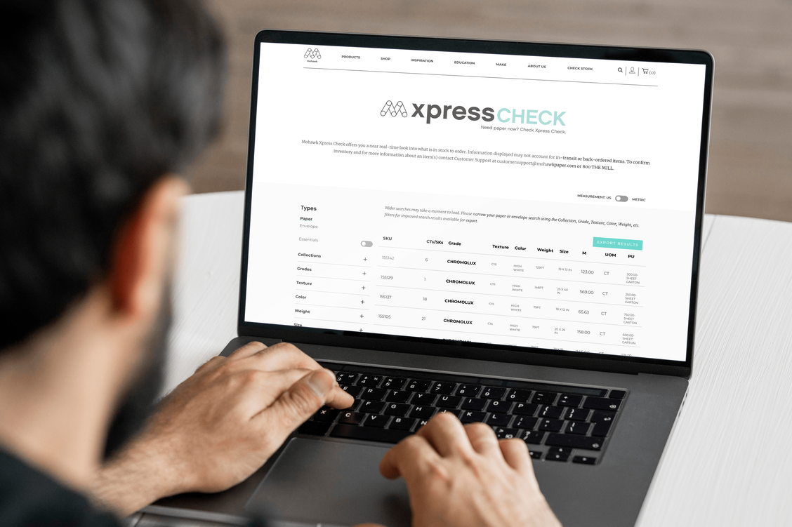
- If you are a print provider, finding the substrates best suited for your specific digital press is a breeze with our simple product finder tool.
- Want to see and feel a specific paper before committing to a whole carton? Contact your local paper merchant to request samples.
- Have general paper questions? Check out this other great section of content, courtesy of Mohawk MakeReady.
Suggested Articles
As digital printing evolves from compromise to sophisticated tool—advances in color, texture, and fiber papers push the boundaries of what's possible.
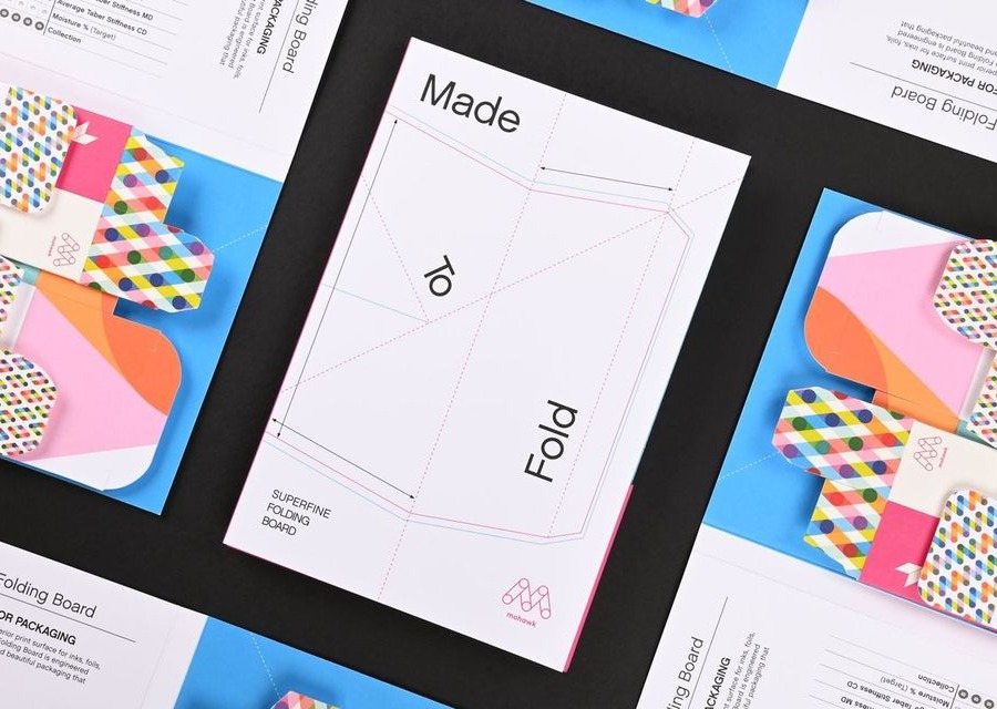
In today's competitive marketplace, packaging plays a crucial role in brand perception and consumer satisfaction.
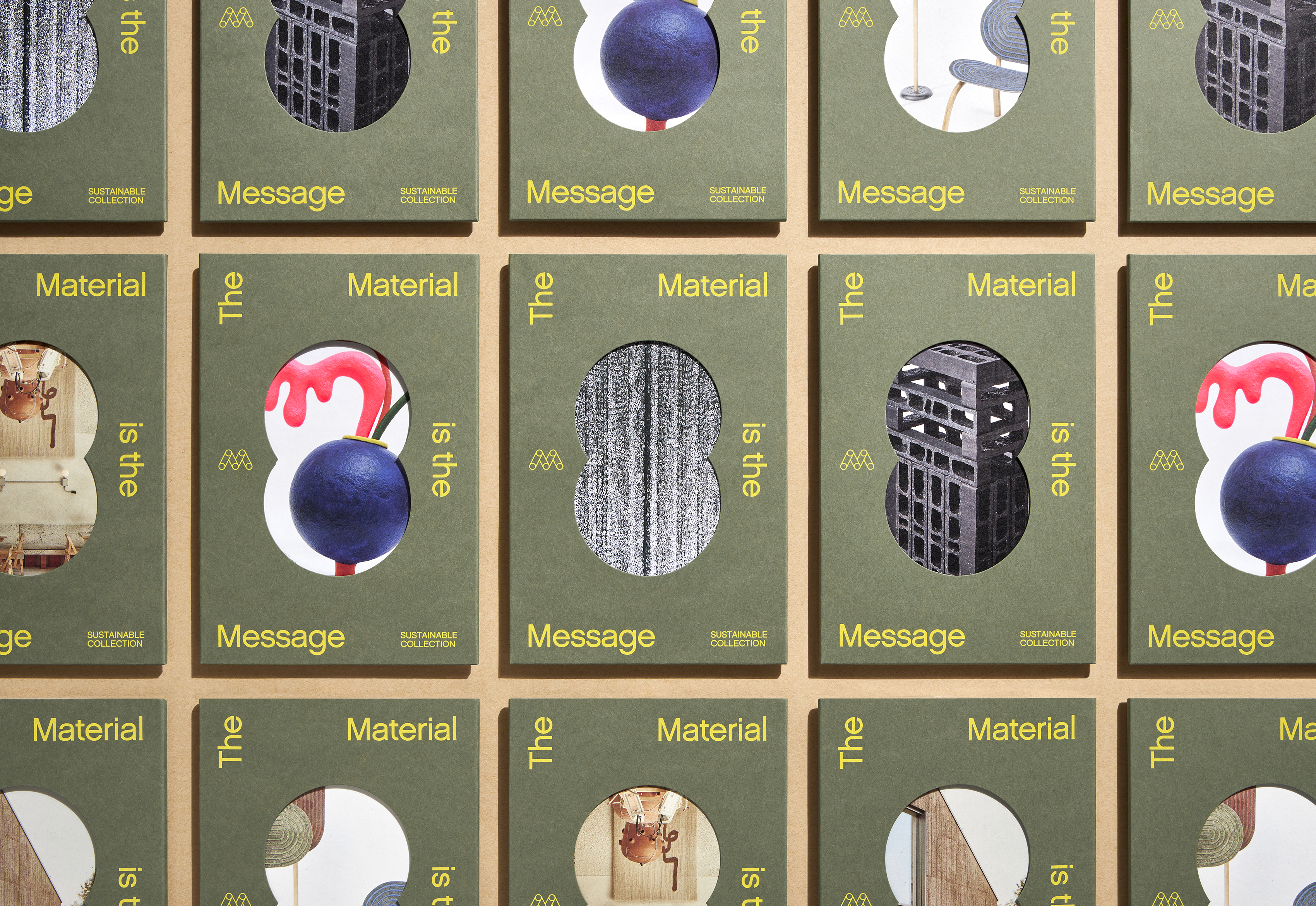
Mohawk Renewal marks a bold new chapter in our ongoing commitment to sustainability and innovation in papermaking.
