Mohawk Blog

A Coordinated System of Sample Books

Words
Paul Shaw
MOH_Blog_ACoordinatedSystemOfSampleBooks_Header.jpg

In support of the new exhibition Paper is Part of the Picture: Strathmore Paper and the Evolution of American Graphic Design, we wanted to share some pivotal highlights of Strathmore’s 125 year history. 
Through the end of 2017, join us as we explore the history of Strathmore Paper and its impact on American Graphic Design. Today’s post, we pick up where we left off and discuss Strathmore’s need for a coordinated system of sample books.

MOH_Blog_ACoordinatedSystemOfSampleBooks_01.jpg
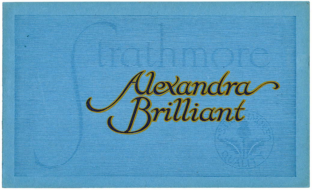
Alexandra Brilliant (Strathmore Paper Co., 1912)
Designed by Will Bradley
One of a series of sample book covers with “faded” lettering.
10 x 6 1/4 inches

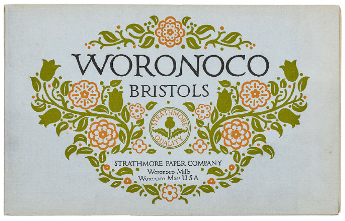
The consolidation of the Mittineague and Woronoco mills as a single entity under the Strathmore name forced a reorganization of the combined paper lines that was not completed until late 1912. Prominent American designer Will Bradley was hired to oversee the task. The number of paper lines was divided into four groups: Writing Papers, Book Papers, Cover Papers and Bristols, and Business Announcement Stocks (combining matching sheets and envelopes). The covers and title pages were designed by Bradley, but most of the designs used to illustrate the stocks were prize winners from a competition held in 1911. Up to five colors were used in the printings.

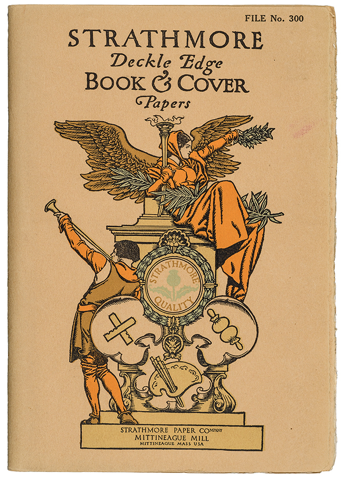
Strathmore Deckle Edge Book & Cover Papers (Strathmore Paper Co., Mittineague Mill, 1912)
Designed by Will Bradley
Note the symbols for the typefounder, printer and artist at the bottom of the design.
6 1/4 x 9 3/4 inches
MOH_Blog_ACoordinatedSystemOfSampleBooks_02.jpg

Although Bradley reduced his workload by creating several series of similar designs, the overall variety and versatility of the unit covers remains unprecedented in the history of the American paper trade. For nearly all of the covers he did the design, illustration, ornamentation and lettering (he rarely resorted to type); and created numerous iterations of the Strathmore Quality seal. He also established standardized vertical and horizontal sizes, something which Strathmore did not return to until the 1930s.

MOH_Blog_ACoordinatedSystemOfSampleBooks_05.jpg
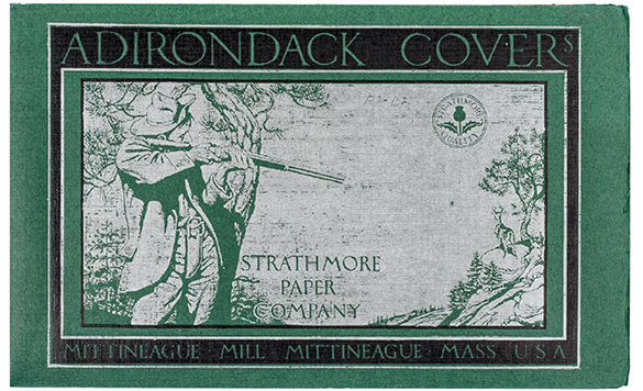
Adirondack Cover (Strathmore Paper Co., Mittineague Mill, 1912)
The use of silver ink was rare among Strathmore sample books before 1930.
MOH_Blog_ACoordinatedSystemOfSampleBooks_03.jpg
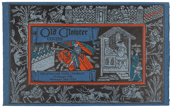
Old Cloister Covers File No. 6 (Strathmore Paper Co., Mittineague Mills, 1912)
The use of silver ink was rare among Strathmore sample books before 1930.
MOH_Blog_ACoordinatedSystemOfSampleBooks_07.jpg
Woronoco Bristols (Strathmore Paper Co., Woronoco Mills, 1912)
Designed by Will Bradley

For the 125th anniversary of Strathmore, we decided to do something special. Together with the Opalka Gallery and Paul Shaw, we’re bringing you “Paper is Part of the Picture,” an exhibition of nearly 200 paper promotions found in the Strathmore Archive. The exhibition is being held from October 3 – December 15. More information can be found here.


Suggested Articles

Mohawk Blog

The Perfect Match

Explore color and texture through the eyes of Thomas Heinz. Mohawk introduces, The Perfect Match.