Mohawk Blog

Introducing The Go-To Notebook from Chronicle Books
Words
Ariel Smullen
Photography
Chronicle Books
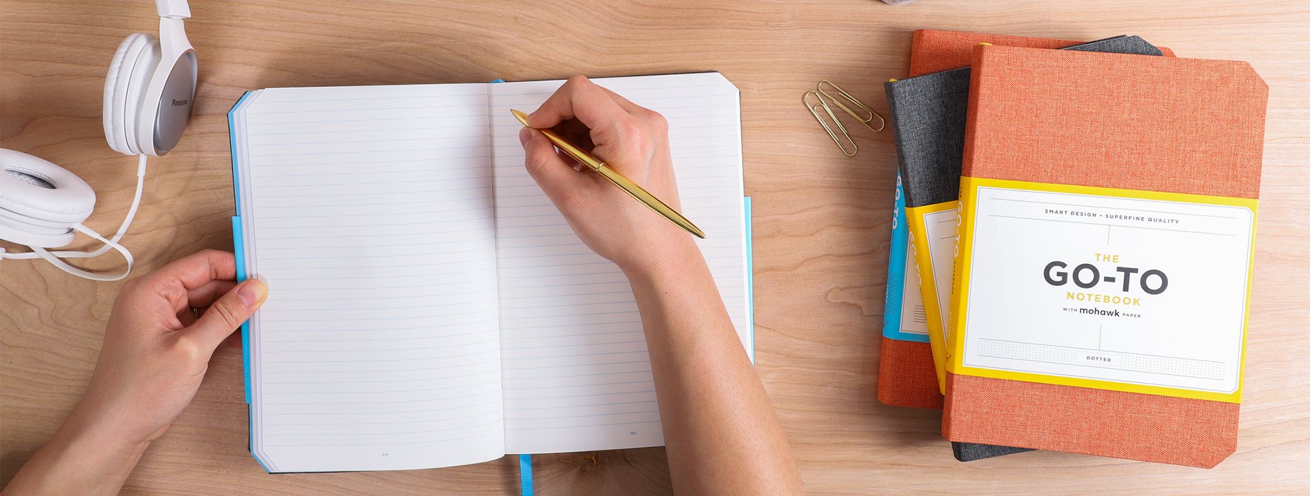
View of hands writing in a chronicle notebook on a desk

Who needs a new favorite notebook? We've teamed up with Chronicle Books to bring you The Go-To Notebook.

This notebook has it all: Project planning and tracking pages, lay-flat binding, a storage pocket, a cloth cover and comes in a choice between dotted or lined pages (you get to decide!). All pages are printed on a carefully chosen combination of Mohawk Superfine and Via.

We caught up with Michael Carabetta, Creative Director at Chronicle Books, to delve deeper into the inspiration behind the Go-To Notebook:

What sets this notebook apart from others in the market?
First and foremost, it’s the quality of the paper, Mohawk Superfine. We have an abiding respect for this paper made by Mohawk; a paper grade that reflects our own standards of quality. We were also eye-weary of the plain black notebooks that proliferate the category, so we opted for cloth on the case wrap.

In surveying what was out there, we concluded we did not want a hardcover notebook; they're too formal and heavy to carry around. We wanted something friendlier, more like a paperback book, and something with some flexibility in the cover boards. In the end, we arrived at a design that has the look of a hardcover book, but the feel of a paperback and contains extra features not often found in run-of-the-mill notebooks.
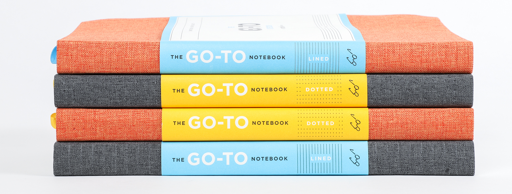
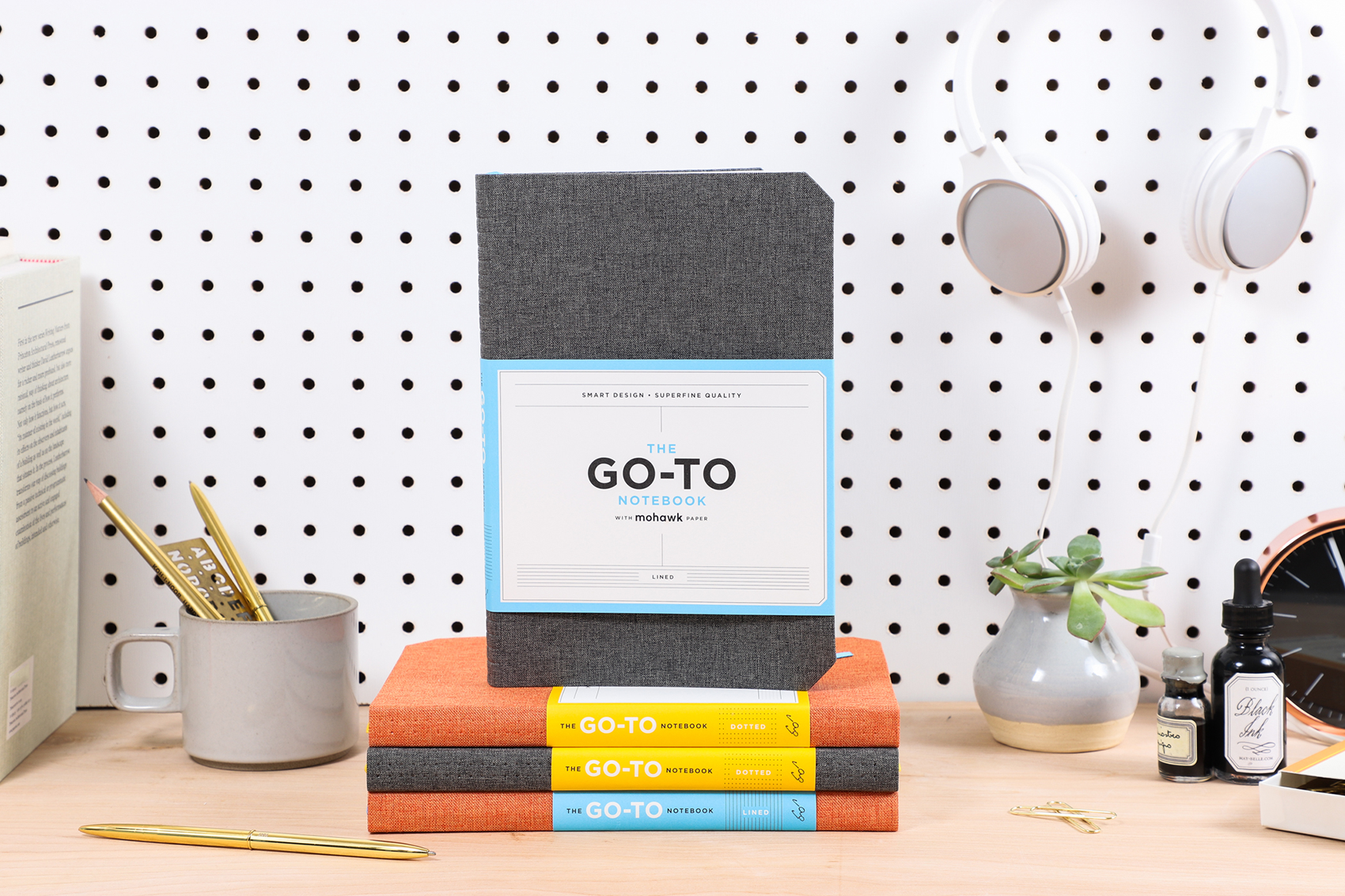
stack of chronicle notebooks
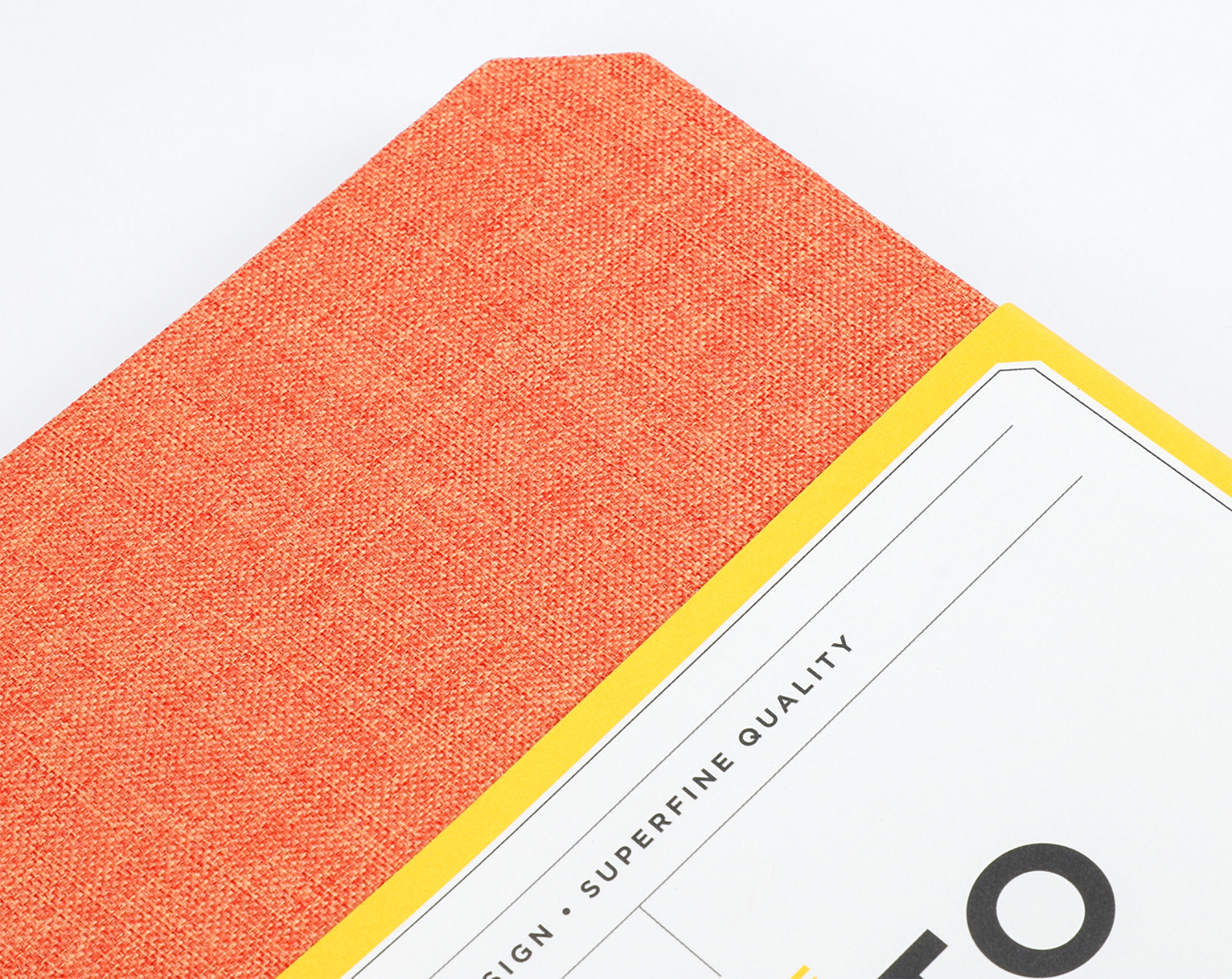
close-up of cover of chronicle notebook
The Go-To Notebook is available in four options
Two are slate grey and two are persimmon orange, each with the option to have dotted or lined pages.

How did you arrive at those beautiful beveled corners?
The chamfered corners were a practical consideration. If you carry a notebook around long enough the covers become dog-eared. To preclude that, we beveled them. In addition to practicality, this design move also gave the notebooks a unique look. 

Tell us a bit about the layout of the pages. How did you arrive at the division of pages between projects and blank pages?
First, we felt the numbering of the pages was important to differentiate this series of notebooks. Physically, not too thin, nor too thick was our preference. We thought of ourselves as typical users of this product, people who take notes, sketch, and ultimately make things. In essence, we envisioned a productivity tool. So we built in a series of project pages, made from Mohawk Via Light Blue, providing the user with a means to record an overview of projects. Depending on the user’s preferences and needs, the notebooks are produced in plain, lined or dotted versions.

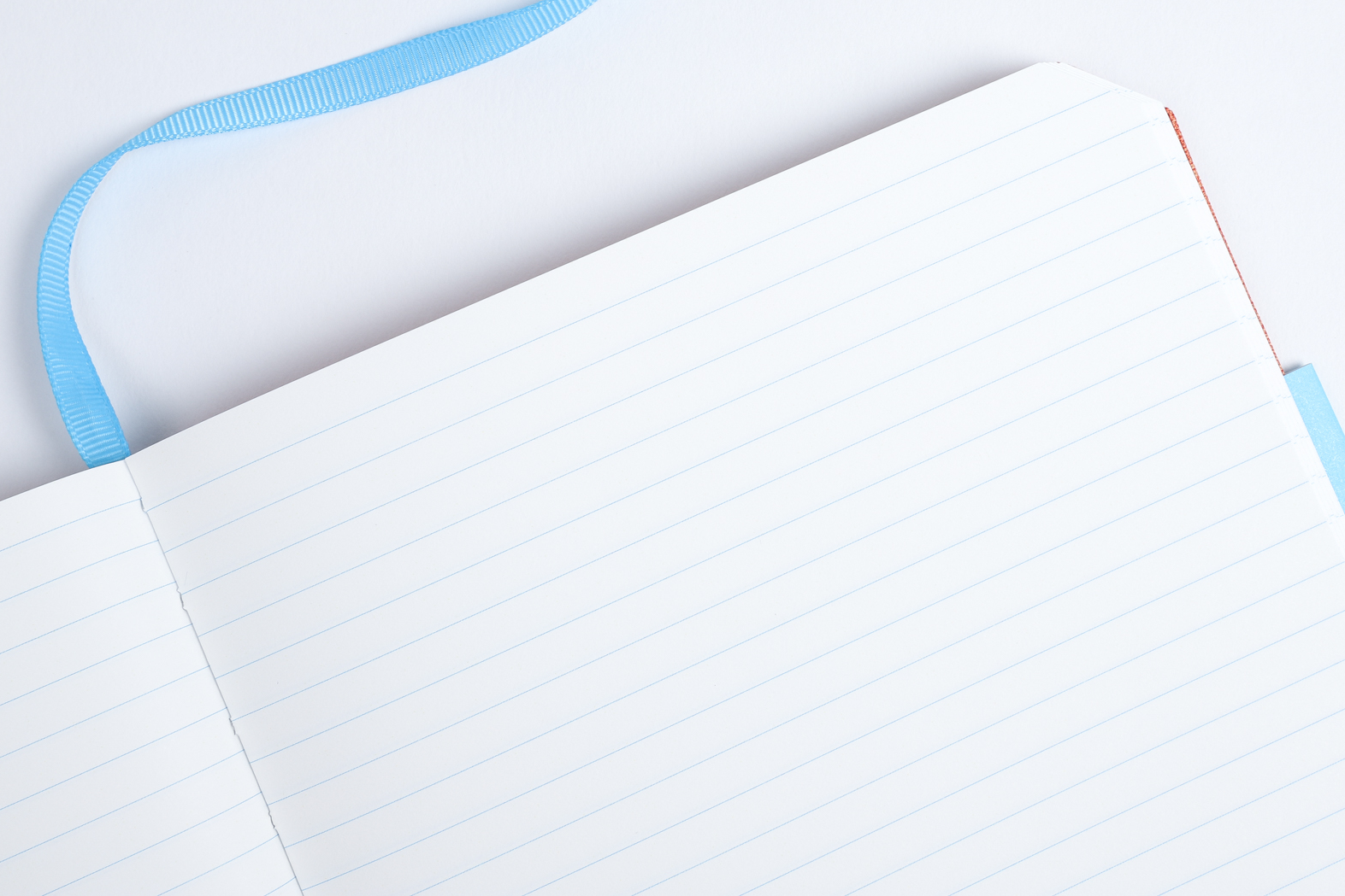
close-up of chronicle notebook page and ribbon marker in blue
The Go-To Notebook from Chronicle Books
Lined Version
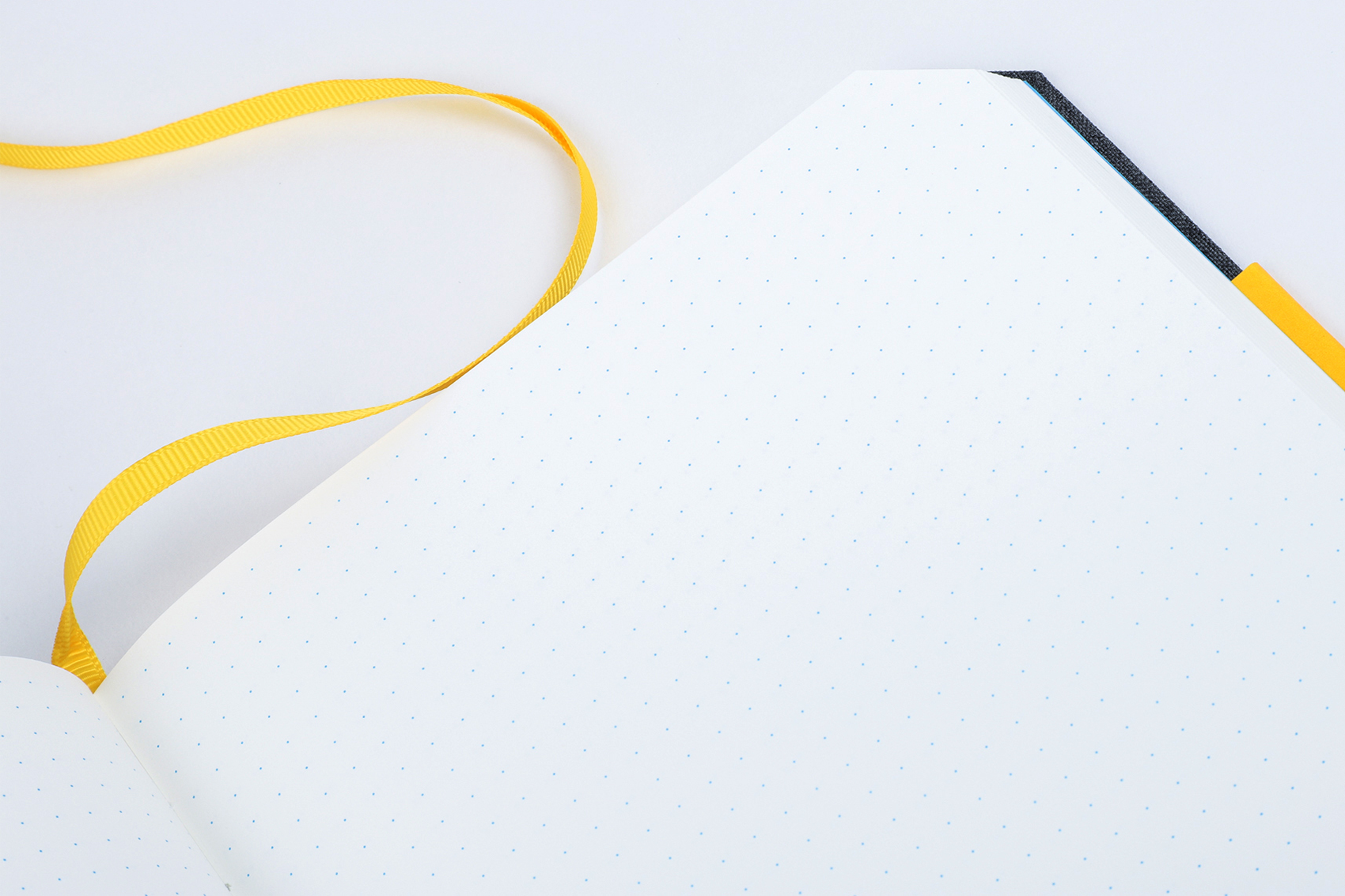
close-up of chronicle notebook page and ribbon marker in yellow
The Go-To Notebook from Chronicle Books
Dotted Version
close-up of chronicle notebook page and ribbon marker in yellow colorway
The Go-To Notebook from Chronicle Books
Project Pages

I hear that this all started with some Strathmore notebooks and Mohawk’s archive…tell us more about that.
We had a chance meeting with Mohawk at the National Stationery Show in New York back in 2014. At the time, Mohawk had produced a series Strathmore paper notebooks for their own use. We were intrigued by this notion of a paper mill producing their own brand of notebooks and wondered if there was an opportunity for us to explore this idea together in greater depth. So began the collaboration between our two companies. To get the ball rolling, we visited the Mohawk paper mill in Cohoes, New York and delved into the Strathmore Archive as a potential source of inspiration.


“ In the everything-digital world we inhabit, tactility is paramount and we felt Superfine was an appropriate choice in this digital-tactile dichotomy.”
Michael Carabetta
Creative Director at Chronicle Books

Why did you choose Mohawk Superfine for the final piece?
Our initial design exploration was focused on the Strathmore brand. Over time, our focus shifted to Mohawk Superfine, a grade that holds an elevated reputation in the design and printing communities, and something we thought we could build a story around. In the everything-digital world we inhabit, tactility is paramount and we felt Superfine was an appropriate choice in this digital-tactile dichotomy.

Tell us more about your relationship with Mohawk.
Aside from traveling in the same circles
the makers’ world of design, paper, and fine printingwe share values around well-designed, well-made products. The way Mohawk and Chronicle talk about their materials, our obsession with details gave us a level of comfort, a mutuality that is key to a collaborative working relationship.

chronicle notebooks

What role did the Mohawk team play in the design and paper choice for the Go-To Notebooks?
From the get-go we’ve had a cordial and productive relationship with Mohawk. Prior to developing the Go-To line, we produced a series of letterpress notecards on Mohawk paper so we were well acquainted. Everyone we worked with has been supportive of our joint efforts, offering critiques and envisioning marketing opportunities. Based on this mutual respect and common goals, we look forward to working together again on future projects.

Paper Used

Suggested Articles

Mohawk Blog

Out of Line: The Incredible Creative Impact of Sketching

Doodling, drawing, workshopping, outlining: call it what you may, but putting pen to paper in search of something new is a powerful creative catalyst. Ideation and imagination need room to work it out, and based on psychological research and artistic practice, sketching space is the place where it often happens.