Mohawk Blog

Materials Matter: Brooklinen's "For Your Eyes Only" Collateral
Words
Rebecca Gatto
Photography
Rebecca Gatto
Brooklinen For Your Eyes Only collateral

Designer Robson Tan searched for—and found—a critical moment of attention in the increasingly crowded direct-to-consumer space.
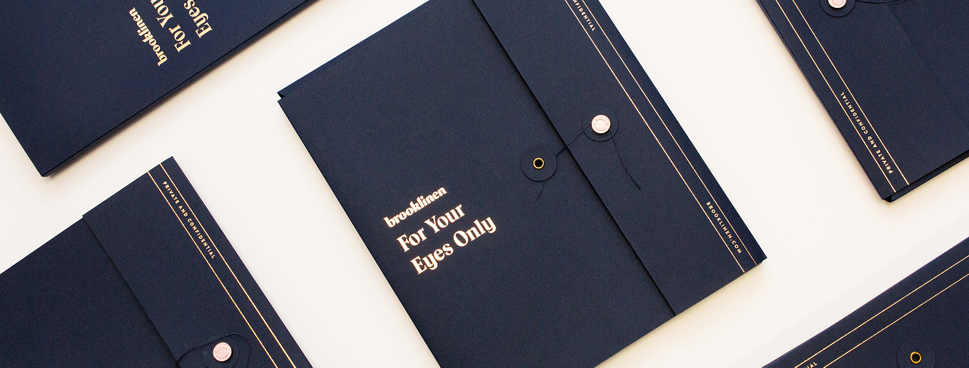
Tasked with creating a takeaway object for attendees at a recent event, Robson Tan and the team at Brooklinen had one objective: “To avoid creating a piece of work that we’d see decorating the trash bins on our way out.”

Tan, a brand designer and art director who has a knack for targeting younger generations (think Millennials and Gen Z), started by getting into the minds of visitors to the upcoming event.

“As a designer, I do my best to empathize with my users first and foremost, and in this project, the question that looms in my mind is: ‘If I receive this piece of material, will I ignore it or throw it away?’” Tan said. “I like to think everything I design is for the user’s benefit.”

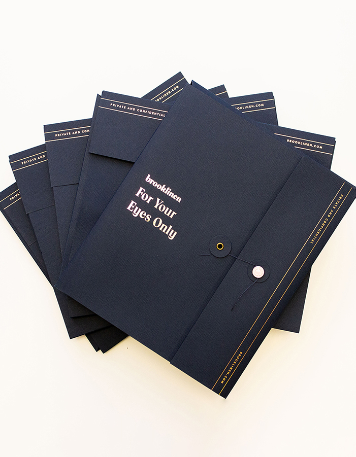
Stack of Brooklinen envelopes
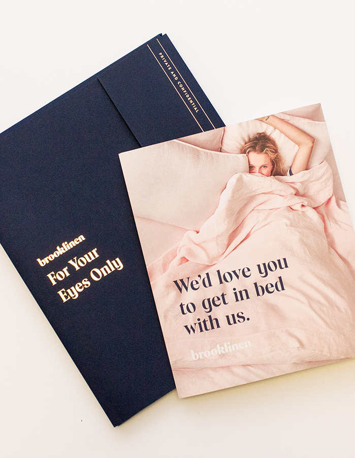
Brooklinen collateral with brochure

It was obvious to Tan that materials would be a critical part of the final object. He knew that the weight, texture, and interactivity of the item would all contribute to a single moment that would make or break the piece’s success.

“In my experience, print and paper make the brand experience tangible. This tangibility also means that you can’t simply swipe it away nor archive it,” Tan said. “Being able to hold that piece of material leads to a split-second decision to engage with that piece of content, or toss it away.”


“I have seen firsthand how these audiences are more willing to take the time to engage with a print material if it is truly well-made, considered and crafted.”
Robson Tan
Designer

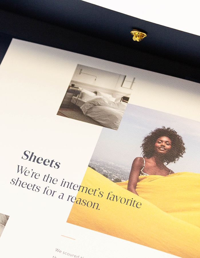
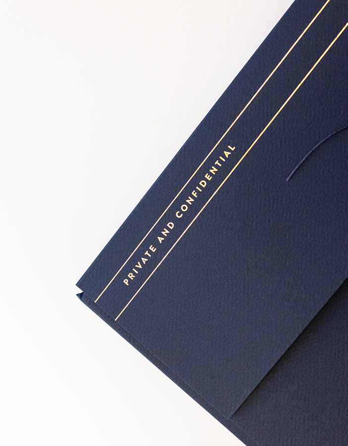
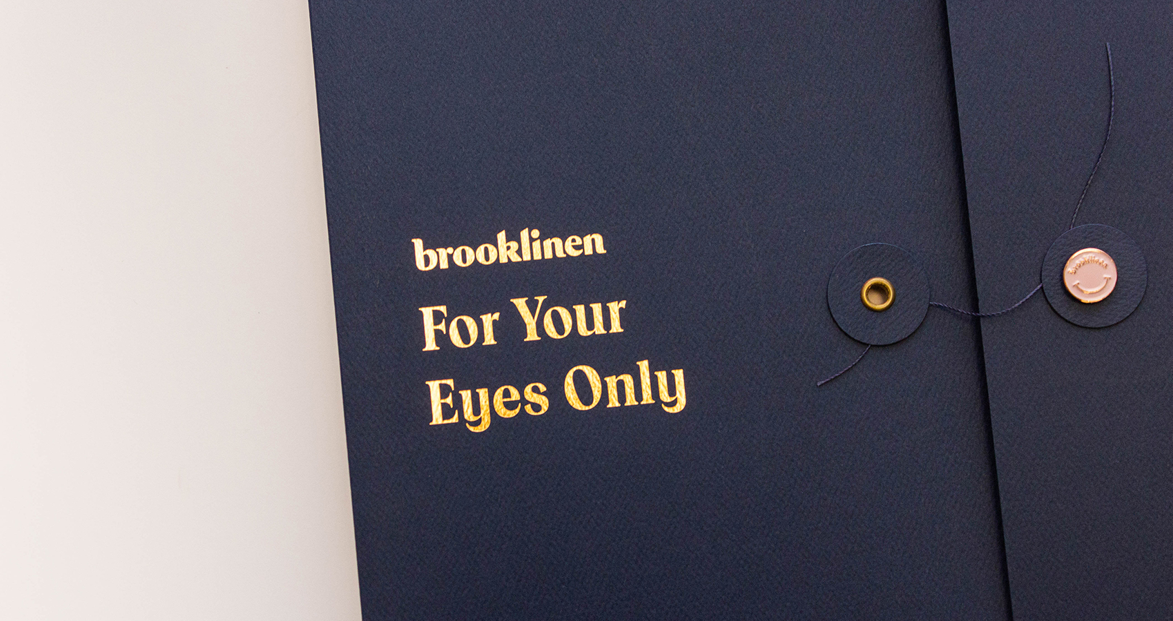
To that end, Tan designed a piece of collateral inspired by the humble office envelope. The outside container was constructed from Mohawk Carnival Deep Blue Felt 80 Cover (Expressive Collection), emblazoned in gold foil stamping with the words “For Your Eyes Only.” The envelope included a classic—and interactive—string closure. Once opened, it revealed a gatefold brochure, printed on Mohawk Via Felt Cool White 65 Cover (Sustainable Collection), and a gel eye mask that read, “Do Not Disturb.” (“That’s literally for your eyes only,” he said.)

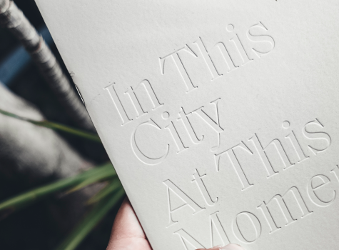
Tan said the design team’s choice to use a string button closure was initially met with doubts, but that “We knew from the get-go that without it, we’d be compromising on user experience.” The interactive closure demanded that users slow down and interact with the unusual and interesting mechanism. Meanwhile, Mohawk Via Felt’s fabric-like texture emphasized Brooklinen’s products: high-quality textile goods. Unifying paper texture with the object’s content helped to create a cohesive message that recipients would easily understand.


close up of string closure on folio
Interactive Elements
Designer Tan insisted that the envelope feature a string button closure to enhance the user's experience.

Specifying materials is an exciting and scary part of the print process, no matter how experienced the designer. “Like renovating a house, you often wonder if that tile you chose would go well with your countertop, and if that would affect the color of your walls,” Tan said. “That sense of fear and trepidation never goes away! And of course, cost. Which is where Mohawk’s various tiers of materials can be very helpful.”

Tan said in spite of the challenges that can pop up when trying out innovative materials and form factors, the rewards are always worth the risk.

“I think it adds an emotional aspect to a lot of my projects,” he said. “It informs how much art and thought the designer, brand, and team put into the project. It offers glimpses of premium vs. cheap. It communicates intention. Most importantly, it inspires engagement.”


“I think the advantages of print as a creative medium these days is that people don’t expect or think about it. In a way, that makes room for printed materials to be able to surprise and delight them.”
Robson Tan
Designer

For designers who are just beginning their journey with printed materials, Tan offered some advice: “Talk to someone. Don’t be afraid to ask all the questions!” he said. “More often than not, your printers and paper reps will have much more experience you can tap. I say that because they’ve definitely worked on far more projects and have seen the good, the bad, and the ugly.” (No, we didn’t pay him to say that.)

“Paper is a medium that is inherently tricky,” Tan continued. “Combinations of different finishes, inks, effects can affect the final product in so many ways. Sometimes, in ways you don’t even anticipate until you’ve seen the final outcome. A ten minute conversation can help alleviate and remove these obstacles from the get-go—when has time ever been more productive than this?”

Close up of printing inside brochure
Gilded Details
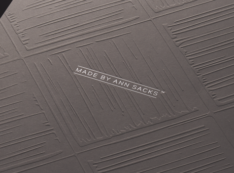
Though the project was inspired by the "humble office envelope," elevated details like hot foil stamping keep this piece from getting lost in the shuffle.
Close up of foil stamping
Pairing Texture
The fabric-like texture of Via Felt adds dimension to the project without sacrificing print fidelity. Printer Unimac used four-color offset printing with UV and Pantone match to keep the content crisp and vibrant.

Tips for matching texture to content to enhance your messaging:

  • Look for the physical characteristics of your product. Consider weight and texture. Also take into account the environment where your product is at home.
  • Match texture to character. Even a brand without physical texture has a character or emotion to convey. Find the texture that best represents the essence of your brand.
  • Be open to an array of options. You don’t need a 100% texture match to achieve a striking effect—something in the right ballpark can have similar results.


Production Notes

PN-print-process
Print Process
Foil Stamping
capability_infoi
Offset Printing
capability_infoi
Ultraviolet (UV) Printing
capability_infoi
roll
Offset Printing Capabilities
4 Color
capability_infoi
PN-designer
Designer
Robson Tan

Materials Used

Suggested Articles

Mohawk Blog

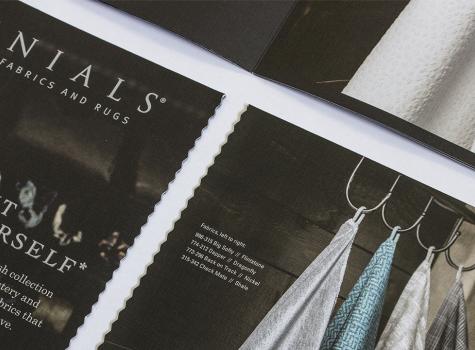
Perennials Fabrics: Matching Texture to Content

We’ve seen that the way paper feels is powerful and how we use it can make a difference. Every project is about something, be it adventure travel or single origin chocolate. Have you ever thought about finding textures in the content, product or stories that you can emulate through paper?