Mohawk Blog

Materials Matter: New York City Ballet 2019-20 Season
Words
Casey Fisk
Photography
Cassandra Palmer
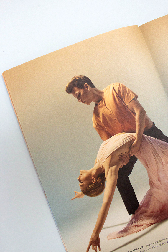
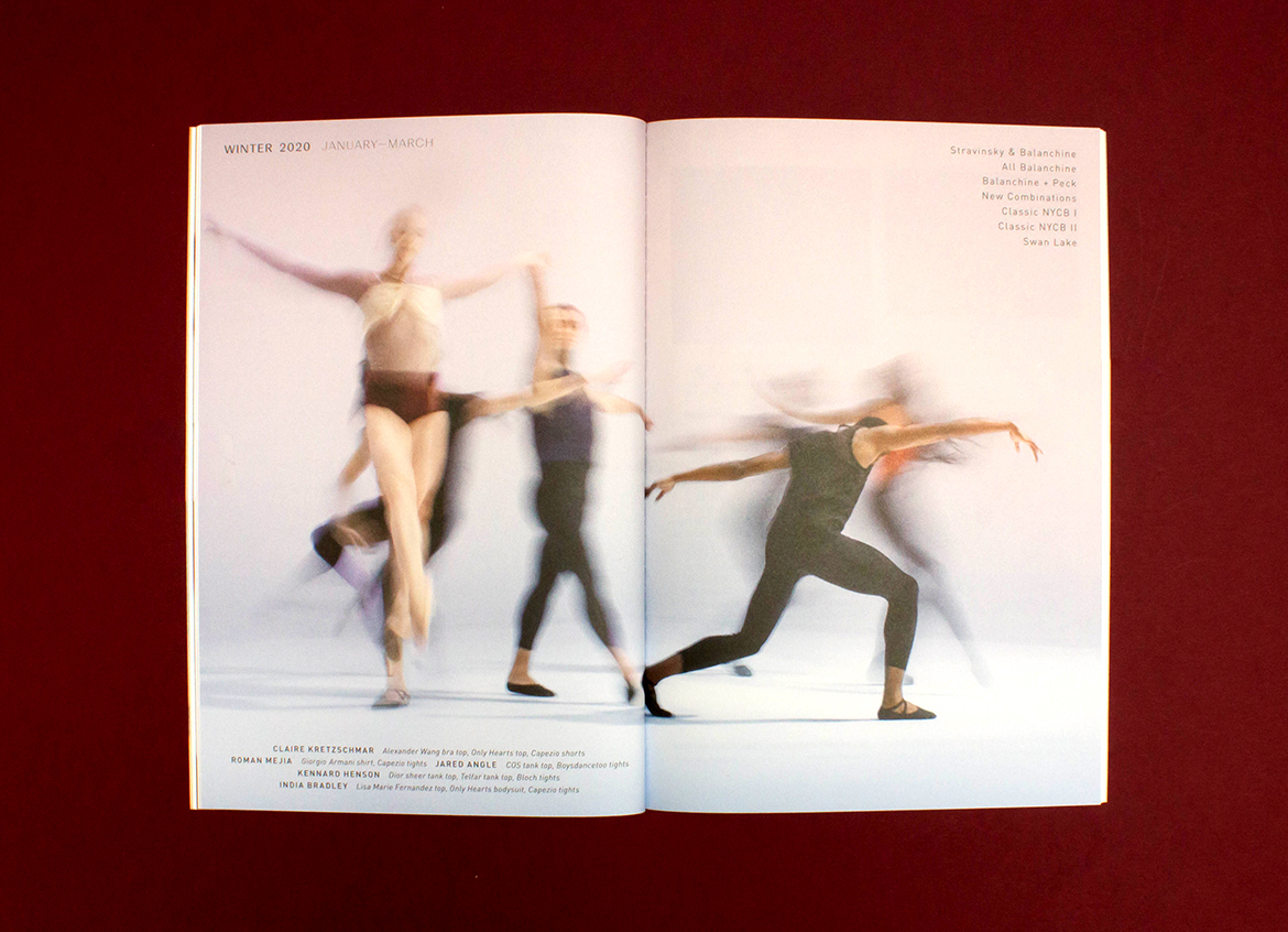
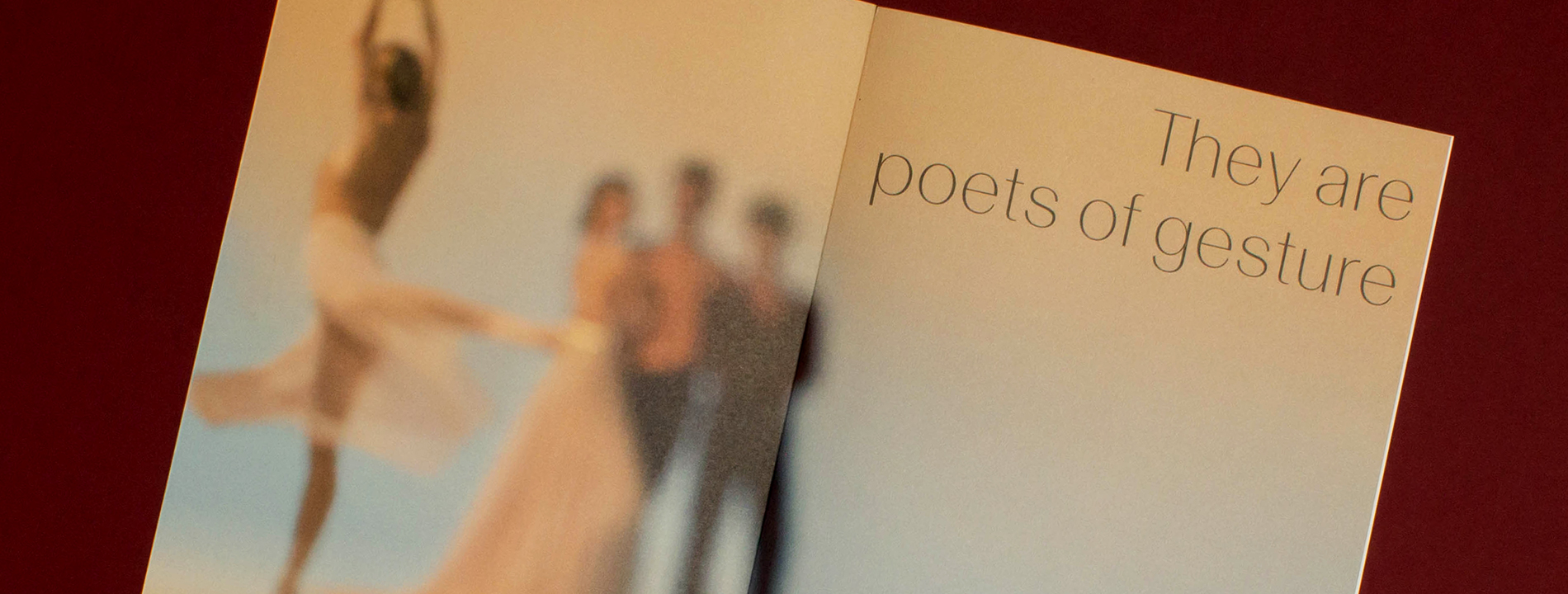
Close-up of inner spread of New York City Ballet booklet

The interplay of imagery and texture in print is a ballet — poetry of texture.

George Balanchine and Lincoln Kirstein formed New York City Ballet with the goal of producing and performing a new ballet repertory that would reimagine the principles of classical dance.

Today, the company remains dedicated to their vision as it pursues two primary objectives: to preserve the ballets, dance aesthetic and standards of excellence created and established by its founders; and to develop new work that draws on the creative talents of contemporary choreographers and composers — and speaks to the time in which it is made.


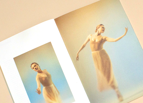
Inner detail of ballet dancers
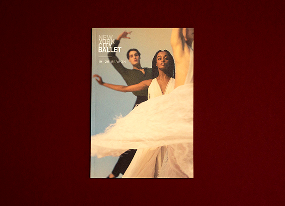
Cover photo of the ballet book

This mission is accompanied by a commitment to expand the company’s audience and make ballet accessible to the widest possible public through touring, education programs, the creative use of media, and other outreach efforts — including print.

The 2019-20 New York City Ballet brochure introduces their season concept and provides a breadth of campaign imagery supported by editorial content. This brochure is mailed to thousands of homes and is also available in the David H. Koch Theater lobby all season long.

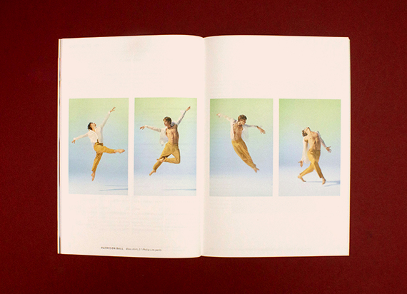
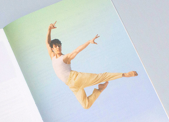
The 2019-20 campaign is based on a quote from George Balanchine that refers to dancers as “Poets of Gesture.” The overall feel is light and airy, which the photography emulates through subtle pastel gradients.


“Mohawk Via Satin’s silky, distinct texture is not only effective for tactile material communication, but it also enhances the imagery.”

NY Ballet Spread  viewed from above
Another inner spread showing ballet dancers viewed from above
Photograph from inner spread of a ballet dancer leaping
Ballet dancers photograph in brochure viewed from above

The main challenge was to find an uncoated stock which complemented the imagery and retained the crispness of the images and subtle variations in the gradients. Mohawk Via Satin (Expressive Collection) was the obvious choice.

Mohawk Via Satin’s silky, distinct texture is not only effective for tactile material communication, but it also enhances the imagery. The variety of finishes uncoated paper offers, gives you more options to control your communication through the interplay of imagery and texture.


Production Notes

PN-print-process
Print Process
Offset Printing
capability_infoi
bindary
Bindery
Perfect Bound
capability_infoi
PN-designer
Designer
Camille Sacha Salvador

Materials Used

Suggested Articles