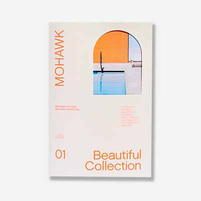
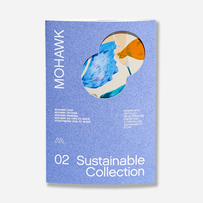
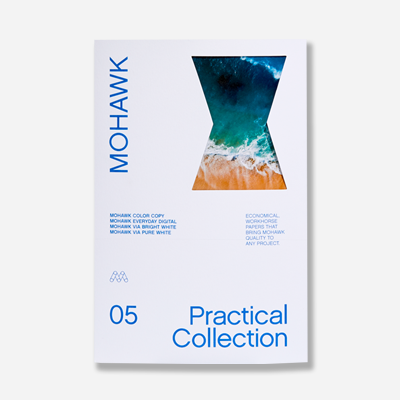
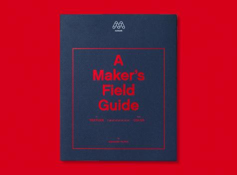
A Modern Take on Colors and Textures with Mohawk Mosaic
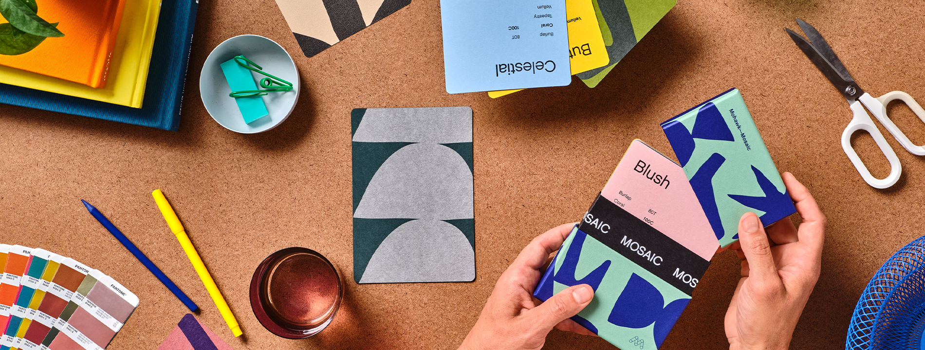
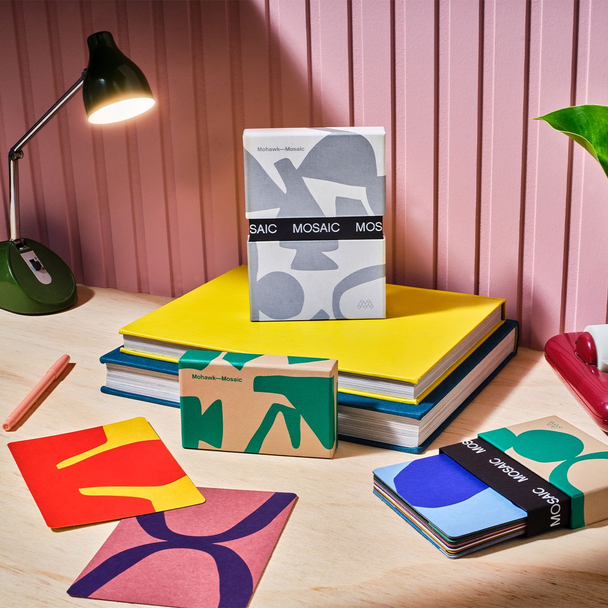
Mosaic, for creative print and packaging solutions.
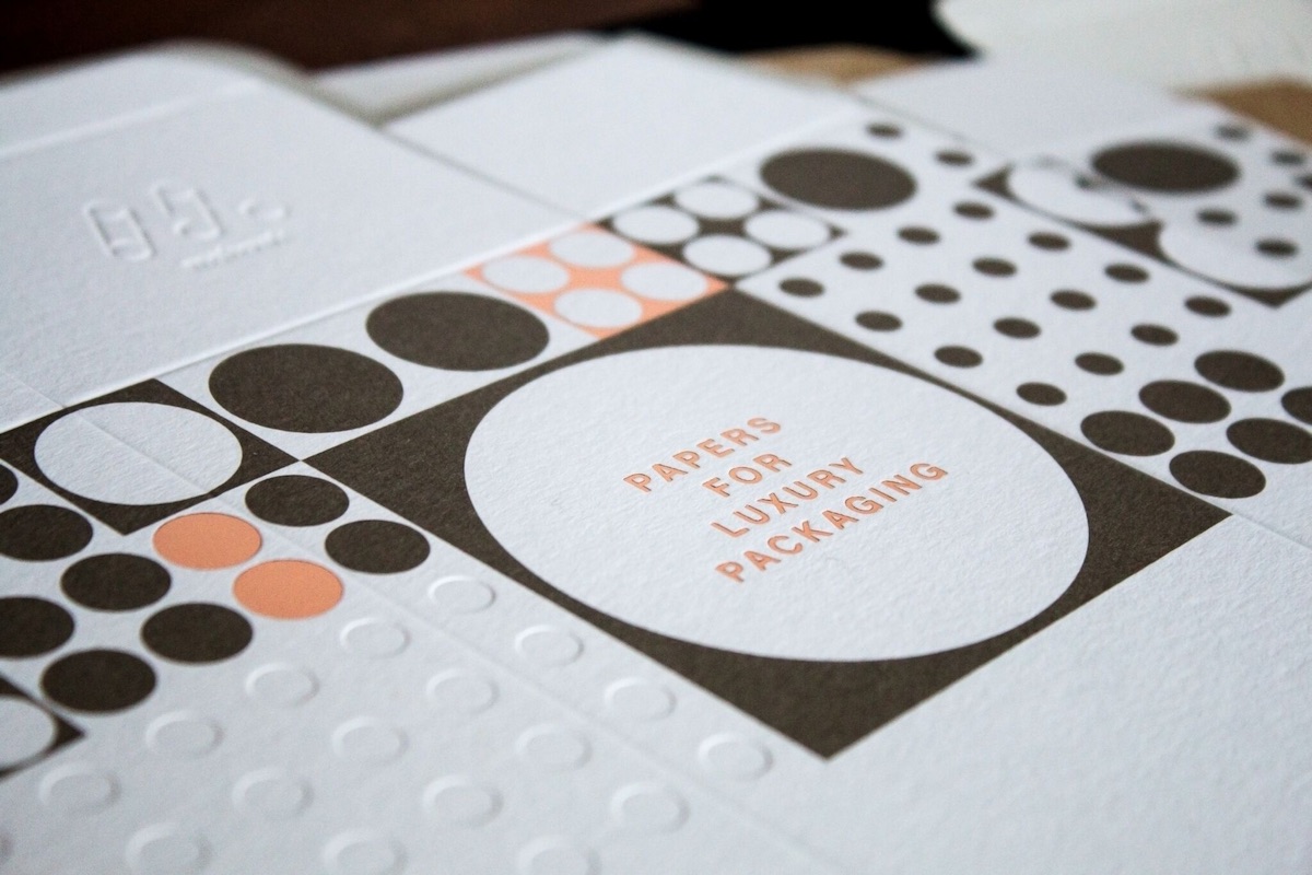
Textured and colored paper can elevate your print and packaging projects from ordinary to extraordinary. It's an investment in your brand's image and a statement about your commitment to quality. In a world where digital media dominates, the physicality of a beautifully crafted piece of marketing can leave a lasting impression.
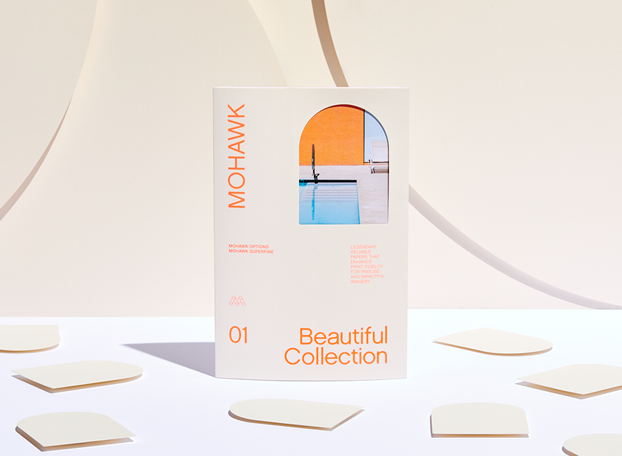
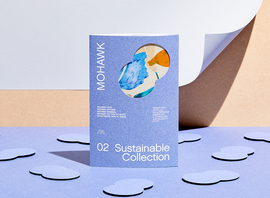
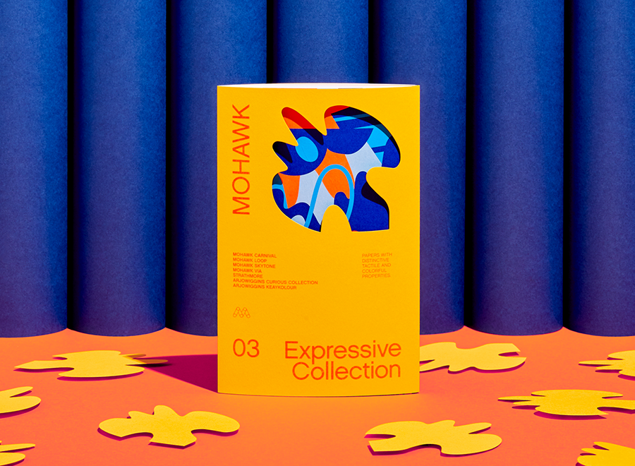
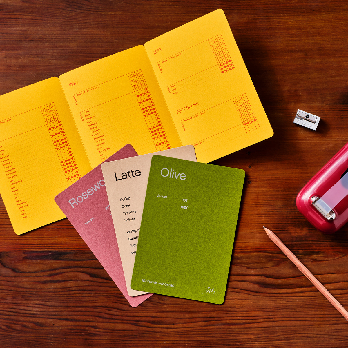
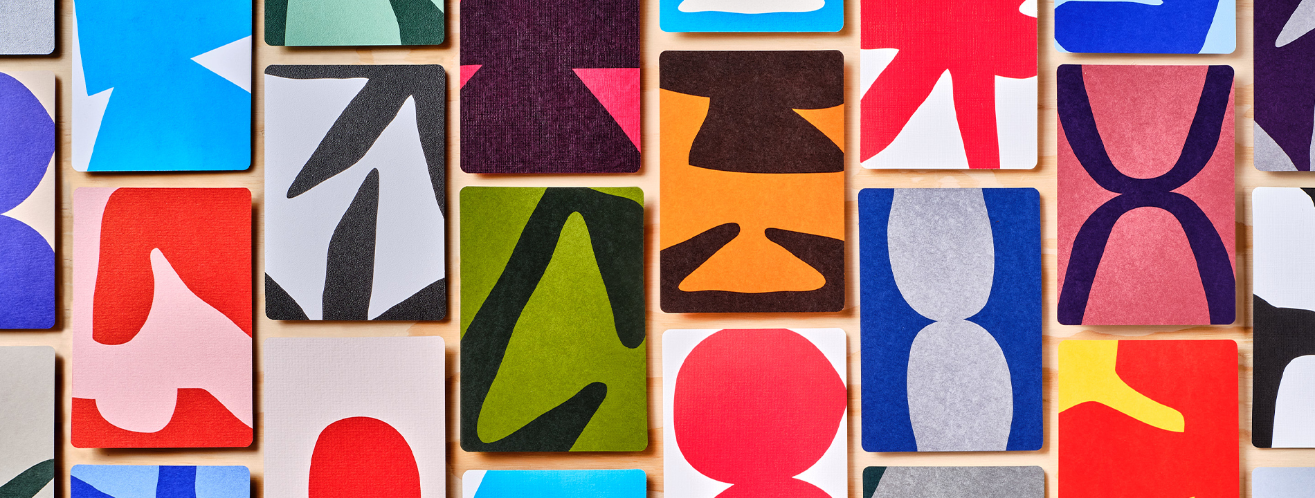
COLOR is a language of its own. The colors you choose for your print and packaging collateral can evoke emotions and set the tone for your message. Soft pastels might convey tranquility and wellness, while bold reds can signal excitement and urgency. By combining the psychological impact of color with the feel of textured paper, you create a multi-layered experience for the recipient.
TEXTURE is not just a visual delight; it's a tactile experience that engages multiple senses. The feel of a raised emboss can transform a simple box into a memorable encounter. This sensory engagement helps to create a connection between the customer and the brand, making it more likely for the material to be kept and shared with others.
Production Notes
Offset Printing
A commonly used printing technique in which the inked image is transferred from a plate to a rubber blanket, then to the printing surface. When used in combination with the lithographic process, which is based on the repulsion of oil and water, the offset technique employs a flat (planographic) image carrier on which the image to be printed obtains ink from ink rollers, while the non-printing area attracts a water-based film (called "fountain solution"), keeping the non-printing areas ink-free.
Materials Used
Suggested Articles
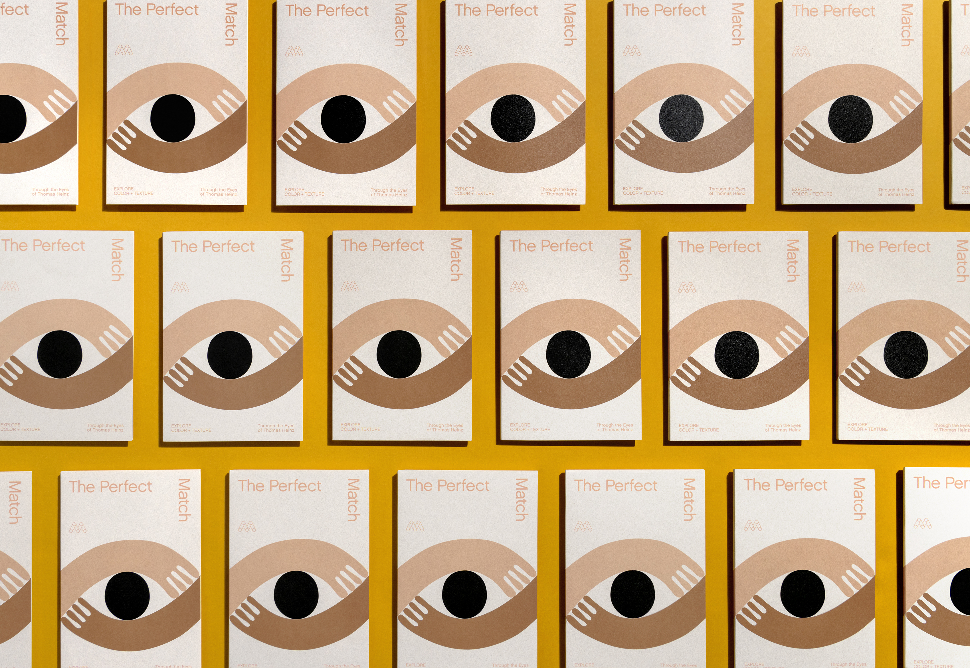
Explore color and texture through the eyes of Thomas Heinz. Mohawk introduces, The Perfect Match.
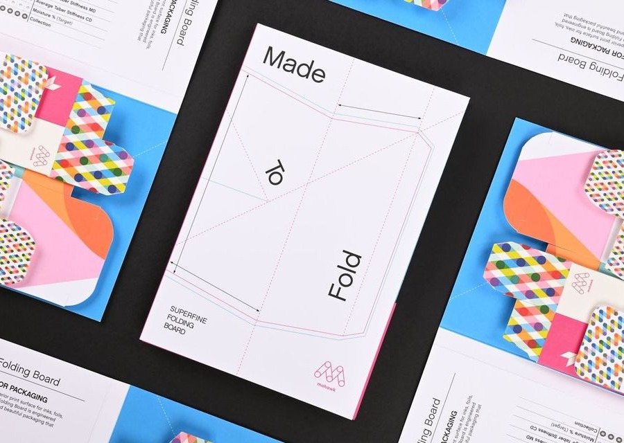
To Have and to Fold: Superfine Specifically Engineered for Packaging
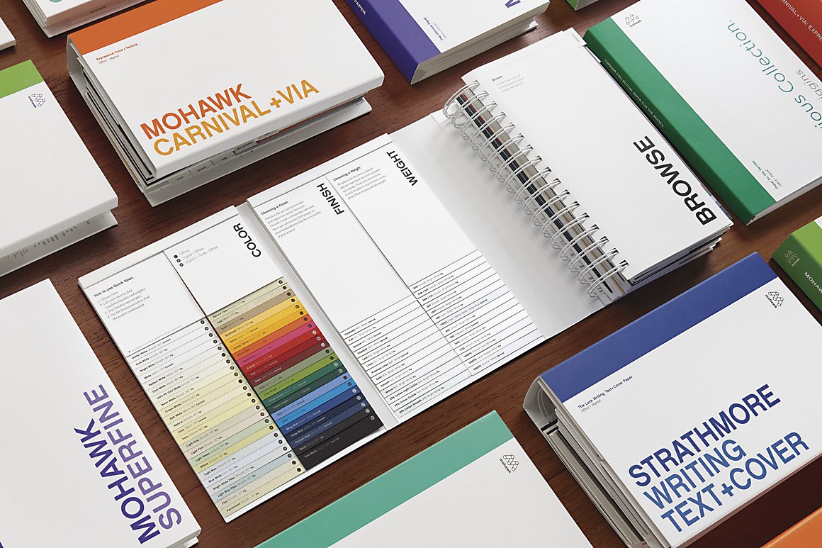
Introducing A Maker’s Field Guide to Texture and Color, an ambitious and comprehensive new printed tool from Mohawk, designed to serve as a hands-on resource for the creative community.
