Mohawk Blog

Paper is Part of the Picture
Words
Bryn Mooth
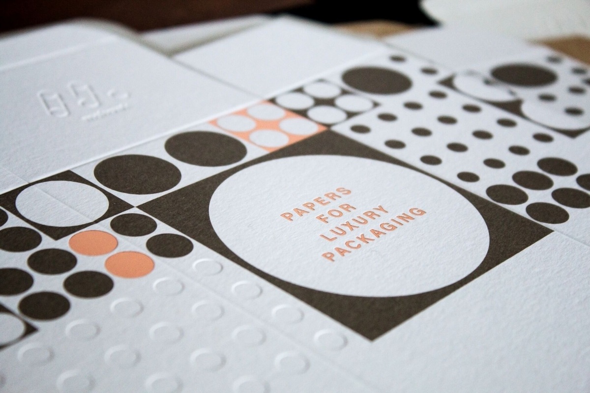
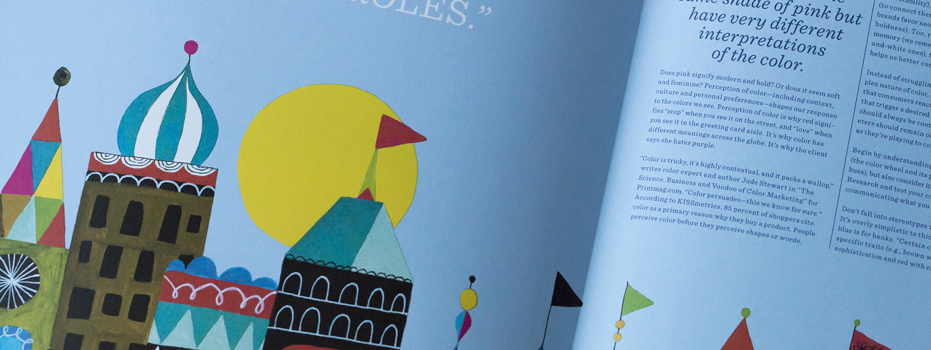
Close-up of an illustration printed on colored paper

Does pink signify modern and bold? Or does it seem soft and feminine? Perception of color—including context, culture and personal preferences—shapes our response to the colors we see. Perception of color is why red signifies “stop” when you see it on the street, and “love” when you see it in the greeting card aisle. It’s why color has different meanings across the globe. It’s why the client says she hates purple.
Color is tricky, it’s highly contextual, and it packs a wallop,” writes color expert and author Jude Stewart in “The Science, Business and Voodoo of Color Marketing” for Printmag.com. “Color persuades—this we know for sure.” According to KISSmetrics, 85 percent of shoppers cite color as a primary reason why they buy a product. People perceive color before they perceive shapes or words.

Little wonder that companies have leveraged color practically since the dawn of branding: Marketers and designers understand color’s power to trigger immediate, instinctive feelings and emotions. Think of how so many financial institutions have blue logos (blue represents stability), why organic foods companies favor green (to connect them with plants and the earth), why tech brands favor neons like fuchsia and lime green (to signify boldness). Too, research has shown that color boosts memory (we remember colored images longer than black and- white ones), that it captures attention and that it helps us better comprehend what we see or read.

Instead of struggling with the emotional, subjective, complex nature of color, designers should harness it. Knowing that consumers react to and remember color, make choices that trigger a desired feeling or perception. Those choices should always be rooted in strategy—designers and marketers should remain objective about color selection, even as they’re playing to consumers’ gut reactions.

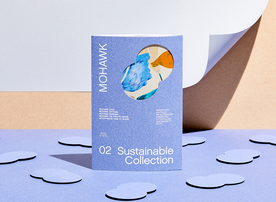
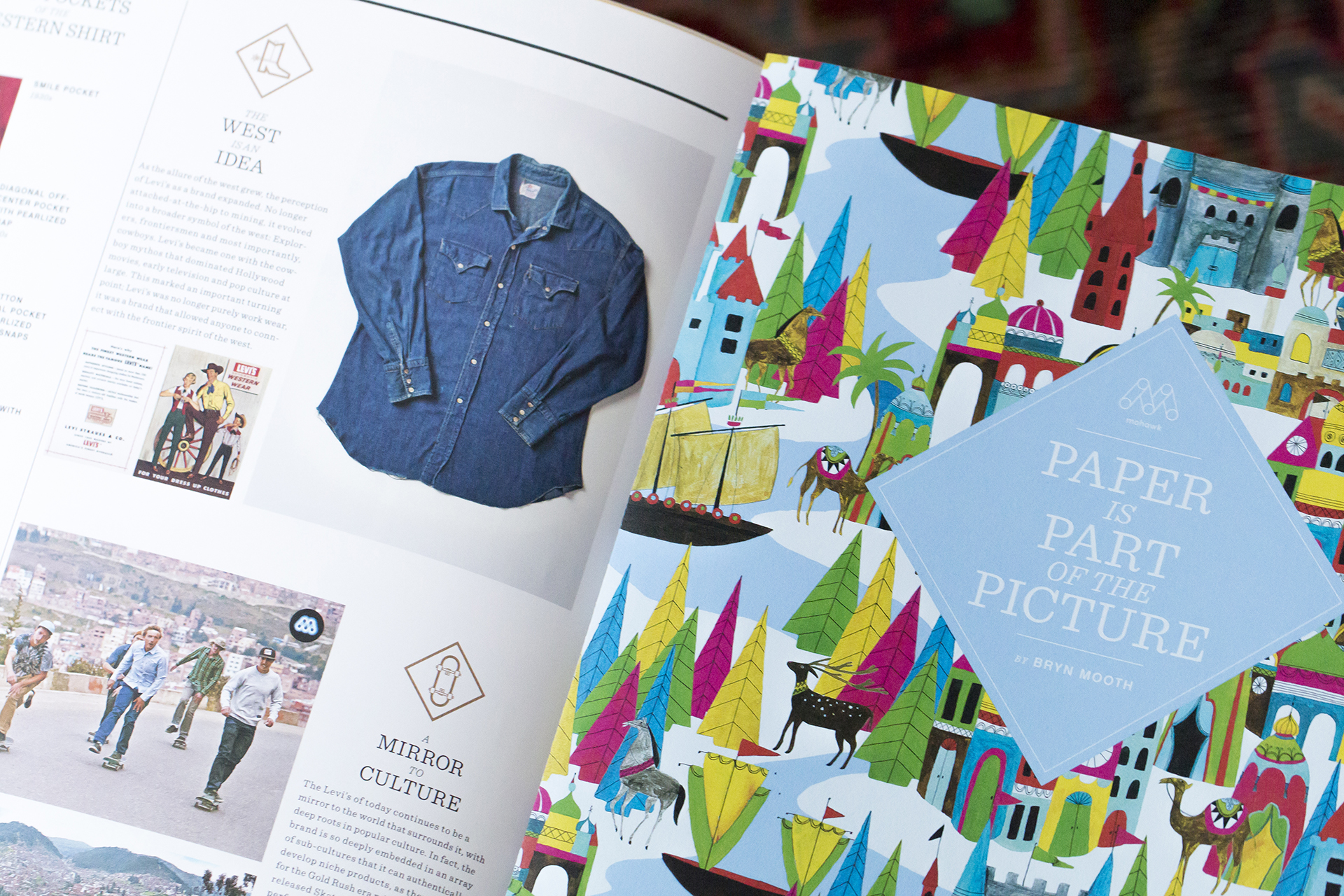
Close-up of printed illustrations on blue paper

Begin by understanding the physical properties of color (the color wheel and its primary, secondary and tertiary hues), but also consider its cultural and societal properties. Research and test your color choices to ensure you’re communicating what you intend to.

Don’t fall into stereotypes when you’re choosing a color. It’s overly simplistic to think that pink is for women and blue is for banks. “Certain colors do broadly align with specific traits (e.g., brown with ruggedness, purple with sophistication and red with excitement),” writes Gregory Ciotti for Entrepreneur magazine. “But nearly every academic study on colors and branding will tell you that it’s far more important for your brand’s colors to support the personality you want to portray instead of trying to align with stereotypical color associations.”

Create color palettes that layer in nuances of meaning. A strong, energetic color paired with a subtle neutral can signify boldness grounded in strategy. Two cool hues might trigger feelings of serenity. Once you’ve landed on a primary color, choose complementary or similar shades for the supporting role.


“Certain colors do broadly align with specific traits (e.g., brown with ruggedness, purple with sophistication and red with excitement). But nearly every academic study on colors and branding will tell you that it’s far more important for your brand’s colors to support the personality you want to portray instead of trying to align with stereotypical color associations.”
Gregory Ciotti
Entrepreneur Magazine

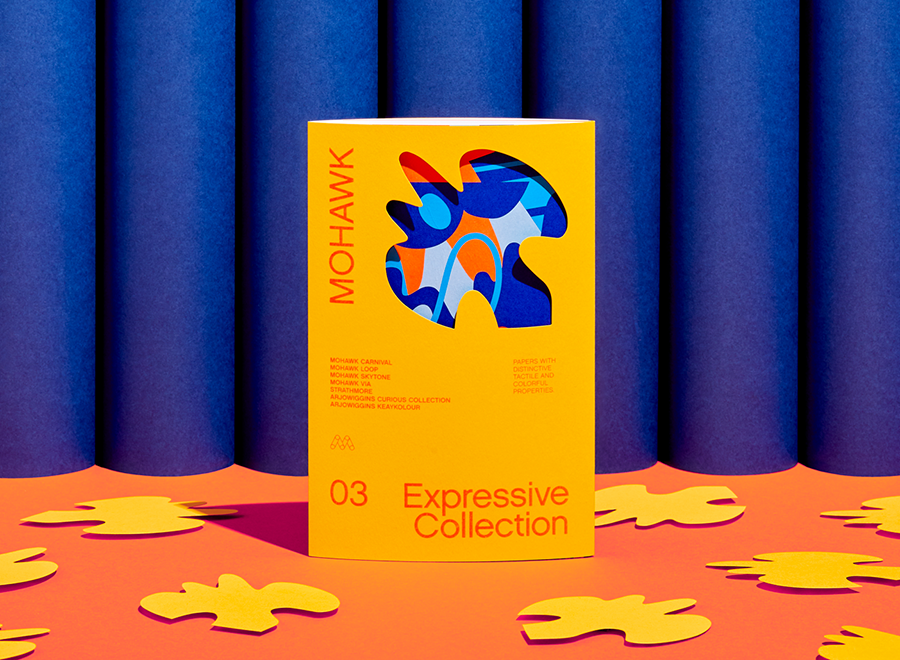
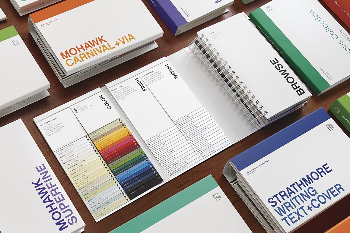
With a solid foundation for your choices, explore ways to bring your color strategy to vivid life. Printing on a colored paper, for example, captures immediate attention and physically enhances a message. A colored stock can convey meaning and support the brand perception you’re creating. Think of paper as a fifth color—whether overlaid with ink or left bare, the surface becomes an integral part of the message. A natural-foods brand, for example, might spec the Leaf Green sheet from Mohawk’s Via line (one of more than 30 shades in the Expressive Collection) to create a perception of wholesomeness.


This article was originally published in Issue 05 of the Mohawk Maker Quarterly. The Mohawk Maker Quarterly is a vehicle to support a community of like-minded makers. Content focuses on stories of small manufacturers, artisans, printers, designers, and artists who are making their way in the midst of the digital revolution. Learn more about the quarterly here.

-or-

If you’re looking for inspiration, examples, and more tips on how to increase the impact of your next printed project through careful paper selection, click here to learn more and take your work from good to great.


Materials Used

Suggested Articles

Mohawk Blog

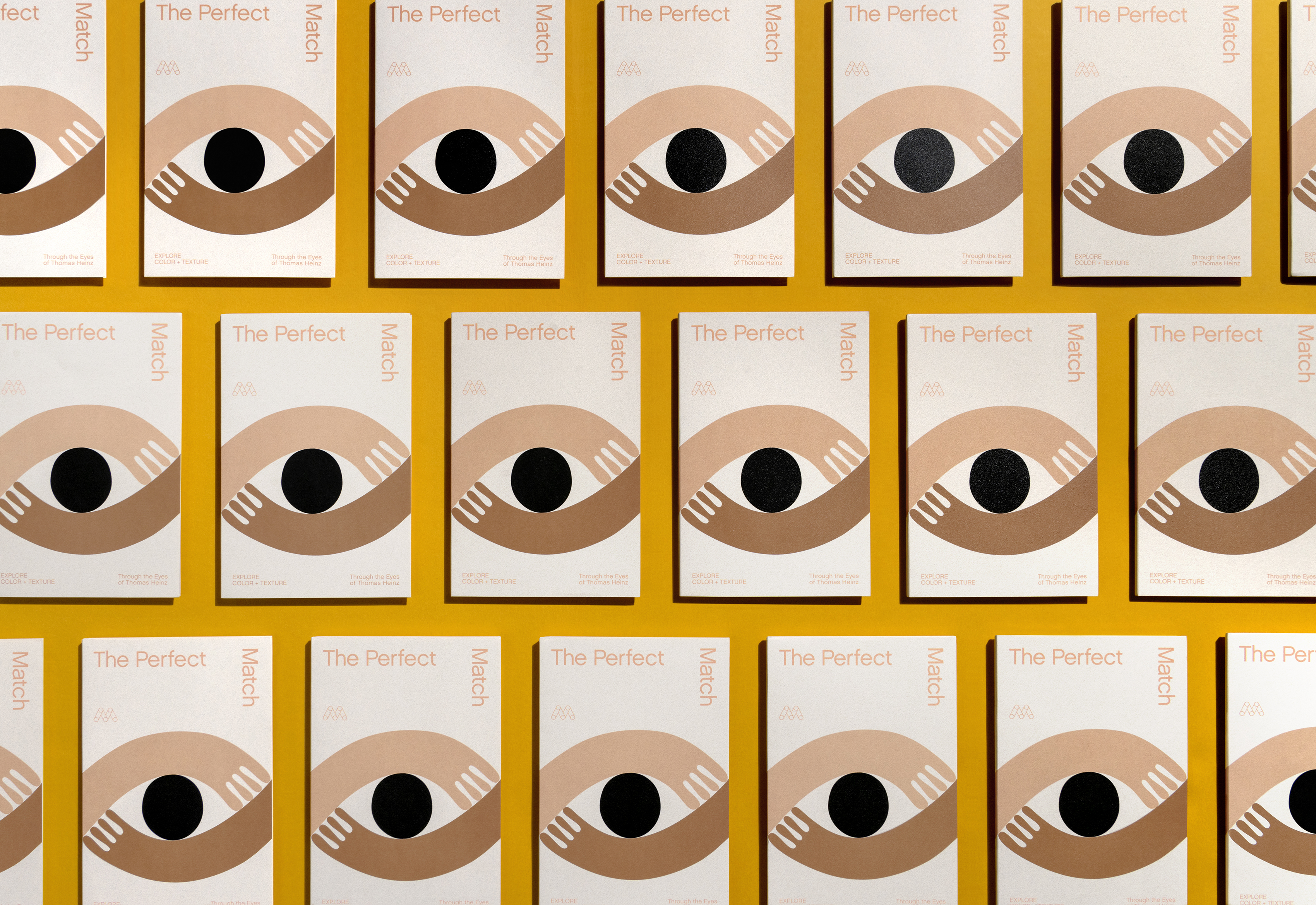
The Perfect Match

Explore color and texture through the eyes of Thomas Heinz. Mohawk introduces, The Perfect Match.