Mohawk Blog

Eye on Design: From Online Publishing to a Printed Magazine
Words
Ariel Smullen
Photography
Eye on Design
Stack of copies of Eye on Design

Since 2014, Eye on Design has been captivating creatives. With stories that are not only visually striking, but that highlight the world’s most influential designers and the issues that affect them, the online publication has elevated the conversation surrounding visual communication. Now, Eye on Design is available in print.
Driven by their success online, Eye on Design released the first issue of their tri-annual print magazine last winter. The magazine is an extension of their daily online publishing, but offers a new kind of flexibility to experiment with one theme, design ideas, printing methods and story formats for every issue. 

Senior Editor, Meg Miller is one of five that contributes to Eye on Design. We had a chance to chat with Meg about Eye on Design, their ideas around the publication, and to ask the question, why print?

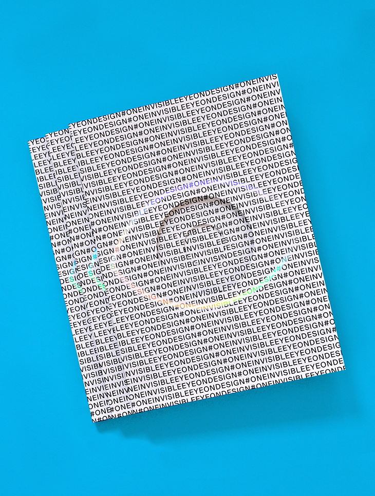
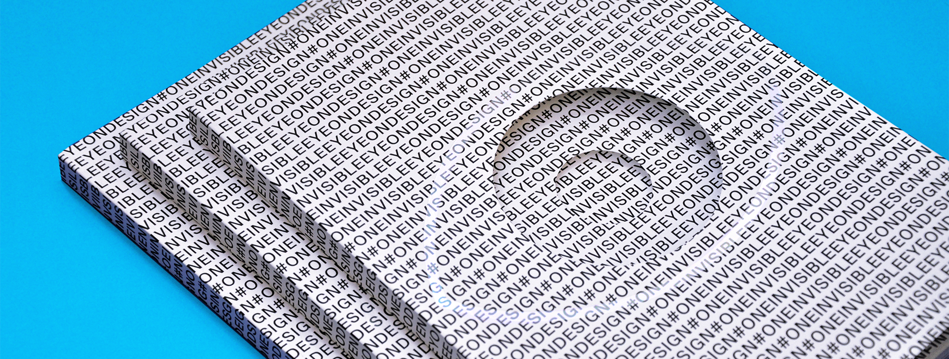
Cover of the Eye on Design Magazine Issue #01
The cover was printed on Mohawk Superfine Eggshell and features die cutting and clear rainbow foil
Cover of the Eye on Design Magazine Issue #01

1. Can you give us a little background on Eye on Design and its relation to AIGA?

Eye on Design is published by AIGA, the oldest and largest professional organization for graphic designers in the United States. Since 2014, we’ve been publishing stories about the world’s most exciting designers and the issues they care about, and last winter we put out the first issue of our tri-annual print magazine. Essentially, with both of these formats—and with the events series we’ll produce in conjunction with the print issue releases—we’re excited to flex and test the boundaries of design journalism. We look at subjects like mental health, sexuality, business, education, identity, all through the lens of design.

We’re a team of five editors and a designer, spread out across New York, London, and Berlin, and we all come from the magazine and media world—Conde Nast, Wired, Fast Company, and It’s Nice That. We’ve taken the best practices from those companies (and learned from the worst) and created a well-oiled editorial machine. And through AIGA we’re backed by a membership-run nonprofit organization with an incredible wealth of institutional knowledge, as well as a long legacy of print.


“We want the magazine to have a long shelf life. Having the online site has been crucial for finding and following those topics that our readers care about. And knowing that we had an audience that was hungry for more of these stories gave us the confidence to launch the magazine.”
Meg Miller
Senior Editor of Eye on Design

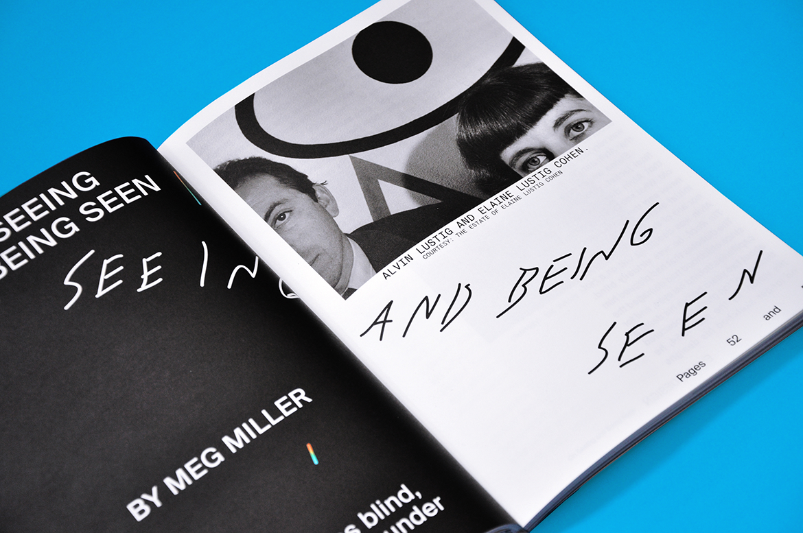
Page showing On Seeing and Being Seen by Meg Miller
On Seeing and Being Seen by Meg Miller
As on designer goes blind, another emerges from under his shadow

2. You’ve been quite successful building a following for Eye on Design online. Why create a printed magazine?

That success online has a lot to do with it, actually. The magazine is an extension of our daily online publishing, where we can cover projects as they launch and contribute to, and hopefully lead, many of the major discussions in the graphic design world as they occur. Publishing online gives us the flexibility to follow those leads as they develop.

The print magazine is a different format, and it’s published on a different schedule. We take about five months to put an issue together, and each one revolves around a specific theme. It provides a different way of looking at graphic design and visual communication, but instead of preparing a story to run in a week or two, we’re thinking about how we want to cover it in a way that will be relevant in five months, or a year, or even 10. We want the magazine to have a long shelf life. Having the online site has been crucial for finding and following those topics that our readers care about. And knowing that we had an audience that was hungry for more of these stories gave us the confidence to launch the magazine. It was Jeremy Leslie from the London shop and journal magCulture who ultimately told us, “Publish the magazine, you’ve already built up a readership for it.”

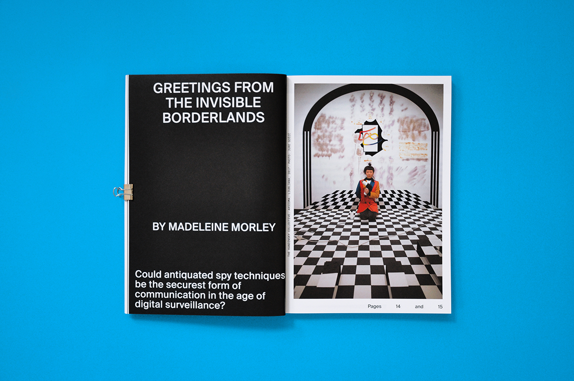
Open booklet showing Greetings from the Invisible Borderlands by Madeleine Moreley
Greetings from the Invisible Borderlands by Madeleine Moreley
Could antiquated spy techniques be the securest form of communication in the age of digital surveillance?
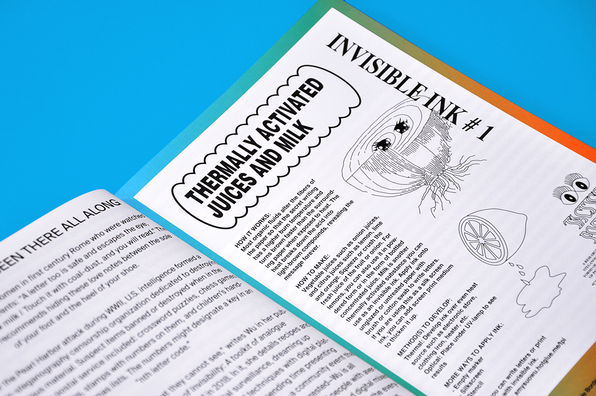
Close-up of Eye on Design page

3. What’s the significance of the theme Invisible?

We picked this theme last fall while the whole team was together for the AIGA Design Conference in Minneapolis. “Invisible” seems a bit counterintuitive for a magazine about graphic design, which is a profession that makes messages, entities, and systems visible. But the more we thought about it, the more we liked it as a framework for thinking about some of the industry’s most important issues. We not only look at the code, data, and grids that lurk behind our interfaces, but we have some really in-depth pieces about intangible subjects like representation and identity. We profile Amy Suo Wu, a designer who’s doing some fascinating work around surveillance and online privacy. Plus, we’ve got her invisible ink recipes.

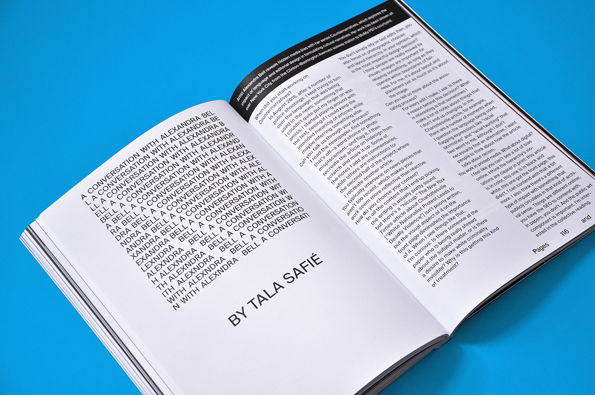
open book showing A conversation with Alexandra Bell by Tala Safie
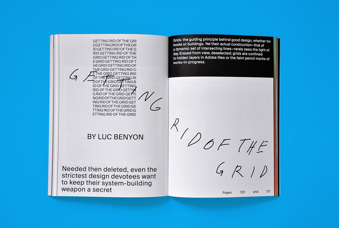
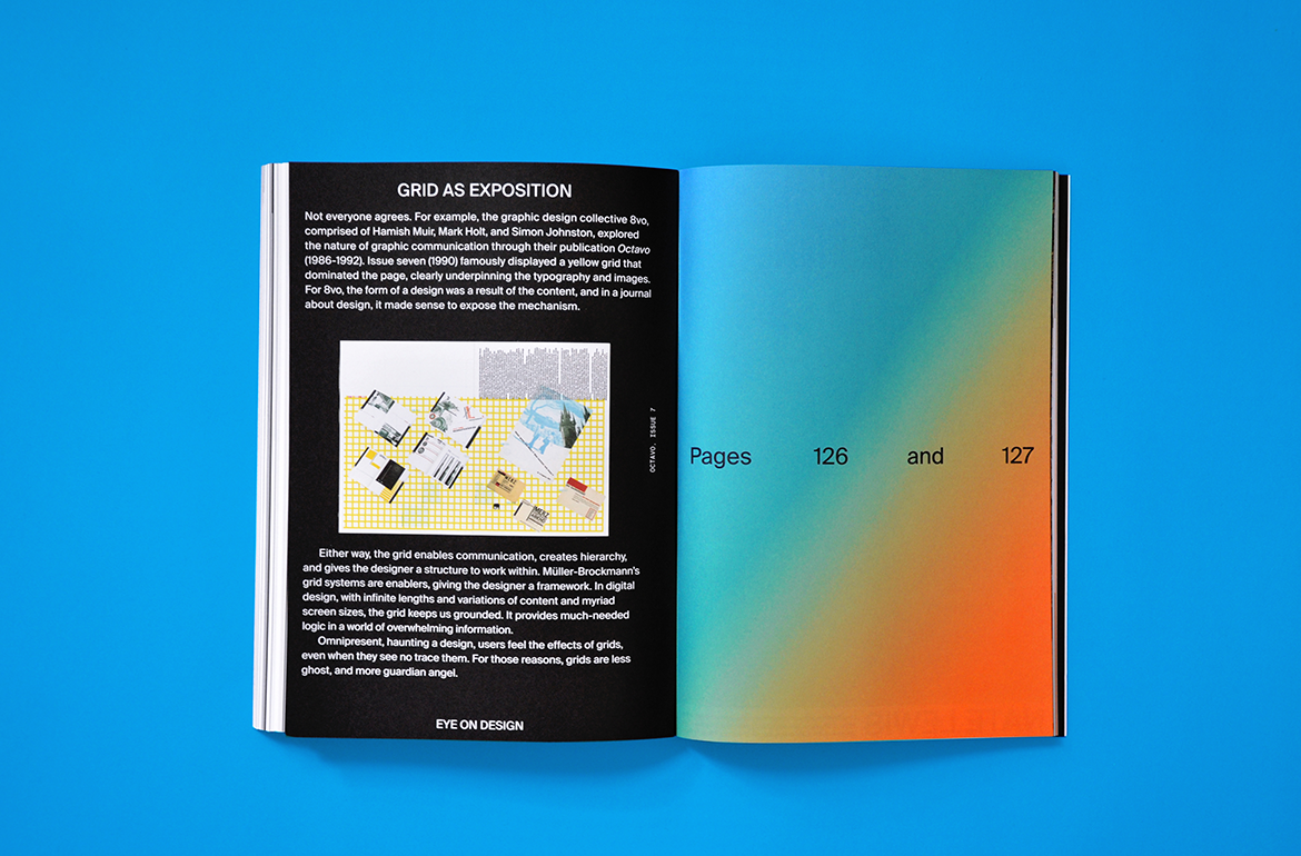
Book showing the article Getting Rid of the Grid by Luc Benyon
A conversation with Alexandra Bell by Tala Safie
Alexandra Bell reveals hidden media bias with her series Counternarratives, which explores the impact of language and editorial design in formulating cultural narratives
Getting Rid of the Grid by Luc Benyon
Needed then deleted, even the strictest design devotees want to keep their system-building weapon a secret

4. Tell us how you came up with the idea of working with different designers for each issue.

This is an important part of our publishing model. It means that each issue will look totally different, aside from a few core elements of the Eye on Design print identity, like the die-cut eye on the front cover. It also means that we’re putting our money where our mouth is, so to speak. We support and cover experimental design and emerging designers on the site. Now with each issue of the magazine we’re saying to our guest designer, we believe in your work and your vision, you have full design control. This is another way that we’re showcasing the design that we find most exciting—not only by writing about it, but by giving those designers a new and unfettered platform for their work.

For the first issue, we commissioned Maziyar Pahlevan, who makes really smart work that’s also very monochromatic and plays with type in interesting ways, which we thought would fit nicely with our theme. Maziyar is a designer who we’ve long admired; online, we might run a profile of his practice and some nice images of his work. For the magazine, we were bringing him onto our team for a few months, and asking him to design it cover-to-cover. And we learned a ton from working with him so closely. Our hope was always that the end product feels as much his as it is ours.


“With print, we get to slow down and really dig deep into a topic, spend a few months writing, editing, and thinking about the format we want these pieces to take, the art, how the whole magazine will fit together in the end. Plus, we get to work with the tactility of paper and on the grand scale of printing. And then at the end we can hold our work in our hands—it smells like the ink we chose, it feels like the paper we mulled over, it looks like the files on our screen, but richer and with depth. It’s insanely satisfying. ”
Meg Miller
Senior Editor of Eye on Design

open book showing Getting Rid of the Grid by Luc Benyon
Getting Rid of the Grid by Luc Benyon
Needed then deleted, even the strictest design devotees want to keep their system-building weapon a secret
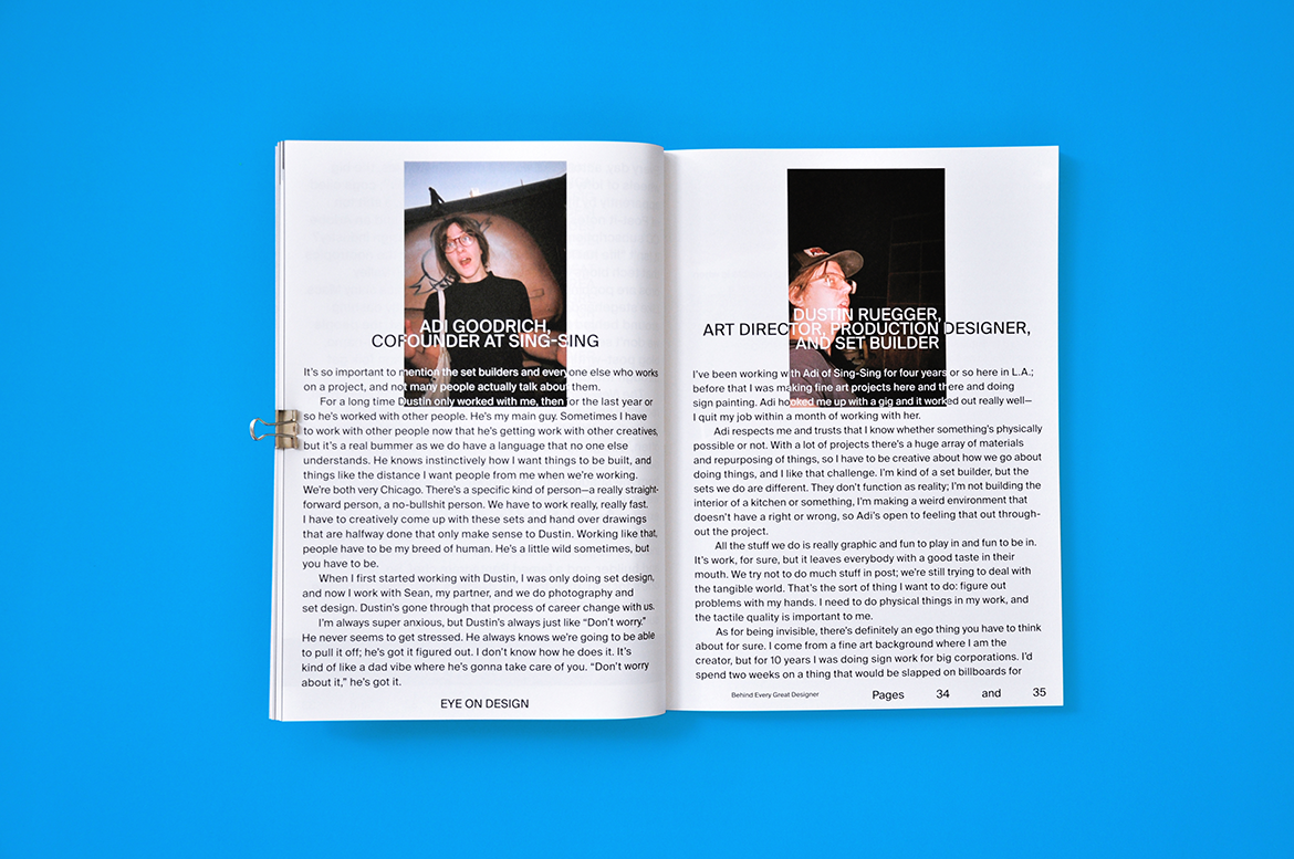
open book showing Behind Every Great Designer by Emily Gosling
Behind Every Great Designer by Emily Gosling
A set builder, studio chef, and masseur to font engineers step into the limelight

5. How do you curate the content for each issue?

We start by having a series of pitch meetings where we talk deeply about the theme of the issue, what sort of topics we want to address, and how we want to cover them. Each issue will have bigger reported features; shorter articles and design history-focused essays; interviews; a comic; and a series of visual portfolios, which, in the first issue, include a photo essay by Nate Lewis and a piece of visual satire by our in-house designer Tala Safie. We also sent a disposable camera to some of our designer friends and the “unsung heroes” they work with and rely on, but who maybe don’t get the chance to step out from behind the scenes, and we asked them to photograph each other. In each issue, we’ll always collaborate with designers and illustrators to tell stories in a variety of formats, from in-depth reporting to fun, unexpected moments of surprise and delight.

6. What are you hoping to accomplish with Eye on Design as a physical magazine?

We want to publish a beautifully designed, thoughtful, and compelling print product three times a year that’s filled with interesting and valuable design journalism. We want to get it into the hands of AIGA members and Eye on Design readers around the world who we know appreciate the value of print. We also want the format to lead us to new ideas and new forms of coverage, and for that coverage to inform the online publication and play out in the form of live events. Ideally, down the line, we want to see the magazines lined up together on shelves, referenced and worn, much like the issues of the AIGA Journal we love to flip through in the AIGA office archives.

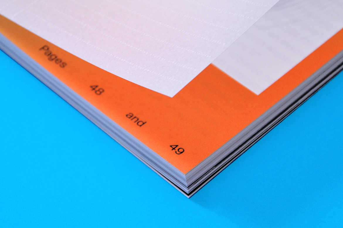
close-up of the corner of a booklet with bright orange printing
Detail of the Eye on Design Magazine Issue #01
The interior of the magazine was printed on Mohawk Superfine Smooth with an insert of Curious Collection Translucents.

7. How do you like working on paper vs. the web?

We love them both. With the web, the pace is a little more agile for covering things as they happen, for providing a testimony of this moment in design, and for having a real-time relationship with our audience. It’s like being in a constant conversation about graphic design, which is fun for us, and we get to talk to designers about what they’re doing and what’s most important to them. With print, we get to slow down and really dig deep into a topic, spend a few months writing, editing, and thinking about the format we want these pieces to take, the art, how the whole magazine will fit together in the end. Plus, we get to work with the tactility of paper and on the grand scale of printing. And then at the end we can hold our work in our hands—it smells like the ink we chose, it feels like the paper we mulled over, it looks like the files on our screen, but richer and with depth. It’s insanely satisfying.


“We wanted the magazine to be made with the highest quality materials, and we knew Mohawk had the best paper supply to choose from. The fact that Mohawk has such a focus on design and a long history of working with designers doesn’t hurt either. It’s such a natural fit.”
Meg Miller
Senior Editor of Eye on Design

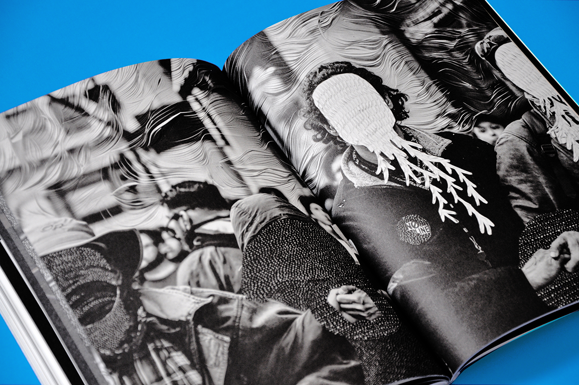
open Eye on Design catalog
Photos by Nate Lewis

8. What made you choose Mohawk paper to work with?

We wanted the magazine to be made with the highest quality materials, and we knew Mohawk had the best paper supply to choose from. The fact that Mohawk has such a focus on design and a long history of working with designers doesn’t hurt either. It’s such a natural fit. When we hand the design reigns over to our issue’s guest designer, we also get to hand over the Mohawk paper sample book and say, Pick anything you like. Designers almost never get that kind of freedom. It feels amazing to put that in their hands. It’s a gift. And then in return we get to see what they come up with when they’re given the best materials and total freedom. That’s our gift, and the readers’, too.

9. Any other stories or comments you would like to share?

With each issue we’re not only excited to push the bounds of what design journalism can be, but we also want to experiment with what a design magazine can be. Whereas our first issue is sort of quietly radical, in that the color palette is pared way back but the editorial design choices are often unexpected, our second issue will be, well, it’ll be quite different. We can’t say more than that right now, but people should subscribe to be the first to see what we’re excitedly working on right now.


Production Notes

PN-print-process
Print Process
Foil Stamping
capability_infoi
Offset Printing
capability_infoi
bindary
Bindery
Perfect Bound
capability_infoi
roll
Offset Printing Capabilities
4 Color
capability_infoi
PN-designer
Designer
Maziyar Pahlevan

Suggested Articles

Mohawk Blog

The Perfect Match

Explore color and texture through the eyes of Thomas Heinz. Mohawk introduces, The Perfect Match.