Mohawk Blog

Under Armour Spring/Summer ’15 LookBook: Designed with the Athlete in Mind
Words
Diane C. O'Connor
MOH_UnderArmour_040615_cover

Founded in 1996 by Kevin Plank, a former University of Maryland football player, Under Armour is a global powerhouse in the world of performance apparel, footwear and equipment.
Known by athletes as the go-to brand for staying cool, dry and comfortable during a game or workout, Under Amour is continually innovating and expanding its technical product assortment with a mission to make all athletes better.

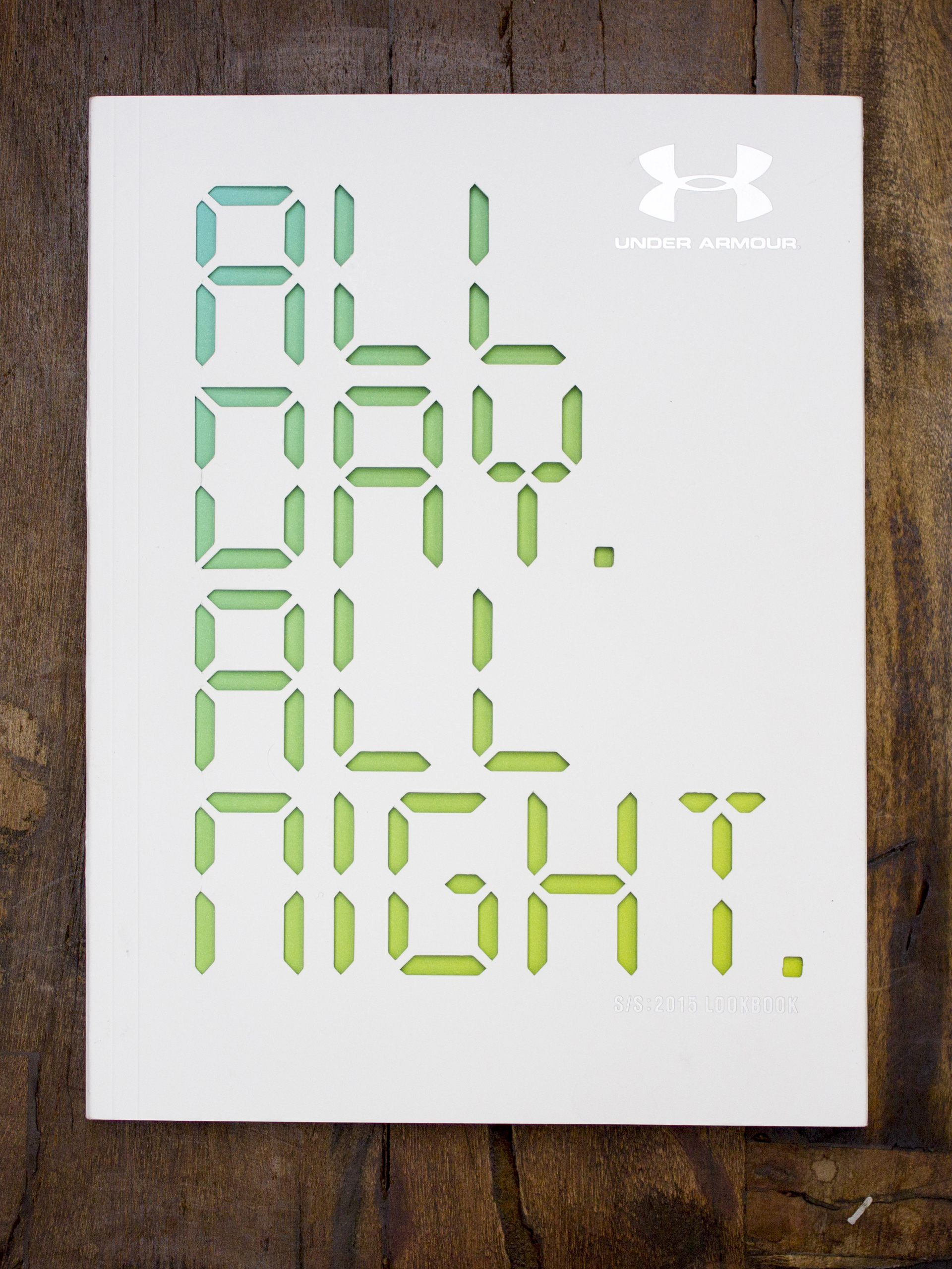
Under Armour’s Spring Summer 2015 LookBook, “All Day. All Night.” was designed to educate journalists, bloggers and industry influencers about the brand’s ever growing product line; while demonstrating how Under Armour’s performance gear can stylishly take athletes through every hour of their day. Just like the brand’s signature apparel, the Spring Summer 15 LookBook exudes style, energy and excitement.

We recently caught up with Under Armour’s in-house creative and communications teams to learn more about the project.

MOH_UnderArmour_040615_02

Can you share overall design direction behind the UA SS 15 Lookbook?

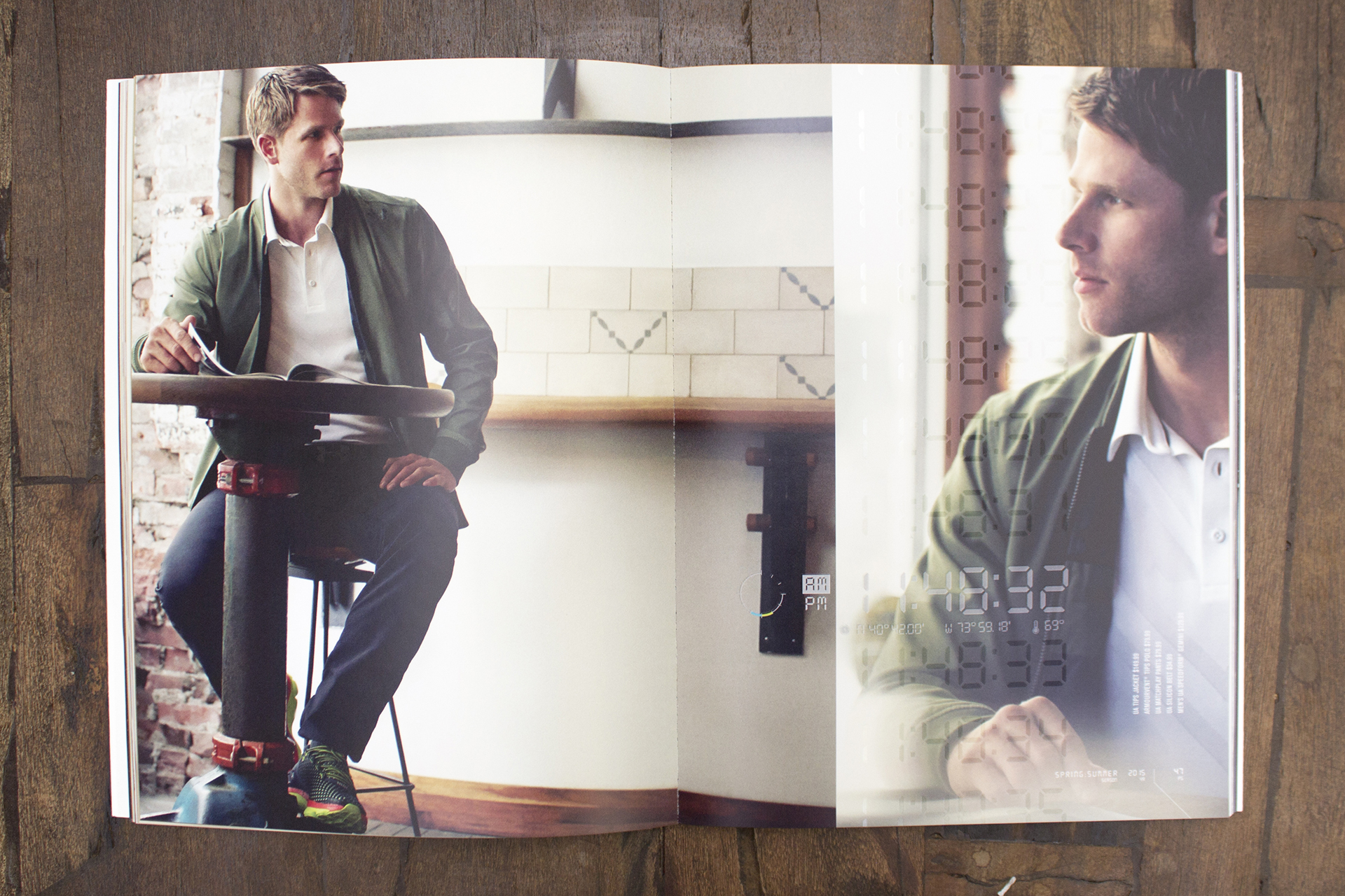
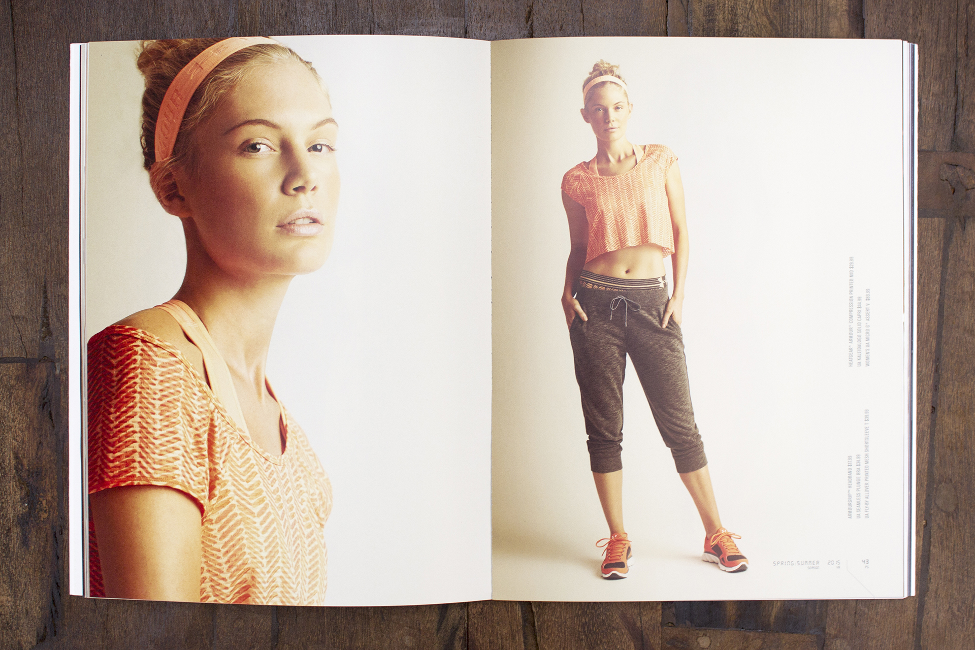
The SS ‘15 lookbook, like our previous lookbooks, was designed with the athlete in mind. But for this particular season we took it a step further–the goal was to demonstrate how Under Armour can be the go-to brand for athletes beyond just the gym or the studio (although we’ve still got them covered there too). We wanted to structure it so that the lighting, settings, and product came together in a way that might make a new consumer, someone who maybe didn’t think of him or herself as the typical Under Armour athlete, look at it and see how it could be incorporated into his or her existing wardrobe. It was about expanding the reach of our product and our message.

MOH_UnderArmour_040615_03

What story did you wish to convey?

Under Armour is known as a sports apparel brand—and that is definitely a huge part of our DNA. But as Under Armour has expanded, so has our product range, and we really wanted to convey that in this particular book. The key story was that Under Armour can outfit you 24/7—from the studio to the street; from your tempo run to your coffee run. To take it a step further, we wanted to show that we’ve created product that combines the high-performance innovations that Under Armour is known for and executed it in a way that looks right off the field, too. Using a combination of on-location and in-studio shots, we were able to depict how Under Armour has you covered (literally) from the moment your alarm goes off in the morning, though your workout, to your afternoon coffee, and into your post-work social setting.

MOH_UnderArmour_040615_04

What feel/mood were designers looking to inspire?

The design of the Spring/Summer ’15 lookbook definitely tapped into the bright, youthful energy associated with Under Armour. UA is a brand on the move in so many ways, and that came through in the mood of the book—we’re making product for an on-the-go individual who looks great without too much effort while living life to the fullest.

MOH_UnderArmour_040615_06

What reactions/feedback have you received?

From a PR perspective, we know that our media and influencer contacts absolutely love our lookbooks. We make an event out of distributing them (in conjunction with debuting the new collection for the season) and these editors look forward to receiving their new books each season. They also expect that, like the collections, the books are going to get better and better each time! We also know that they utilize the books heavily—we never go more than a day or two without getting an inquiry that references our look book in one way or another. It’s definitely one of our primary tools for getting our product out into the world.

MOH_UnderArmour_040615_05

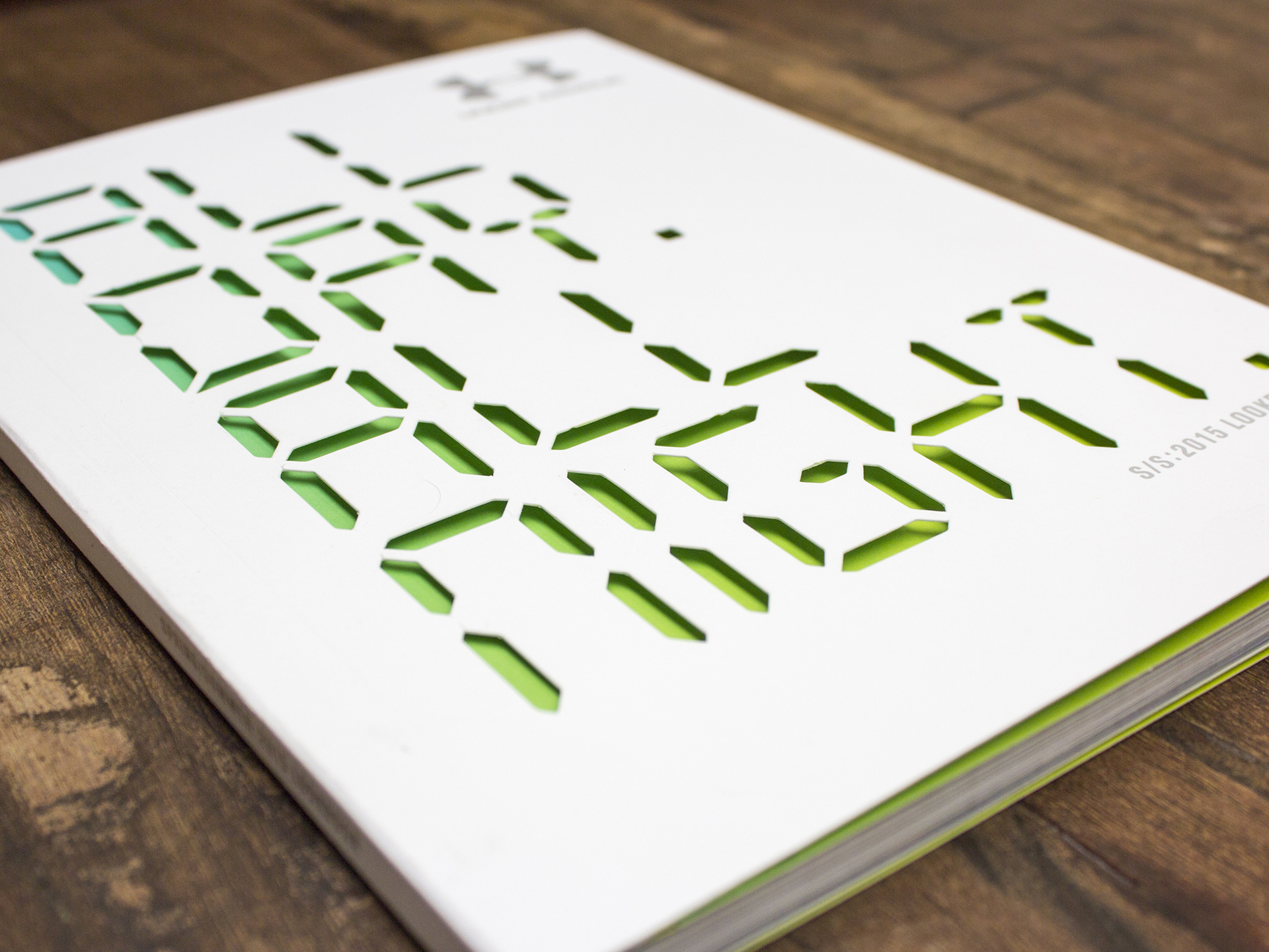
The book is a combination of digital and four-color process printing. The color of the cover suggests Spring through the use of shades of light greens, blues visible through diecut white cover. How challenging was it to match the colors from the inside front cover throughout the printing process as you used different printing processes/equipment?

The cover was produced first on a conventional offset press and served as a reference guide for the internal pages, which were printed on an HP Indigo Digital Press. Our printing partner McArdle did a wonderful job of carefully monitoring the quality on the digital press to keep those spring-like colors consistent throughout.

MOH_UnderArmour_040615_01

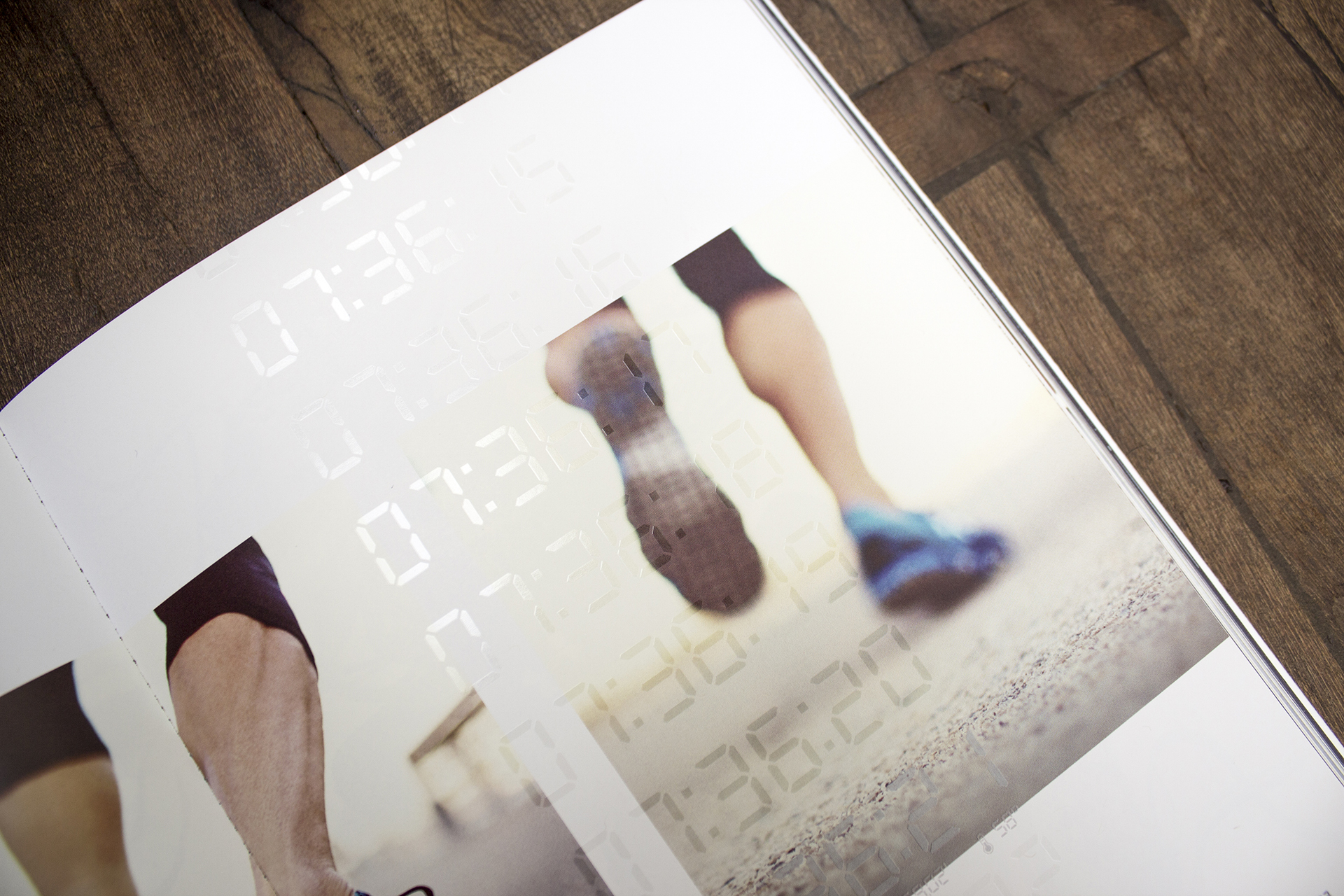
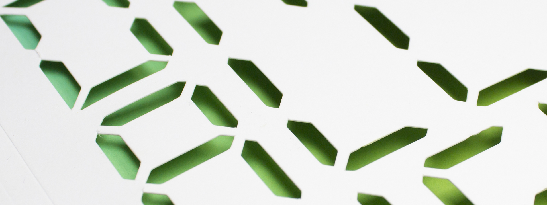
Tell us about the die cut copy on the cover…and embossed digital numbers on each page using raised white ink, why was it important to use these unique printing processes?

Our lookbooks give us a chance to make a unique piece that takes advantage of all of the printing techniques available. The die cut on the cover gave us a window to provide a splash of color to the front of the piece. The clear raised ink mimics the advancing time on an LED clock. Both processes (die cut and raised ink) really set the mood for the book, which takes you through a day full of Under Armour.

MOH_UnderArmour_040615_07

Printer acknowledgements?

McArdle was our printing partner on this project. Their usage of the HP Indigo digital press helped bring our vision to life. We were able to run multiple tests to determine such things as the correct thickness to lay down the raised ink so that it was noticeable, but not too distracting. Even with some last minute changes we were able to pull off an amazing piece on time.

Why was Mohawk paper selected for the project?

The Mohawk Superfine paper really holds the ink well for a project like this. We needed the cover to be smooth enough and white enough to give a nice, clean look, but also have a slight bit of texture to it that you could feel when you held it in your hands. It also does a great job of holding the foil stamped elements as well, even on the spine where the area was relatively small.

Do you feel the printed version of the lookbook has more impact than its digital counterpart? Why?

Despite the fact that we live in a technological age and more and more processes are becoming digital, we know that our key editor contacts like to have a tangible book on their desks that they can quickly reference when they need to call in Under Armour product. That tactile aspect of the book is one reason we value the printed version so highly. Over the years, the physical design of the book has become more and more elevated, just like our Under Armour products. It’s a piece we’re really proud to share, both internally and externally.


Production Notes

PN-print-process
Print Process
Offset Printing
capability_infoi
bindary
Bindery
Perfect Bound
capability_infoi

Materials Used

Suggested Articles

Mohawk Blog

The Perfect Match

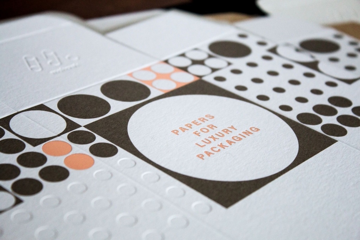
Explore color and texture through the eyes of Thomas Heinz. Mohawk introduces, The Perfect Match.