Mohawk Blog

Fitchburg State University: Contrasting Texture
Words
Mohawk
Photography
Mohawk
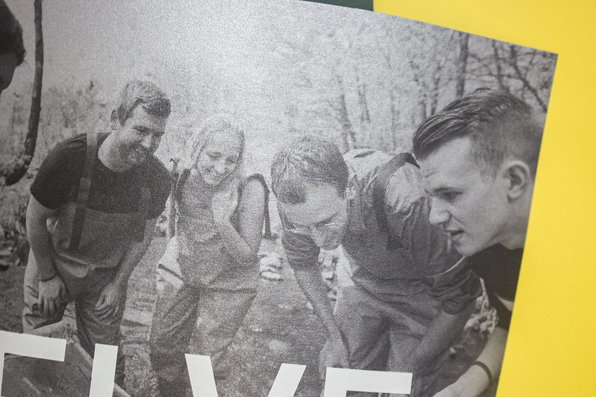
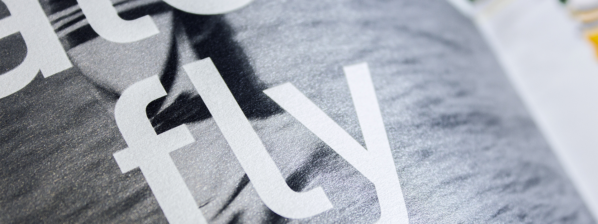
close-up of typography inside the Fitchburg State book

Pairing dramatically different textures can heighten sophistication and elevate your message, capturing your audiences’ attention through touch.
Have you ever thought about using textures so different from one another that they spark people’s senses as their fingers move from one texture to another?

Fitchburg State University, located in Central Massachusetts, offers quality undergraduate, graduate and continuing education programs that stress career-oriented learning firmly grounded in the liberal arts. For more than a century, Fitchburg State has emphasized small classes, extensive internship opportunities and an accessible faculty dedicated to the student.

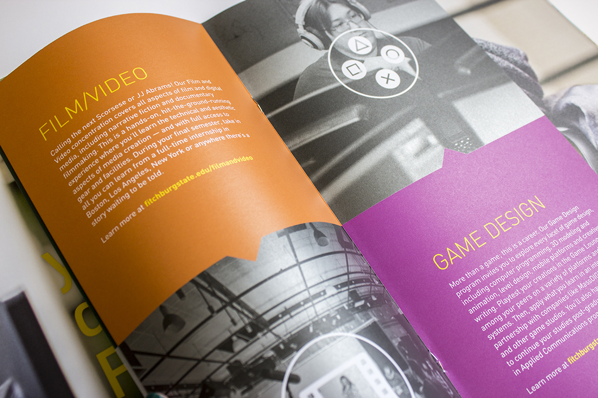
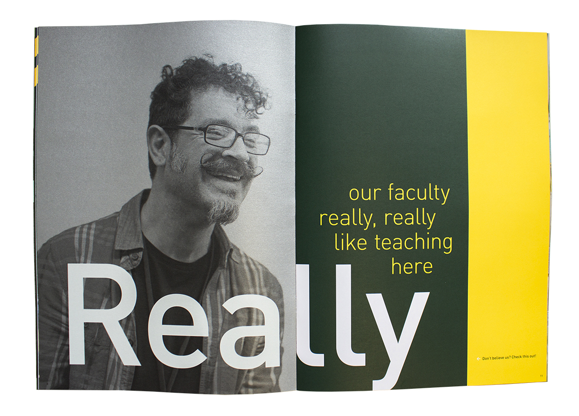
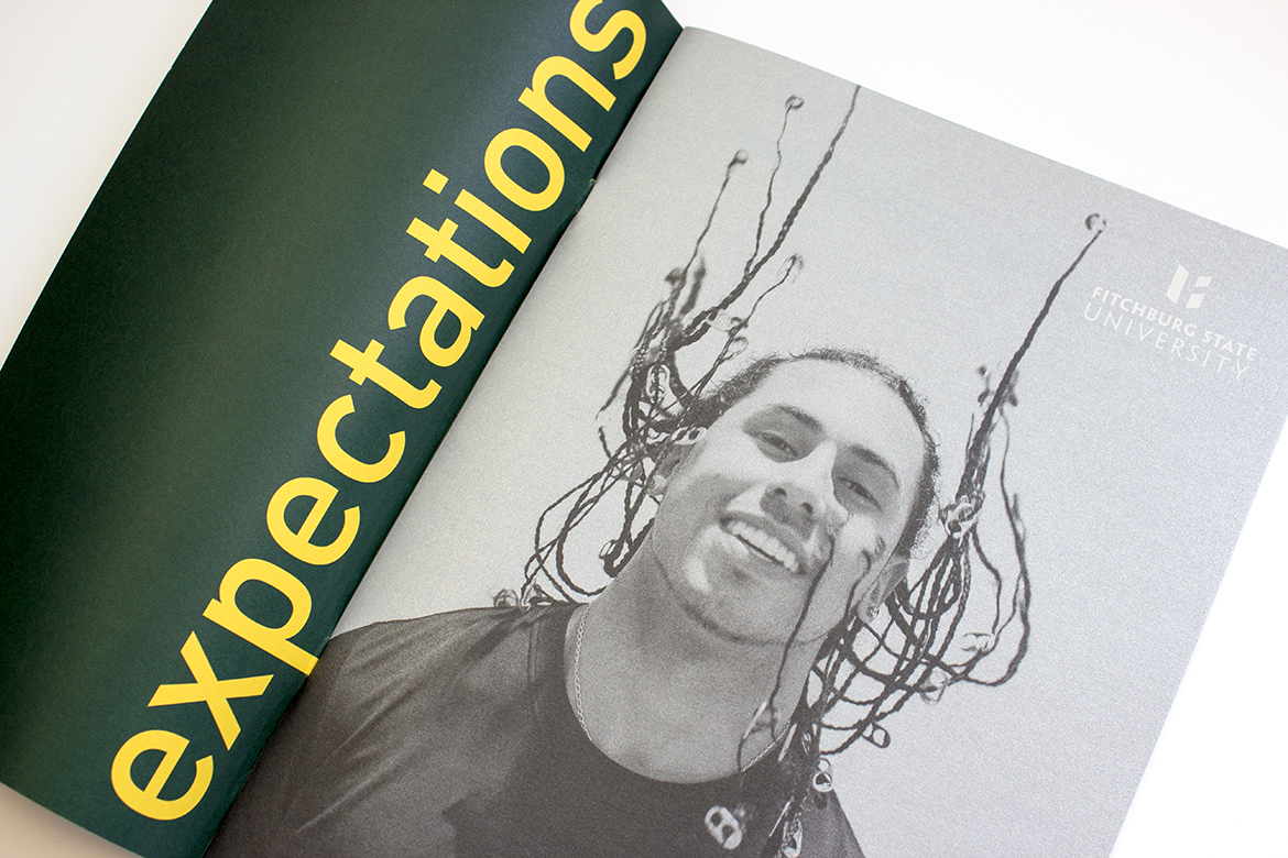
An inner page from the Fitchburg State book

Their 2017 viewbook focuses on how the university is defying expectations in their educational programs, the campus environment, and the value provided to their students. In order to become an effective tool in attracting the attention of prospective students, the materials used to print the book were thoughtfully chosen. Flipping from page to page, you’ll encounter three different stocks, all of which provide a different sensory experience in texture and color.

Inside the Fitchburg State book with green background, yellow typography, and monochrome images
Close-up of a black-and-white photograph

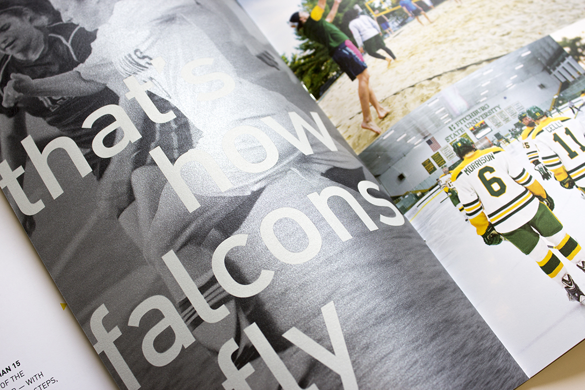
The majority of the interior pages are printed on Mohawk Options Navajo Smooth Brilliant White (Beautiful Collection), chosen for its rich smoothness. Glimpses of Mohawk Carnival Vellum Yellow (Expressive Collection) appear in the short sheet outer cover and inside the viewbook, a perfect match to Fitchburg’s brand yellow. Curious Collection Metallics Galvanised (Expressive Collection) was chosen to reflect the determination, edge, and hardworking mentality of the students and community.

Inner view of a spread that uses monochrome pictures and blocks of color

The design team at kor group led by Karen Dendy Smith and Matt Rogers, fully embraced paper and print to deliver an interactive experience and to tell a layered story.


“The design concept is based on visually expressing the new school theme: dig in, delve deep, defy expectations. We intentionally mixed the papers and page lengths to reflect the multiplicity of experiences at Fitchburg State University and printing UV ink on the papers made the colors more vibrant, rich, and consistent”
Matt Rodgers
Fitchburg State University

Close-up of typography and photography inside the book

Client: Fitchburg State University, Fitchburg, MA

Design: kor group, Boston, MA

Printer: Signature Printing, East Providence, RI

Paper Stock: Mohawk Carnival Vellum, Yellow 70 text; Curious Collection Metallics, Galvanised 80 text; Mohawk Options Navajo Smooth, Brilliant White 80 text

Printing: All LED UV Inks used. 4-color process; Match Green, Opaque White, Dense Black and Metallic Ink

Bindery: Saddle Stitched


Tips on how to contrast texture:

  • Avoid similarities. Find textures that are very different from one another. Otherwise, the shifts in texture may be too similar and go unnoticed.
  • Strike a balance. Especially when striving for a thoughtful and refined feel, you’ll want to pair loud, eye-catching textures with those that are subtler.
  • Turn up the volume. If over-the-top, no-holds-barred, undeniable character is what you’re after, then forgo the subtleties and pair two bold textures.

If you’re looking for inspiration, examples, and more tips on how to increase the impact of your next printed project through careful paper selection, click here to learn more and take your work from good to great.


Production Notes

PN-print-process
Print Process
Offset Printing
capability_infoi
Ultraviolet (UV) Printing
capability_infoi
materials_techniques
Materials + Techniques
Match Colors
capability_infoi
bindary
Bindery
Saddle Stitching
capability_infoi
roll
Offset Printing Capabilities
4 Color
capability_infoi
PN-printer
Printer
PN-designer
Designer
kor group

Suggested Articles

Mohawk Blog

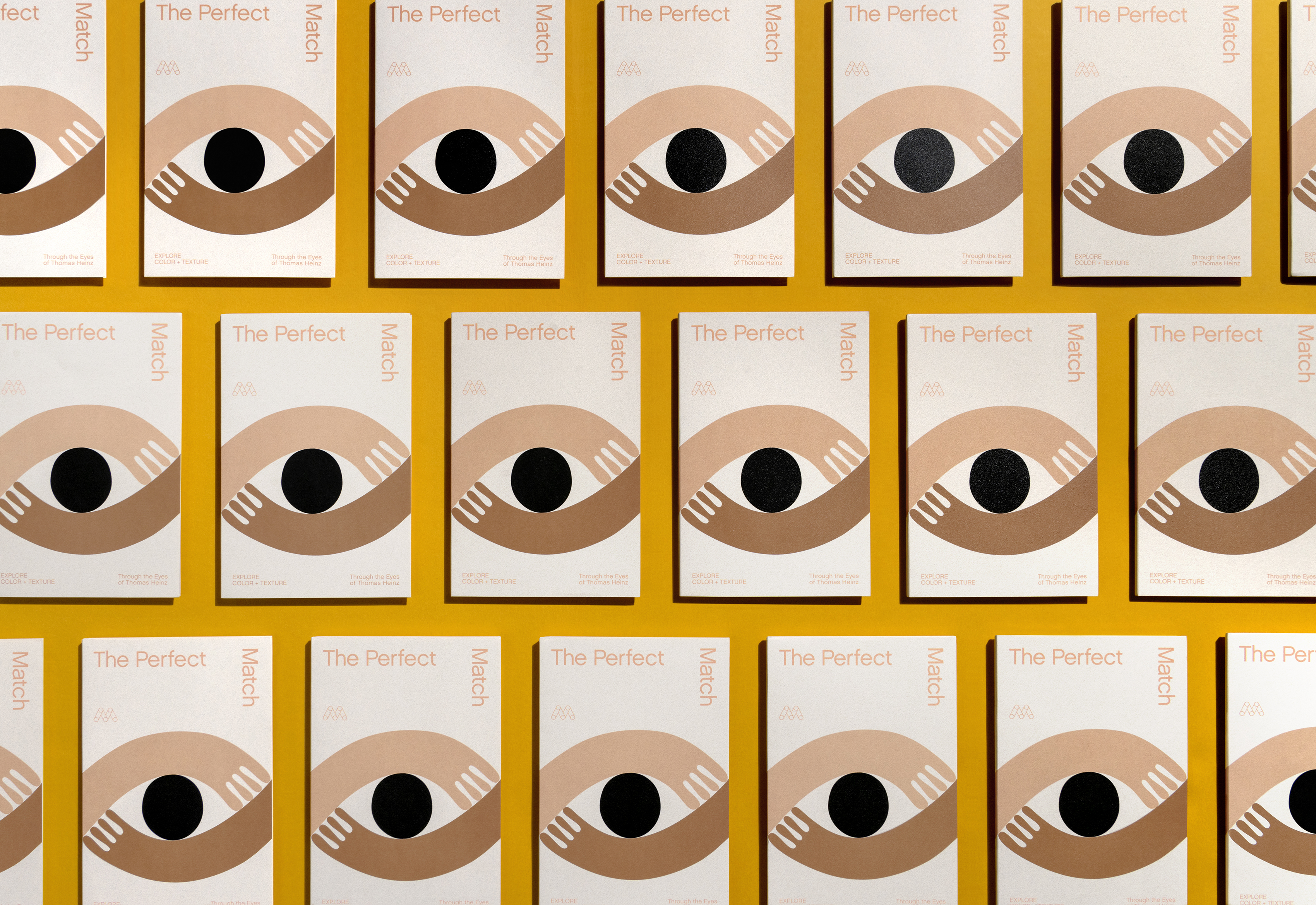
The Perfect Match

Explore color and texture through the eyes of Thomas Heinz. Mohawk introduces, The Perfect Match.