Mohawk Blog

Will Bryant: Use Paper as a Bonus Color
Words
Mohawk
Photography
Will Bryant
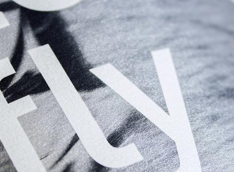
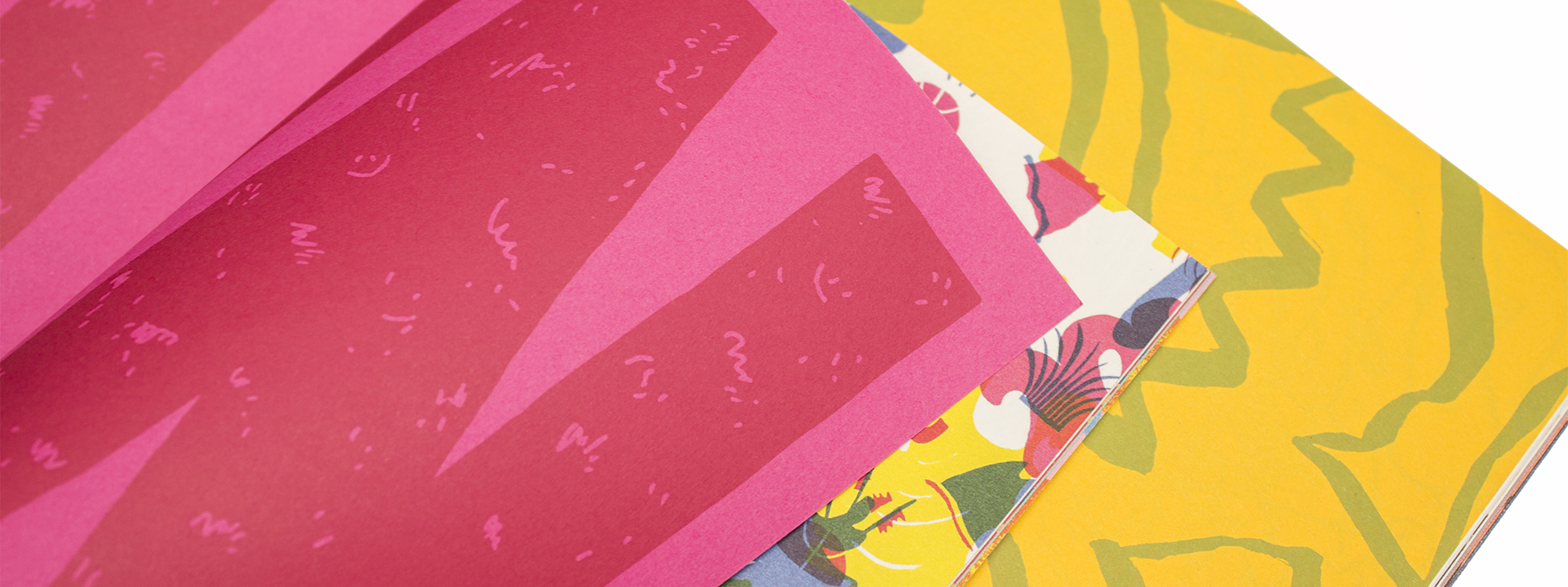
Close-up of Will Bryant pages

Colored paper opens up new possibilities for design and communication. Used with 4-color printing, it can become part of the image itself, giving you an additional color to work with. Have you ever thought about using colored paper as a bonus in your project?
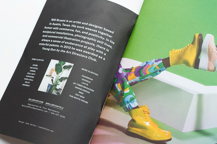
Will Bryant is an artist and designer based in Austin, TX. His work weaves together humor with commerce, fun and positivity. In his sculptural installations, photographic still lives, and commercial illustration projects, there is always a sense of exuberance at play with a colorful palette.

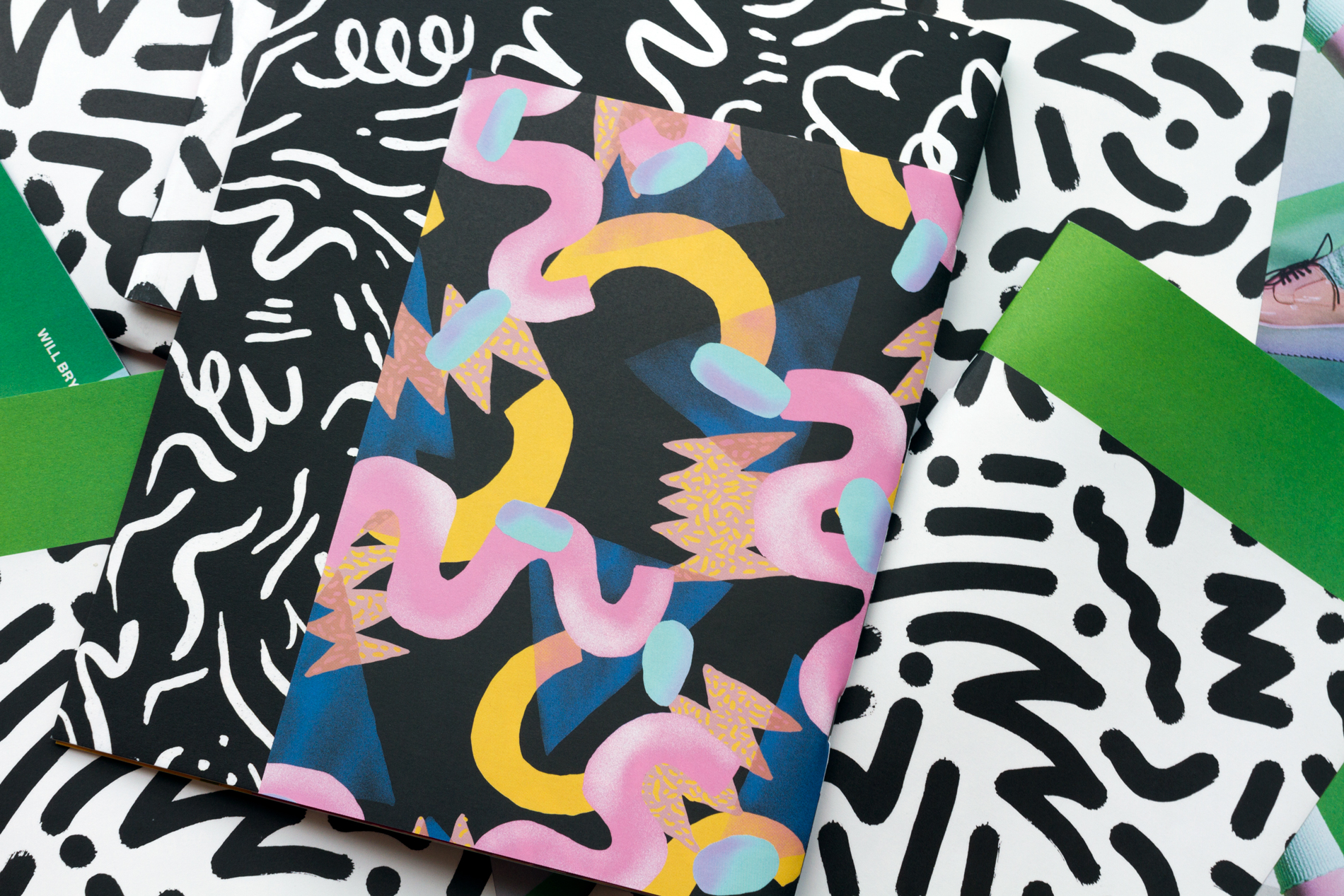
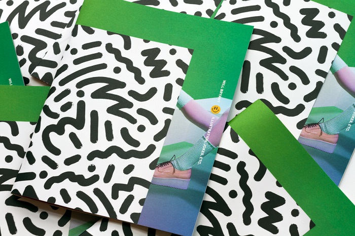
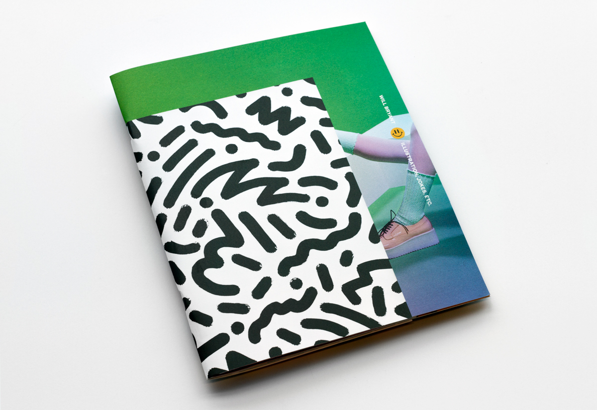
Front of Will Bryant promo with black and white printed wrap
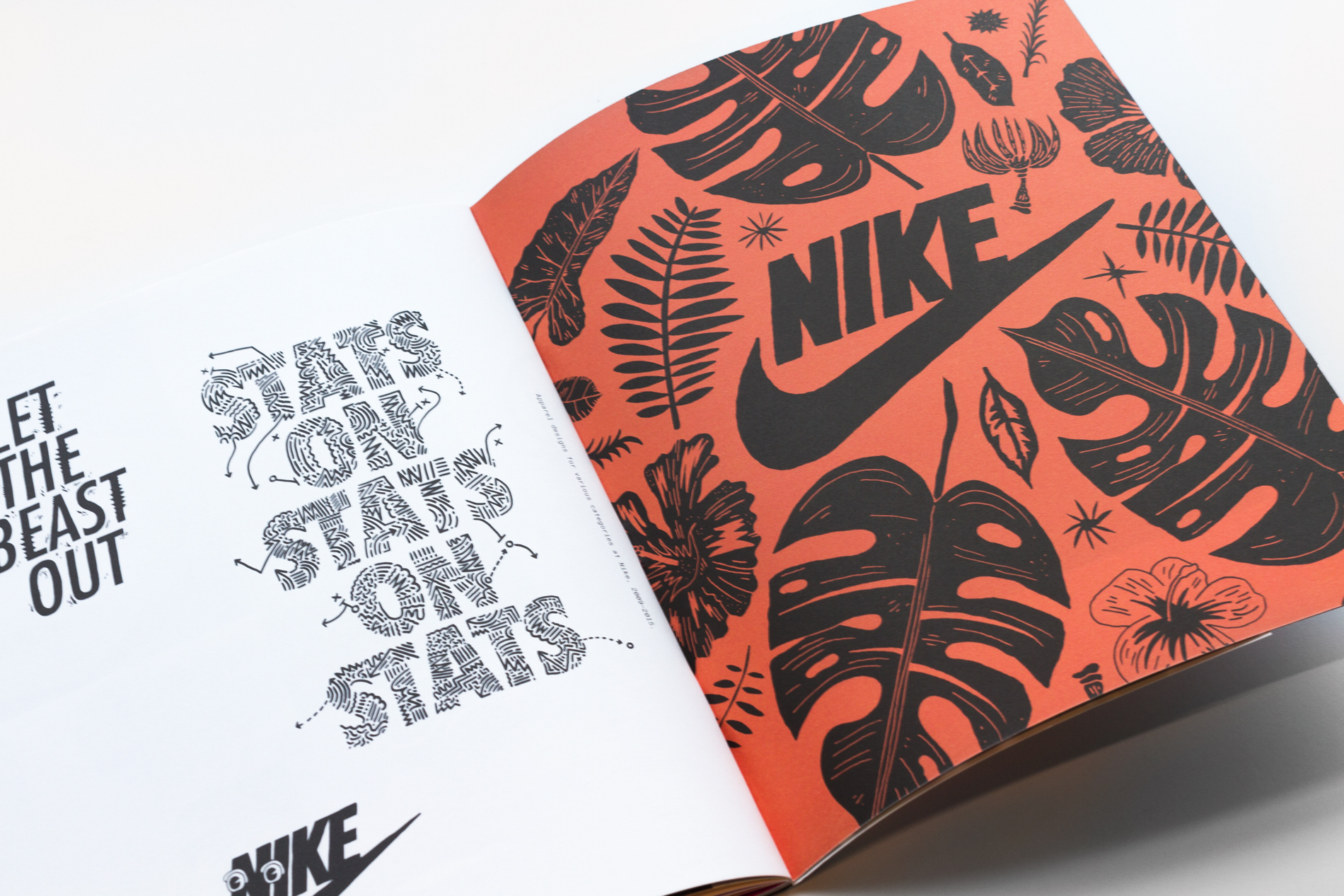
Nike art in Will Bryant promo

He has worked on projects with Adobe, Adidas, Converse, Coca Cola, Facebook, Google, Nickelodeon, NYT Magazine, Nike, Printed Matter and The White House, among others. Despite this formal third person bio, he doesn’t take himself too seriously. To help promote his work, Bryant created a printed portfolio using a variety of Mohawk papers.

Pile of randomly arranged Will Bryant promos
inside of Will Bryant brochure

“This was a challenging book to make mostly due to the fact that I was trying to meet a lot of requirements that were somewhat contradictory,” says Bryant. “My agent needed a printed portfolio for book showings, but I also wanted to create an impressionable leave behind piece that showcased the range of my work while conveying my personality—a mixture of wacky, weird, slightly irreverent, but also professional.”


“Is it an art book? Is it a portfolio? Can it be both? Those are somewhat opposing objectives, but I think what makes this all work is the design, nice printing and incredible paper.”
Will Bryant
Artist + Designer

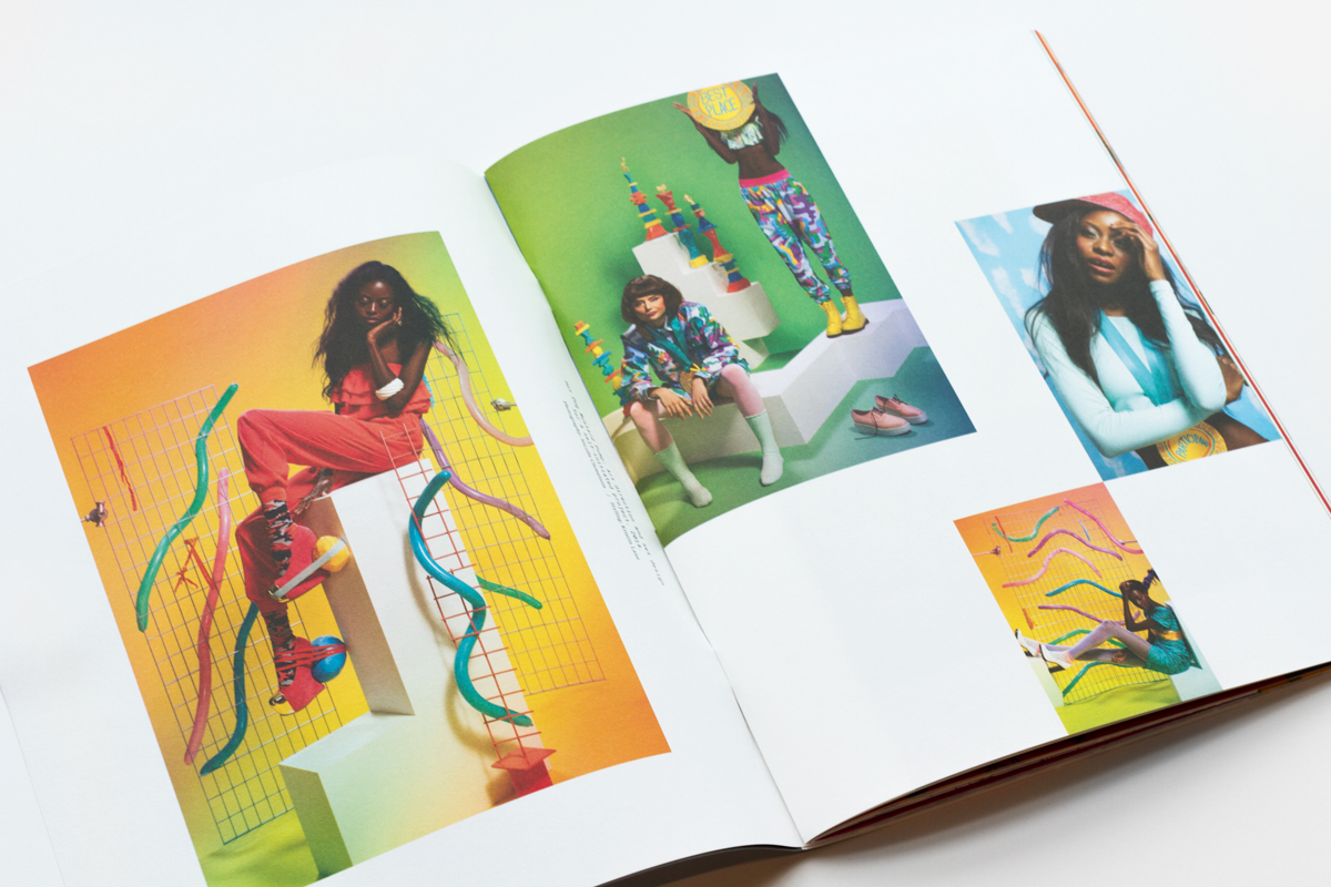
Inside art showcased in Will Bryant promo
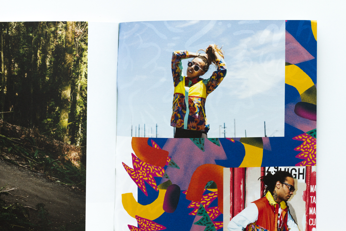
More art close-up from inside Will Bryant promo

“It felt right to keep any design elements to a minimum, given how much is going on in his work,” designer Cody Haltom adds. “We wanted the visual interest to come from pairings, overlapping elements and variation in style, as opposed to layering elements over the work. We also focused on contrast, in design and paper, to help make the final piece more engaging.”

The book contains three different Mohawk papers varying in color as well as texture: CarnivalVia and Options in 70 or 80 text weights.

“We chose thinner stock because we were dealing with multiple books, and didn’t want it to feel clunky,” Haltom states. “The lighter weight also helps with a more casual feel than it would have with heavier stock. We also liked the interplay between pages with a thin sheet; happy accidents where objects from other pages show through.”

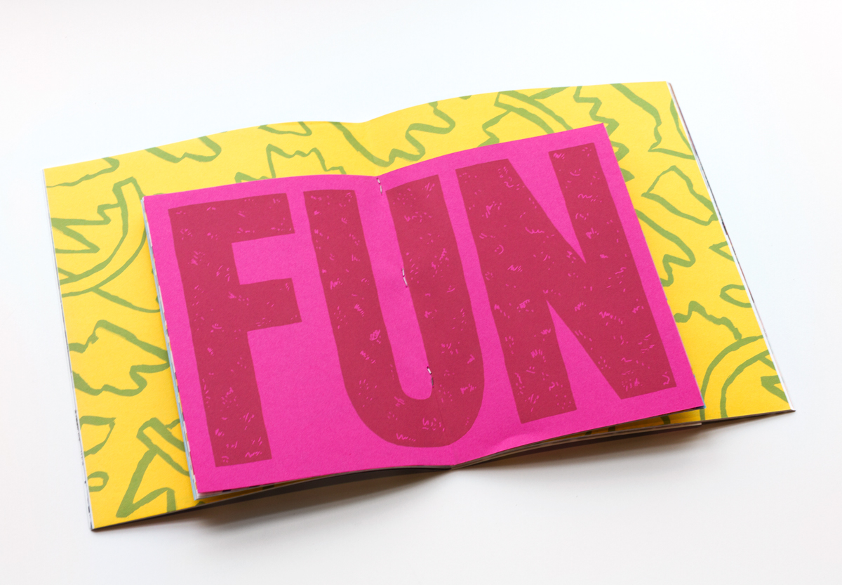
Inside of Will Bryant promo with blocky typography and graphic illustrations

The book contains individual projects and one-off projects which are visually separated through the use of different sheet sizes; the individual projects are on the larger sheets while the short sheets contain Bryant’s one-off projects.

“Texture was important as well. It’s subtle, but the textural contrast references the contrast in the work,” Haltom adds. “The smaller book was meant to feel like its own zine, and the tooth from the vellum sheet adds to that.”

The book was printed at OneTouchPoint SW in Austin, TX.


“After more than 45 years in the printing industry Mohawk has not failed client expectations or my own. Great ink hold-out and always confirmed customer satisfaction on press and after the job has been completed and delivered. The natural feel of Mohawk’s outstanding, uncoated, fine papers are always rewarding to print and bind. Fine Papers are alive and well.”
Roland Castuita
OneTouchPoint

Abstract designs on Will Bryant promo

Client: Will Bryant, Austin, TX

Design: Cody Haltom, Austin, TX

Printer: OneTouchPoint SW, Austin, TX

Paper Stock: 

Printing: 4-color process

Bindery: Saddle Stitched short sheets, self-cover with interior short sheets


Tips on how to use paper as a bonus color:

  • Start light and bright. If you are printing traditional 4-color process, use lighter paper colors as they will impact printed color in a more subtle fashion.
  • Think about the ways in which colors mix. Choose your colors based on how non-opaque inks will look with a little paper showing through.
  • Don’t fear the dark. Deep, rich papers can be impactful additional colors, with an under-base recommended. Three to four hits of white work well.

If you’re looking for inspiration, examples, and more tips on how to increase the impact of your next printed project through careful paper selection, click here to learn more and take your work from good to great.


Production Notes

PN-print-process
Print Process
Offset Printing
capability_infoi
bindary
Bindery
Saddle Stitching
capability_infoi
PN-designer
Designer
Will Bryant
Cody Haltom

Materials Used

Suggested Articles

Mohawk Blog

Perennials Fabrics: Matching Texture to Content

We’ve seen that the way paper feels is powerful and how we use it can make a difference. Every project is about something, be it adventure travel or single origin chocolate. Have you ever thought about finding textures in the content, product or stories that you can emulate through paper?