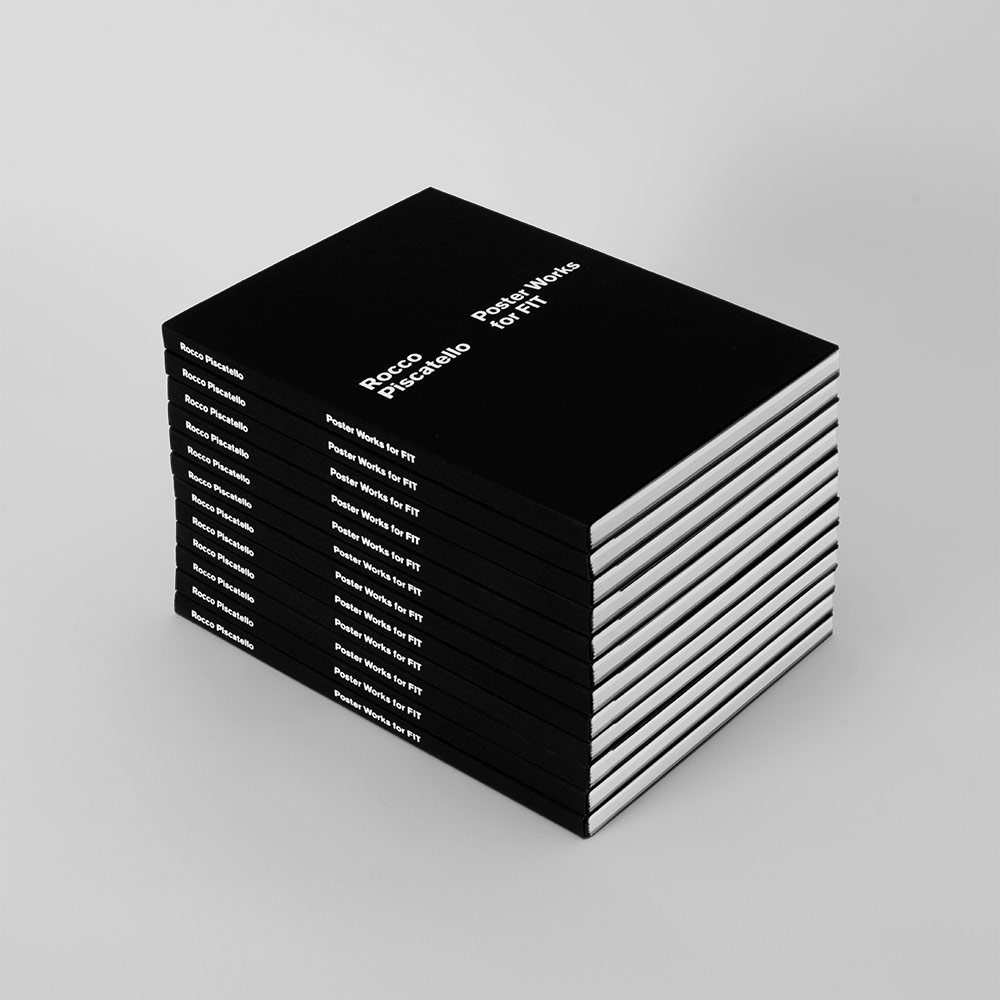
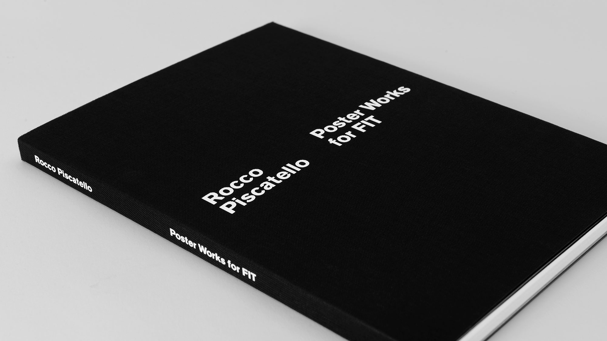
Rocco Piscatello: Poster Works for FIT
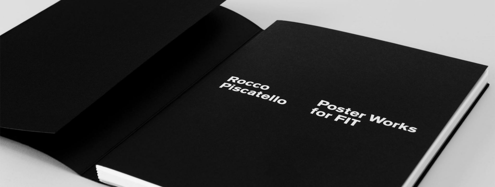
We all love a good poster. But, what makes the design for a poster effective?
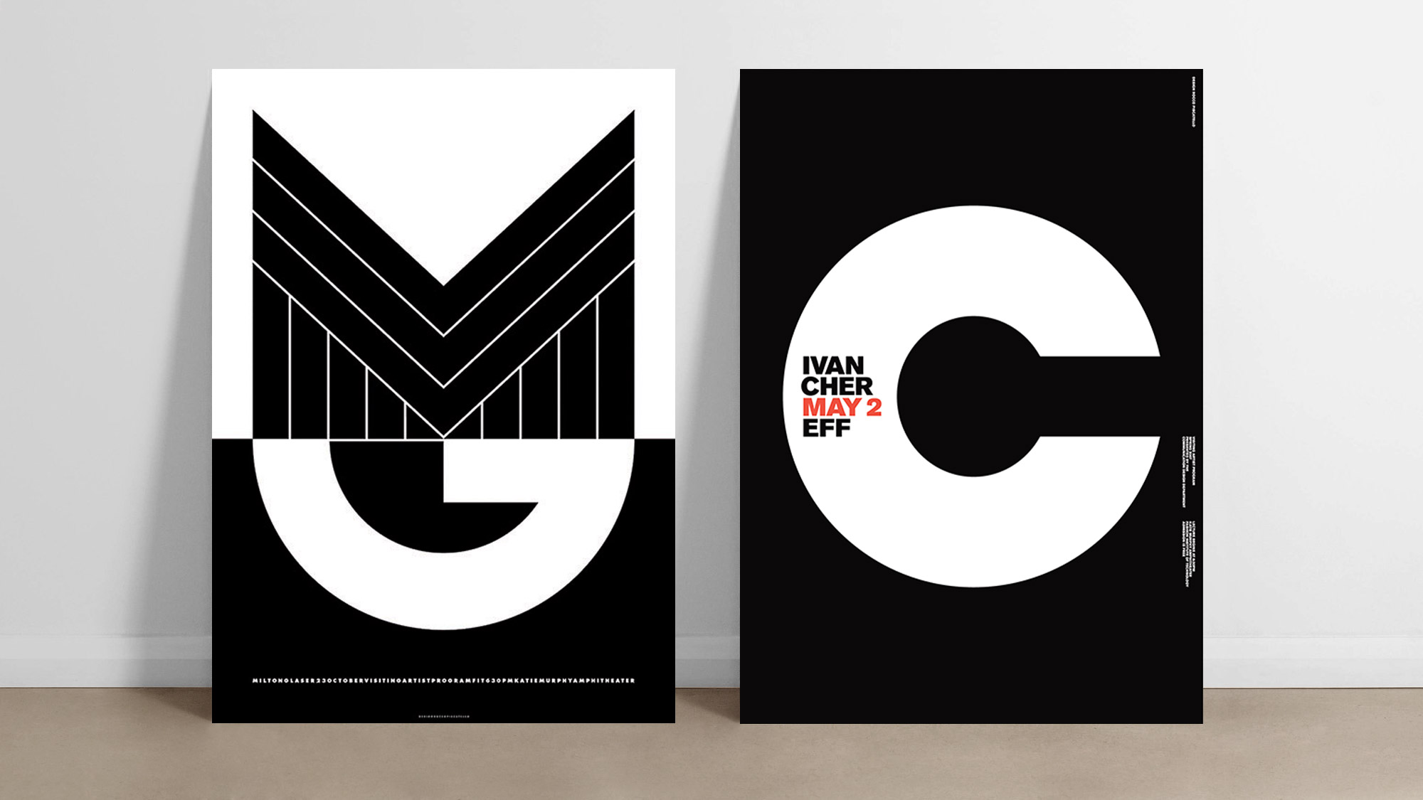
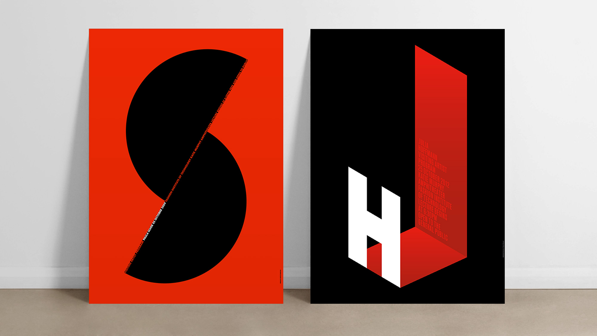
Reflection by Rocco Piscatello
In today’s digital world, the opportunity to design a print poster for the purpose of promoting an event is rare. When the Fashion Institute of Technology approached me to design a poster for their newly formed Visiting Artist Program, I immediately said yes. Their brief was very succinct: create a poster announcing a designer’s lecture, while adhering to strict budgetary constraints.
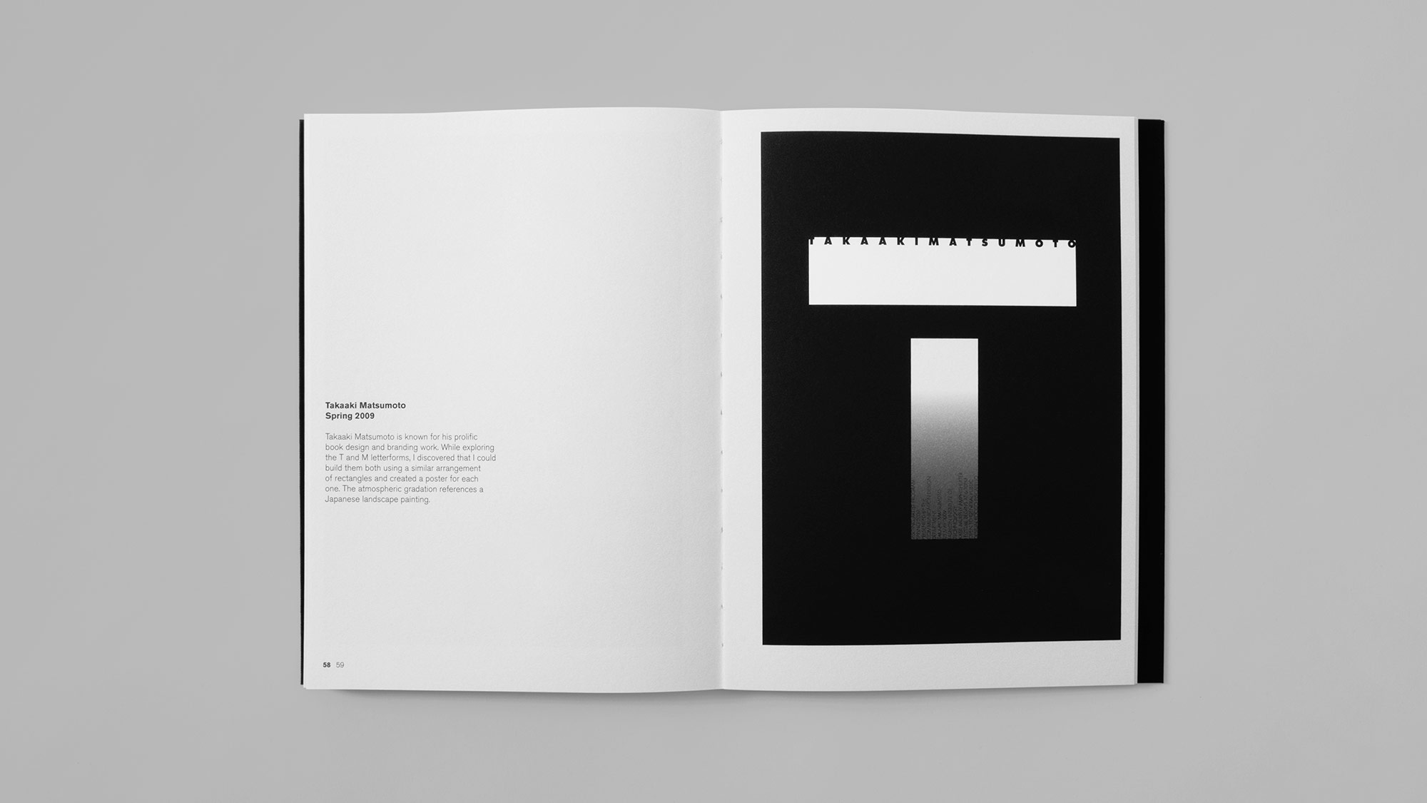
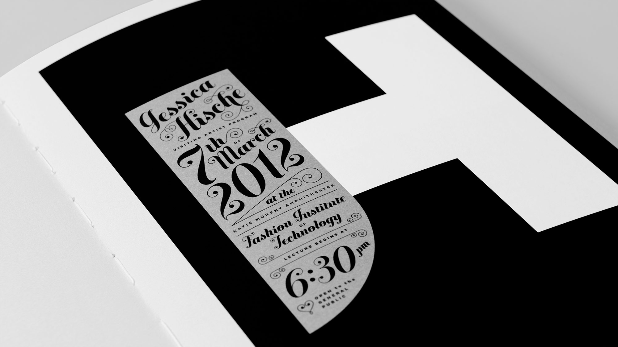
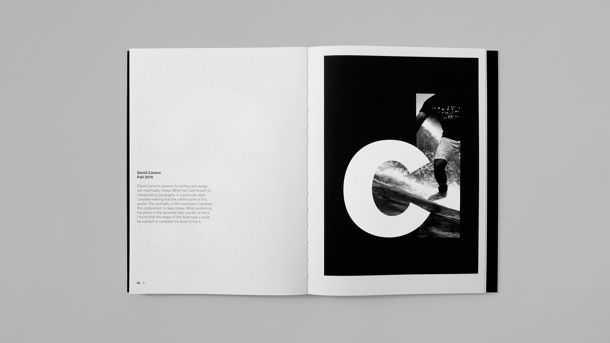
One poster quickly multiplied to two. A dozen years later they accumulated to a collection of twenty-four. The posters are all represented here in reverse chronological order.
Looking back and reflecting on the work included in this book, I have identified ten qualities that make the posters enduring.
- Clarity of Message- It is my responsibility to ensure that the message conveyed is clear and meaningful. Type size, style and color are used to highlight the most important information.
- Dramatic Proportion and Scale- My work pushes the limit of scale and legibility to create engaging and monumental forms. This attracts attention and inspires interest from my audience.
- Geometry and Mathematical Proportion- The elements and compositions in my work are built from geometry and use mathematical proportions to achieve balance and beauty.
- Emphasis on Typography- I develop custom letterforms to create compositions based upon the lecturer’s initials. This brings originality and uniqueness to each poster.
- Grid-based Composition- Every poster starts with the development of a grid system. I use the grid and an underlying structure to support the typography and bring order to the composition.
- Reduction of Elements- I work by subtraction. It is crucial to have a clear understanding of a subject in order to develop a strong idea and know what can be taken away without diminishing the message.
- Differences within Consistency- I challenge myself to create different and changing forms for each poster while still maintaining a consistent visual vocabulary throughout the series. This ensures a memorable identity for the lecture program as a whole.
- Elements of Surprise- When appropriate, I like to incorporate a playful or surprising element into the design. These elements give viewers and unexpected and delightful experience.
- Pursuit of Excellence- From the overall composition to the tiniest typographic detail, I strive to achieve the highest level of excellence. This includes working with quality printers and paper manufacturers.
- Iterate, Refine, and Repeat- Good design takes time to develop. It’s a process that requires study and reflection. I challenge you to slow down and take the time to create the best design possible.
Rocco Piscatello’s Reflection was originally published in Poster works for FIT: Publication. No part may be used or reproduced in any manner without the written permission from the author, except in the context of reviews.
Production Notes
Aqueous Coatings
Water-based aqueous coating can be applied over wet ink from a special coater tower. Aqueous seals a press sheet instantly allowing the ink to continue to dry underneath. Matte, dull and lay flat aqueous are recommended for uncoated paper. Aqueous coatings generally cover the entire sheet because they do not yellow over time. Like varnish, aqueous coating primarily prevents rub off.
Materials Used
Suggested Articles
Luxury packaging is more than just a mere container - it’s a powerful brand statement that resonates long before your product is revealed.
Mosaic, for creative print and packaging solutions.
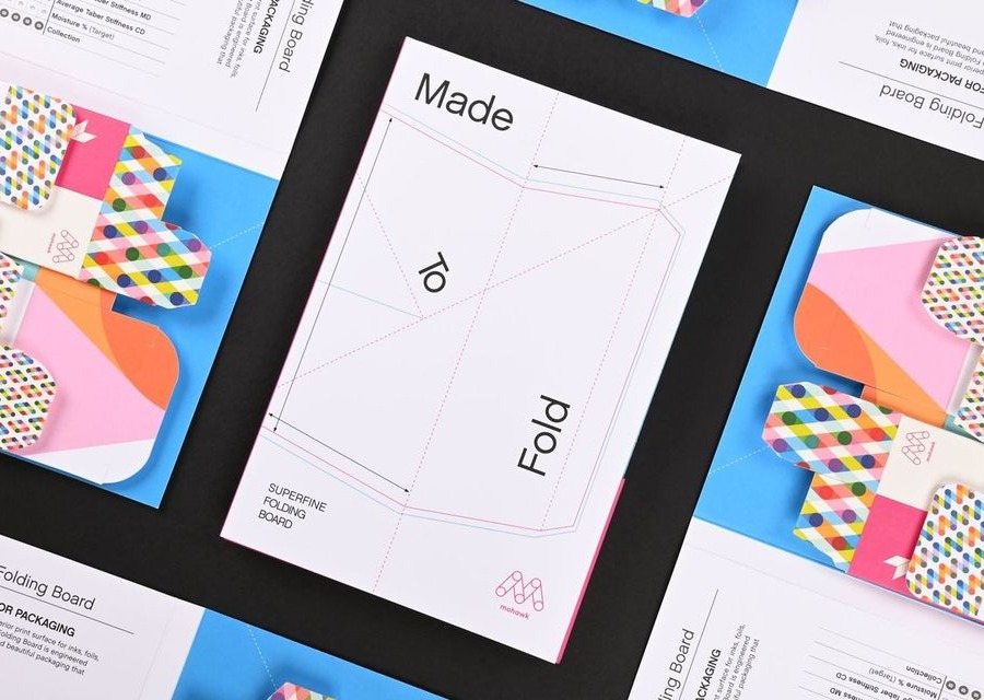
To Have and to Fold: Superfine Specifically Engineered for Packaging
