Mohawk Blog

World Relief Sees its 70th Year through Color and Design
Words
Ariel Smullen
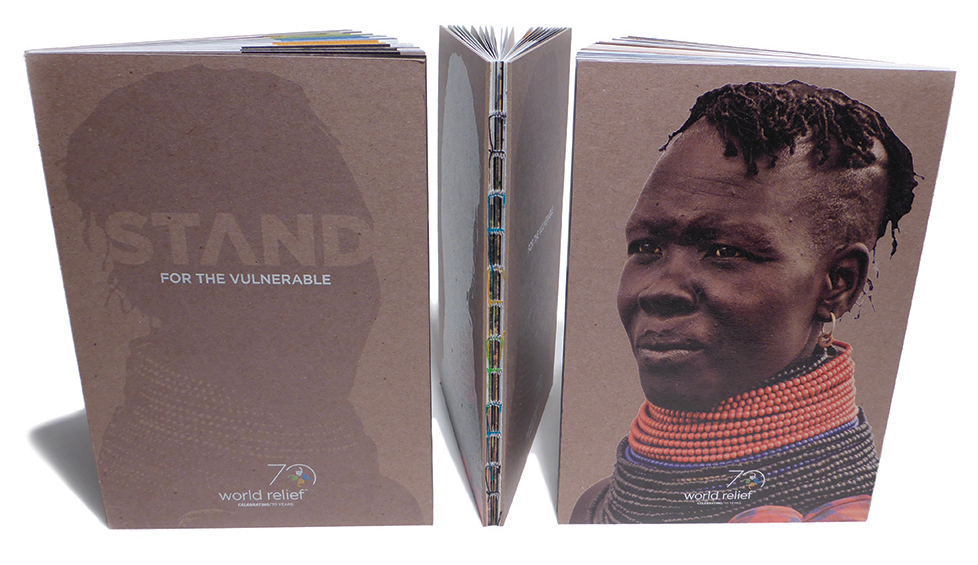
World Relief booklet standing up on a table

Since 1944, World Relief has helped serve nearly four million individuals who suffer from poverty.

By working with churches in struggling communities, this non-profit organization has transformed vulnerable communities into empowered communities. World Relief recognized its 70th anniversary with a rebranding, working with StudioNorth to create a book celebrating the organization’s history and mission.

The book uses Mohawk Options (Beautiful Collection) to showcase the concise history of World Relief throughout its 70 years. The book’s highly visual format dramatically captures the story of the organization and the millions of lives they have changed.

World Relief has worked with design studio, StudioNorth since 2013. We had a chance to chat with the studio’s Art Director, Marilyn Frank, about the inspiration behind the book’s design.

How did your relationship with World Relief begin?

In 2013, an art director from International Justice Mission took a new job at World Relief, and paid a visit to StudioNorth with his marketing director, Rose Corazza. Our first opportunity with Ms. Corazza was to work on a key fundraising piece: the Catalog of Hope. Since that time, we have been working with World Relief on strategy and planning for annual campaigns, marketing collateral, and other branding initiatives.
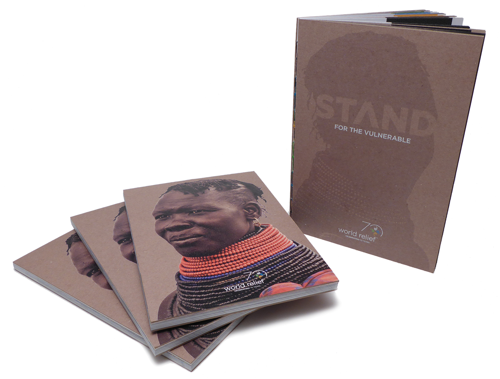
Several copies of the booklet arranged on a table
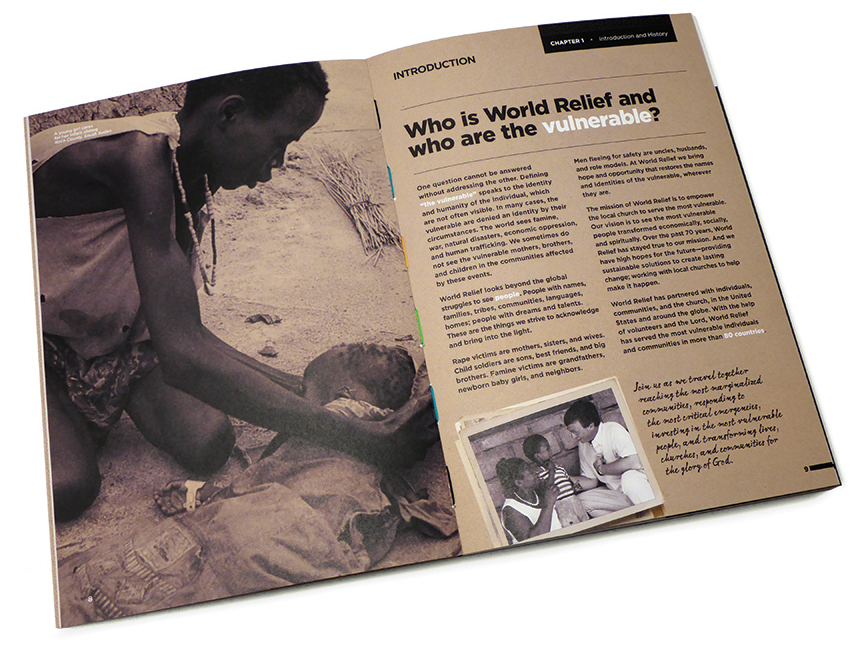
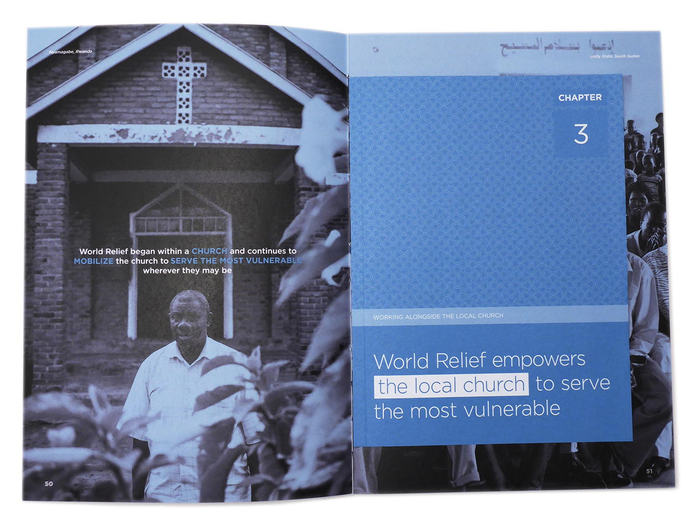
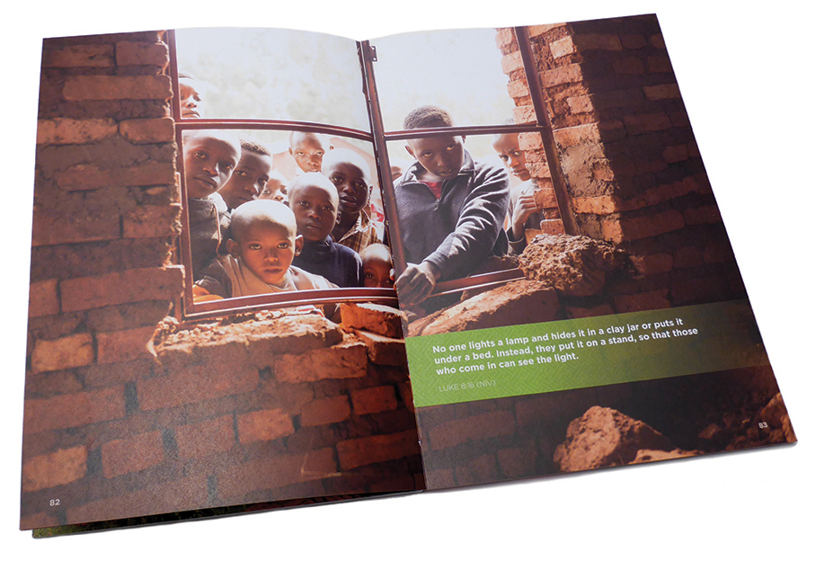
Inside spread of the booklet showing a two-page photograph

What is the intended use for the book?

This 70th anniversary book is a singular, concise history of World Relief – the first of its kind in their history. It blends images, stories, and historical accounts in a unique format. Intended to be given as a gift to major donors, the book shows how financial contributions and direct involvement can impact the lives of many through programs that promote transformational development.

This book is part of a larger effort to rebrand the organization and solidify their position as a relevant force in global humanitarian efforts. World Relief serves some of the most vulnerable populations on the planet: women and their children needing health care and nutritional support in Africa; refugees resettling in the US after fleeing poverty and violence in their homelands; people suffering from HIV/AIDS in Africa, Asia, and the Americas, among many other groups (for an extensive list of programs visit worldrelief.org).

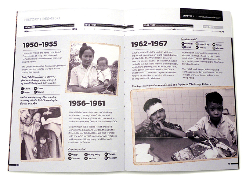
Inner spread of the booklet
Another inner spread with photos and text

Where did the inspiration for the design of the book come from?

The inspiration came primarily from a key value that World Relief holds, which is woven into their mission to empower churches to serve the most vulnerable: it’s all about the act of seeing.  The very nature of World Relief’s efforts mandates bringing the most vulnerable out into the open to help them see their own potential for personal empowerment. It was important to bring that into the book in a visual way.

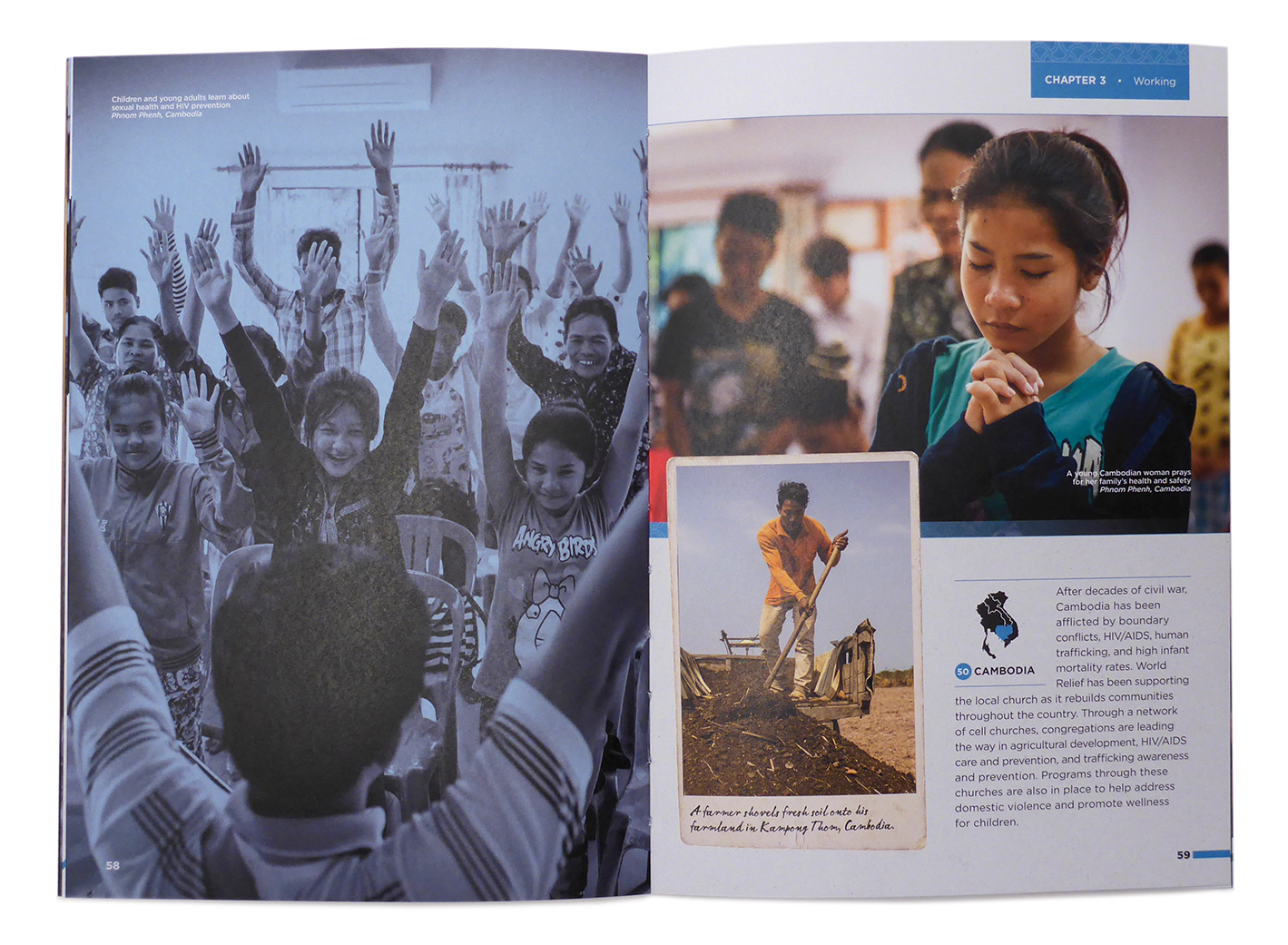
We used color as a vehicle to show the transformation from vulnerability to empowerment. From the opening chapter (black, white, and beige), to the closing chapter (full color), the book takes the reader on a journey filled with challenges, hope, and faith. The use of color is another layer that helps tell the story of a non-profit that had to change alongside a changing world during a 70-year period. Because color was so important to telling the story, our paper selection was critical.

Another inner spread with a golden-colored short sheet placed in between
An inner spread with photography and text

The book construction is beautiful, featuring a Smyth bound spine and showcasing thread colors that match the World Relief brand. How was the concept developed?

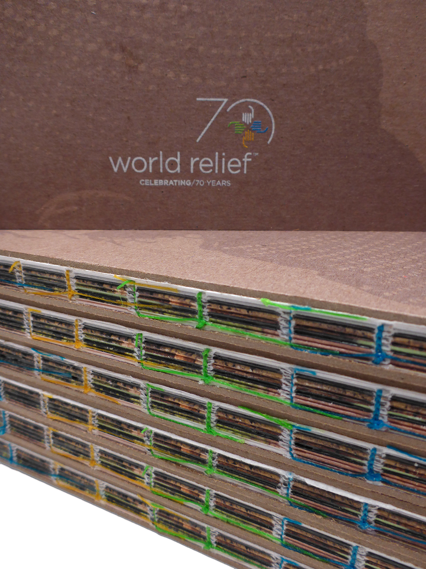
The binding choice works on several different levels. Smyth binding seemed to be a very appropriate choice. First, an exposed spine is perfectly in alignment with the idea of “seeing”—an idea embedded in the backbone of the organization. Second, by placing the World Relief brand colors in such a critical place, we leveraged another opportunity to bring the brand into the very structure of the book. Third, Smyth binding has a hand-crafted quality to it, aligning with the grassroots aspect of some of World Relief’s own approach to helping others. Quite a few of the people they serve are also makers and craftspeople who earn a living by creating things with their own hands. Fox Printing in Milwaukee, printed, bound and glued the book, and handled a majority of the production by hand, staying true to the craft of bookbinding. This book is truly a work of art.

Stacks of World Relief books

What was your favorite part about designing the book? Any favorite spreads?

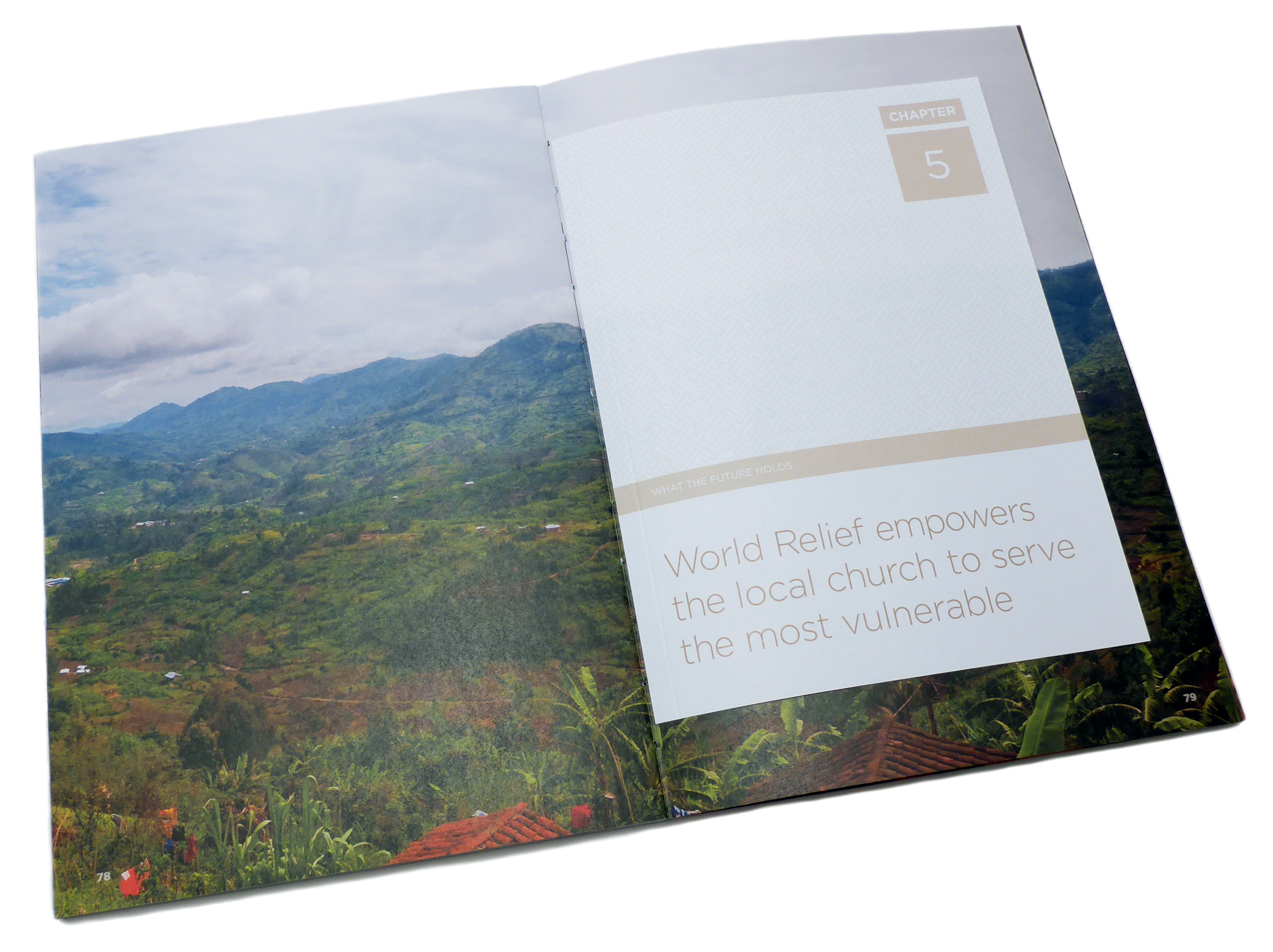
My favorite part of the book? All of it. Knowing what went into making it happen, I can’t point to one thing and say, “this is my favorite part.”  I do love the closing chapter, though. It’s so joyful and open, and a poignant summation of a labor of love that has gone on for 70 years. It’s amazing that StudioNorth had the opportunity to use our talents and resources to create this book with such a trusting partner.

Inner spread of the booklet
Another inner spread with photography, design and type

Why was Mohawk Options selected for this project? 

Color was a critical piece of the puzzle. Our paper choice had to have some tactility, but be smooth enough to help enhance image quality. The paper selection needed to absorb just enough ink to reflect light and dark while maintaining color clarity and fidelity. Paper that had too much tooth, or too little, wouldn’t work well. Paper that would absorb too much ink, or be too glossy wouldn’t work well either. Balance was key—and Mohawk Options (Beautiful Collection) gave us exactly what we were looking for.

To learn more about World Relief or to join their efforts, visit worldrelief.org

Client: World Relief
Design: StudioNorth, North Chicago, IL
Printer: Fox Printing, Milwaukee, WI
Paper Stock: Mohawk Options/ Navajo Smooth/ Brilliant White/ 100T, 60T
Printing: 4 color process UV inks
Bindery: Smyth Sewn


Production Notes

PN-print-process
Print Process
Offset Printing
capability_infoi
Ultraviolet (UV) Printing
capability_infoi
bindary
Bindery
Smyth Sewn
capability_infoi
roll
Offset Printing Capabilities
4 Color
capability_infoi
PN-designer
Designer
StudioNorth

Materials Used

Suggested Articles