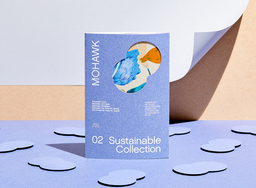
Mohawk Renewal marks a bold new chapter in our ongoing commitment to sustainability and innovation in papermaking.
We know that materials matter, and the right materials can take a project from good to great.
The competition for an audiences’ attention has risen to a fever pitch. They are overwhelmed, bombarded with more-more-more, with less and less impact.
We know that materials matter, and the right materials can take a project from good to great.
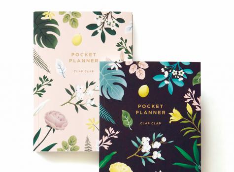
Today, guest blogger, Sarah Schwartz, editor of Stationery Trends and The Paper Chronicles, chats with one of Stationery Trends’ Top Ten 2016 Designers to Watch about her career, inspiration and thoughts about paper. Today, Sarah introduces us to Mimi Kim of Clap Clap.
In a previous post we dived deep into the nuances of color, including the differences between RGB and CMYK color spaces, when to use each and how to design for them. What about spot colors?
As we move about our day, we’re bombarded with thousands of branded images. Most of them are white noise, but others manage to cut through the clutter and intrigue us.
For those accustomed to selling traditional lithographic print, making the transition to selling digital print can be challenging.
In 2014, Mohawk stumbled upon a paper holy grail: a collection of samples, swatchbooks and sales guides boxed up in a warehouse, all but forgotten.
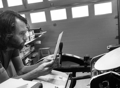
For the past two years, Chris Fritton has been on the road, traveling to letterpress print shops across the United States and producing unique, regional prints at each stop.
