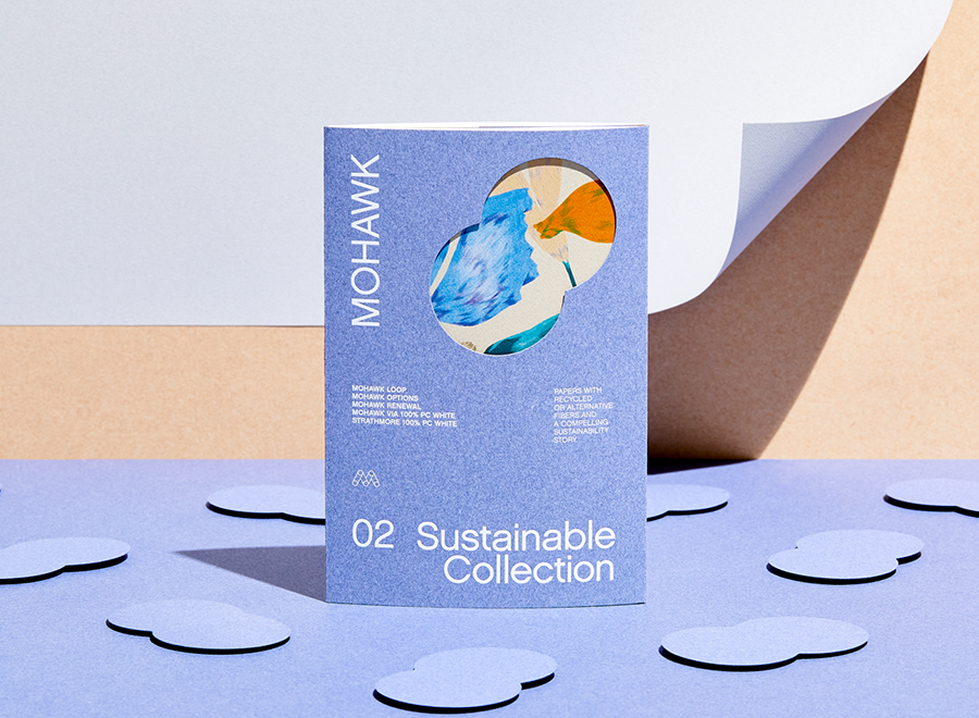
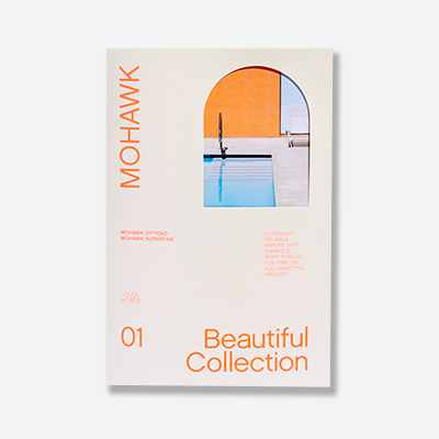
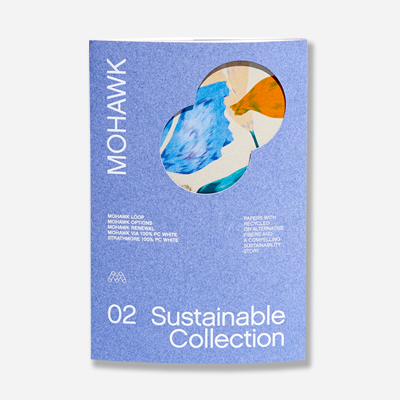
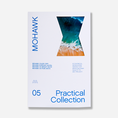
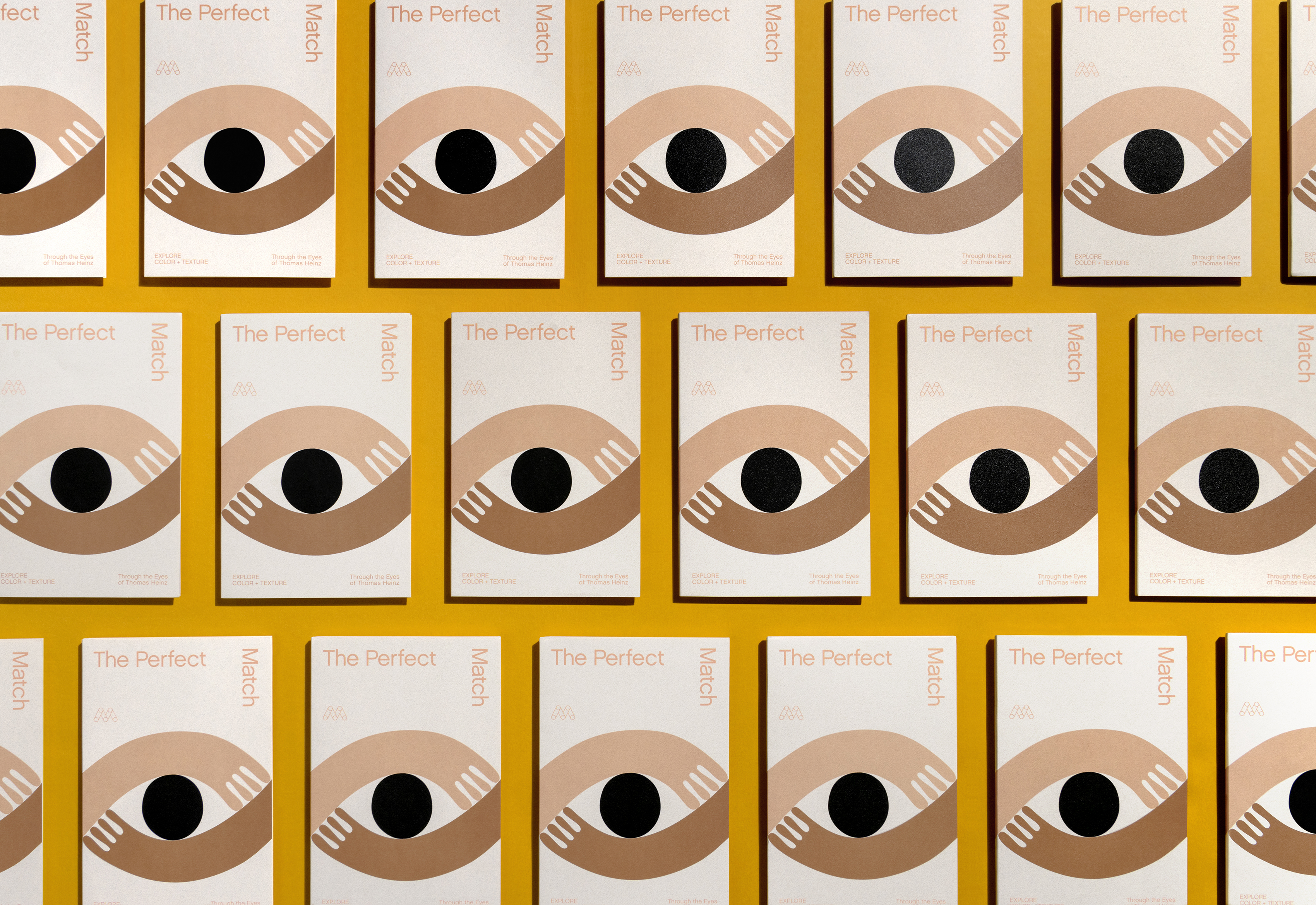
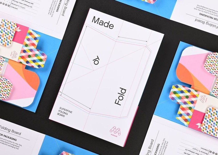
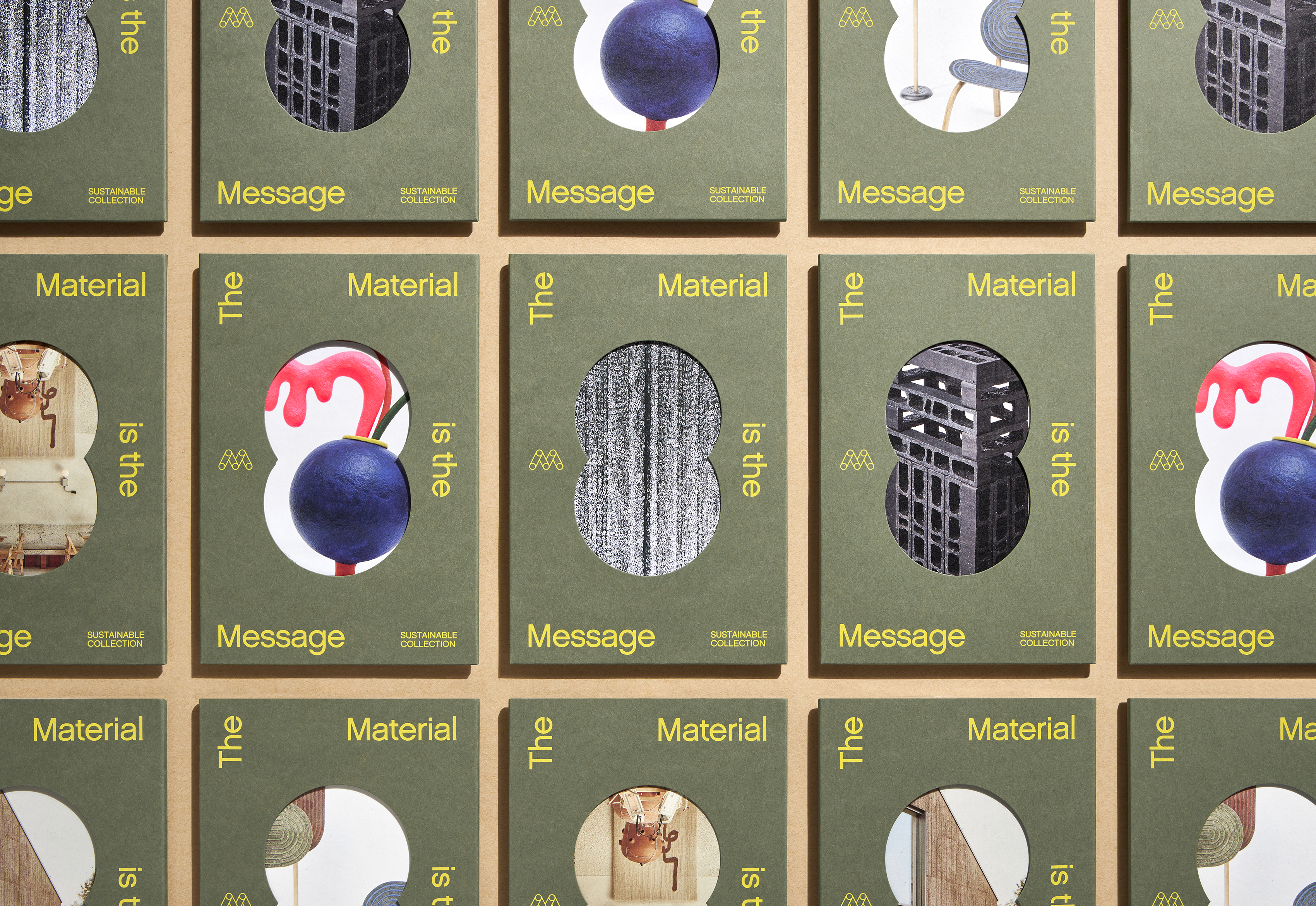
Mohawk Renewal marks a bold new chapter in our ongoing commitment to sustainability and innovation in papermaking.
The world is changing and we have to as well, but we should never (or let anyone else) forget the value and impact of what we do well.
Our ultra-modern world of on-demand services promises convenience and instant gratification; life moves fast, and we want things even faster. But at what cost? Understanding the DIY revolution—reclaiming our creativity to make more and do more—allows us a new way to connect to ourselves and to each other.
Doodling, drawing, workshopping, outlining: call it what you may, but putting pen to paper in search of something new is a powerful creative catalyst. Ideation and imagination need room to work it out, and based on psychological research and artistic practice, sketching space is the place where it often happens.
Field Notes have become one of the most popular notebooks people use for daily musings, doodles and to-do lists. For the Spring 2017 edition, Field Notes introduced “Utility,” a notebook format perfect for any hard worker who may spend a bit of their time in a local hardware store…or for anyone that aspires to do so.
Upon reading this article’s title, if you’re thinking: ‘Fire a customer? That’s crazy! Any business is good business!’ – please do yourself a favor and read part one of this series.
Firing a customer. It sounds like an oxymoron, doesn’t it? But contrary to popular belief, the customer is not always right and not all customers are good.
Today, guest blogger, Sarah Schwartz, editor of Stationery Trends and The Paper Chronicles, chats with one of Stationery Trends’ Top Ten 2017 Designers to Watch about her career, inspiration and thoughts about paper.
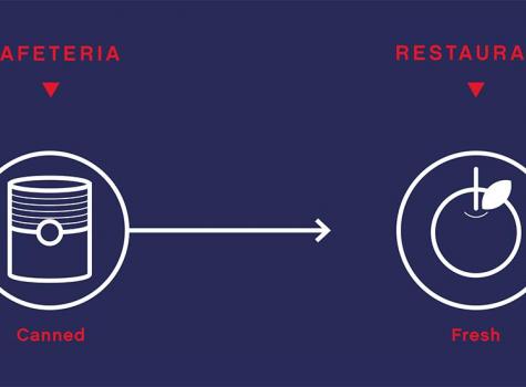
Imagine two lunch spots: a cafeteria and a restaurant. Each serve their own purpose, but which one would you bring a client or first date to?
Last week, we began our discussion on how to design for spot colors used in digital print technologies. This included how to determine which spot colors may reproduce accurately as CMYK builds and what information you can gather from the various Pantone guides.
